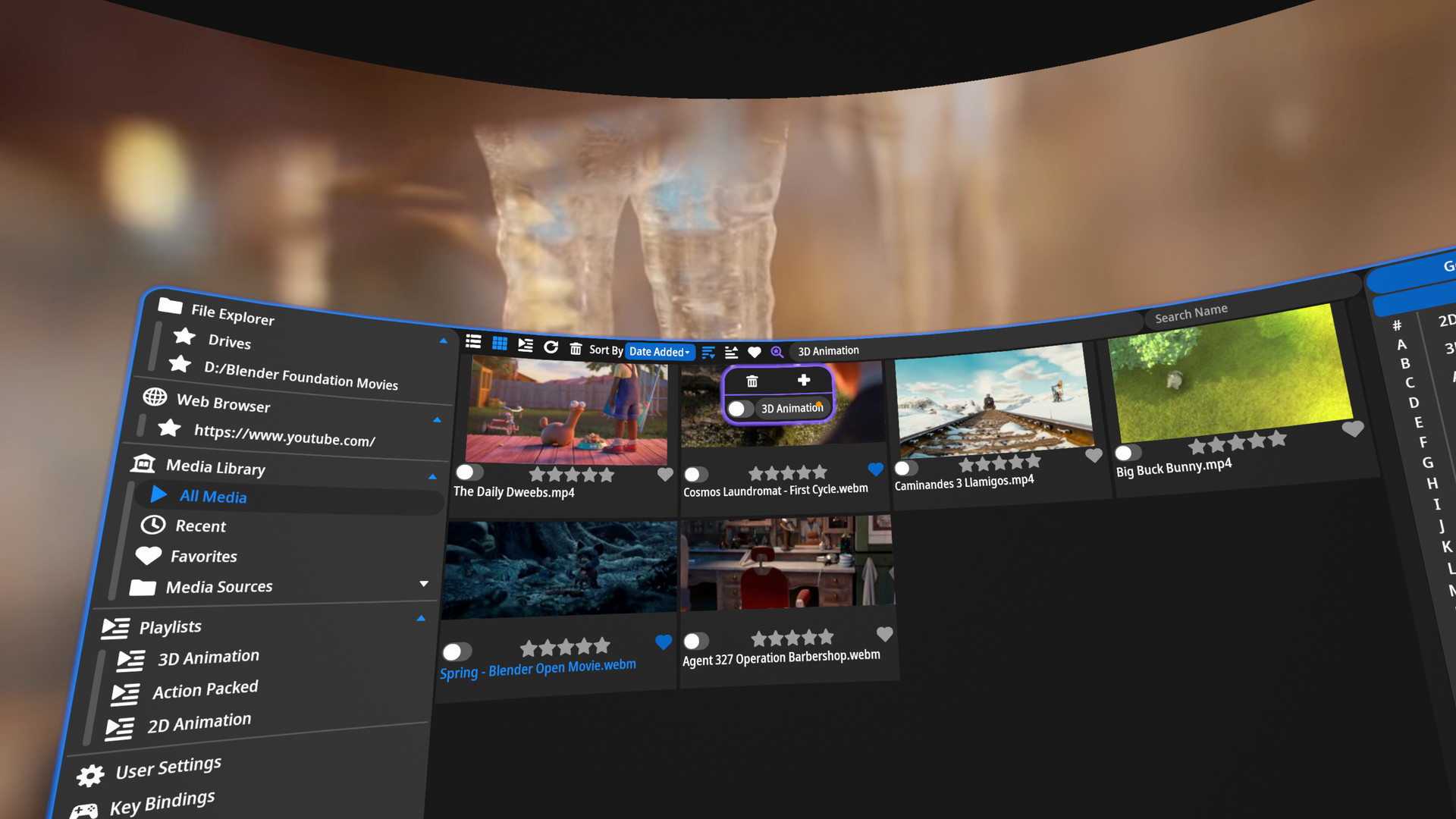
Is the issue that you can't tell the color difference between on and off? I've considered using an outline and fill icon style instead (most sites have switched to this style probably to help with the visually impaired), but it doesn't look good in VR due to the small outlines having more aliasing in VR compared to a normal monitor. Are there specific colors that you have an easier time seeing? Maybe I can add a color theme option that'll allow you to switch up the colors.
Yes, it's the differential in colors I have a hard time identifying. For me, I'm the ultra-rare, 100% color blind, so dim for disabled to a more light icon for enabled would be optimal. That's why I was thinking to just adopt the scheme for the logos already in place. I have no problem identifying the difference between the heart logo at the top and the one at the bottom, and I figured it would hopefully only be a minimal code change.