
Indie game storeFree gamesFun gamesHorror games
Game developmentAssetsComics
SalesBundles
Jobs
TagsGame Engines

HereSphere VR Video Player (Meta Quest)

VR video player with immersion-enhancing algorithms, streaming, and media library features · By HereSphere

Color Scheme to Rating and Favorites Icon

A topic by nerfdaderp created Mar 12, 2023 Views: 231 Replies: 4
Viewing posts 1 to 4

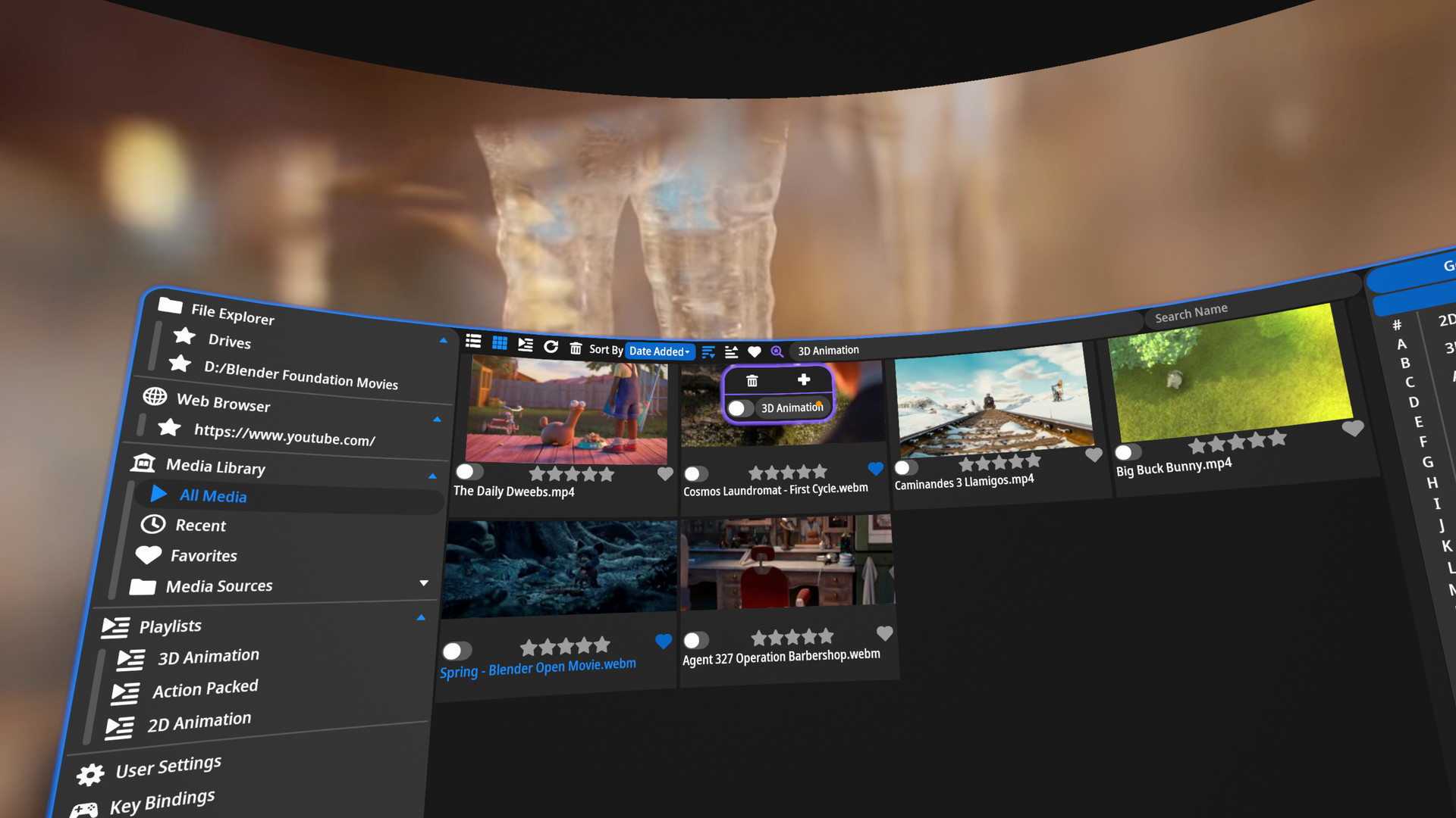
For the color scheme to the 5-star rating system and the Heart favorite button, I am visually disabled, and I can never tell if they are enabled or not. I did hear of a UI revamp in the works, but I was wondering if you could adopt the color scheme from the heart icon in the top panel of the UI for the lower heart and rating system if they are indeed enabled.

Thanks for the awesome app!

Developer

Is the issue that you can't tell the color difference between on and off? I've considered using an outline and fill icon style instead (most sites have switched to this style probably to help with the visually impaired), but it doesn't look good in VR due to the small outlines having more aliasing in VR compared to a normal monitor. Are there specific colors that you have an easier time seeing? Maybe I can add a color theme option that'll allow you to switch up the colors.

Yes, it's the differential in colors I have a hard time identifying. For me, I'm the ultra-rare, 100% color blind, so dim for disabled to a more light icon for enabled would be optimal. That's why I was thinking to just adopt the scheme for the logos already in place. I have no problem identifying the difference between the heart logo at the top and the one at the bottom, and I figured it would hopefully only be a minimal code change.


HereSphere VR Video Player on Steam 

Developer (1 edit)

To clarify, the heart icon at the top is white when disabled and blue when enabled. The heart icon on the thumbnails is gray when disabled, and then blue when enabled. You're having trouble telling the difference between the gray and blue, right? So if I changed it to be white and blue, that would ok? I think I originally set it to be gray, because I wanted the heart to become a lighter color when hovered over.

I'll be honest, blue does not mean much to me as everything is gray haha but yes, if the color scheme adopted white, I would definitely not have an issue. I might suggest it be white on enable and dim on disable but that's fully your call. Thanks for any consideration you may have for the request!