
Thanks, and thanks again for streaming the game!
Of course I completely agree with all your points, and we talked about the first two on the stream.
Your third point is very interesting to me, though. The display at the bottom of the screen, which shows the guardians in your party and what their attacks do, was meant to be one of the most important elements of the game's UI and one of the main ways I try to communicate mechanics to the player - but I haven't seen any players talk about it, so I'm not sure whether it did its job.
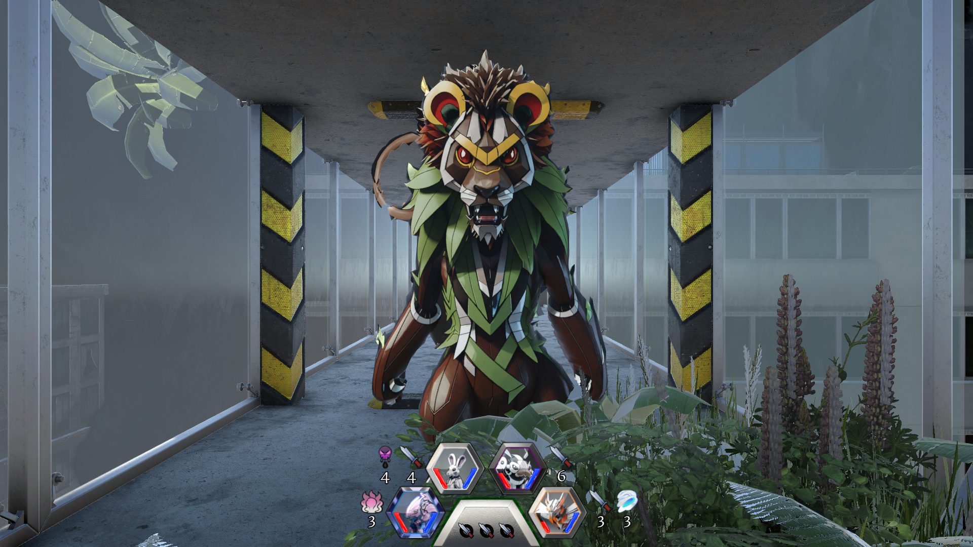
Was it a display you consciously noticed or thought about while playing? I'm wondering whether I didn't make its purpose clear enough, or whether I simply made it too small and unobtrusive (my determination to have a "clean, modern" UI coming back to bite me)?
Thanks again for your detailed comments, and good luck with the rest of the jam!