Play game
Guardian Gorge's itch.io pageResults
| Criteria | Rank | Score* | Raw Score |
| Graphics - Is the game aesthetically pleasing? | #15 | 4.333 | 4.333 |
| Overall | #35 | 3.600 | 3.600 |
| Gameplay - How fun is it to play? | #44 | 3.500 | 3.500 |
| Completeness - Is it an unfinished tech-demo, prototype or a complete game? | #50 | 3.722 | 3.722 |
| Audio - Does the game have nice sfx and music? | #51 | 3.556 | 3.556 |
| Theme - How well does it incorporate the theme? | #83 | 2.889 | 2.889 |
Ranked from 18 ratings. Score is adjusted from raw score by the median number of ratings per game in the jam.
Leave a comment
Log in with itch.io to leave a comment.


Comments
I was have a bunch of fun with this, and then walked backwards out a window or something and ended up in a 2x1 area with absolutely no where to go it seemed :(. It was right across from where, I think, I was about to get a penguin-like guardian. Not sure if I missed something (in hindsight, perhaps something I needed to click on? I was using the controller up until then...). The guardian hex grid was really cool, I enjoyed playing with different options, and really nice that I got immediate feedback on what kind of attacks everyone had (as I was unclear if "X damage" meant base damage or no damage ^_^).
Eugh, yeah, sorry; now that you mention that I can think of exactly where that is. That 2x1 is part of a later section of the level that was never finished; I must have forgotten to put in a thin wall on the floor above where the window is, so it's possible to fall out into it. My bad entirely!
Thanks for the play and the helpful feedback, and hope the bug didn't spoil the experience too much!
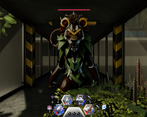
What a cool idea! It took a bit for me to understand the battle grid, but it's a super neat concept that I could totally see some fun strategies come out of in a longer game. The freedom of the movement system was also a very nice change of pace, felt cool to take shortcuts and platform around! The combat system still confuses me a lot, I think having just the combat numbers made it really hard to tell what I was actually doing. I had a hard time telling what attack I was doing too, I was never really sure what my damage amount would be. The visuals were really nice though, and the level design worked pretty well at leading me forward!
This game has some really nice style! I think the grid system for characters and weapons is a very fun idea!
Some thoughts…
Over all, I thought this was fun game with some very nice creature and environmental designs, and a fun mechanic for character/equipment management! Excellent work!!
Here is the link to me playing your game during my stream :)
Thanks, and thanks again for streaming the game!
Of course I completely agree with all your points, and we talked about the first two on the stream.
Your third point is very interesting to me, though. The display at the bottom of the screen, which shows the guardians in your party and what their attacks do, was meant to be one of the most important elements of the game's UI and one of the main ways I try to communicate mechanics to the player - but I haven't seen any players talk about it, so I'm not sure whether it did its job.
Was it a display you consciously noticed or thought about while playing? I'm wondering whether I didn't make its purpose clear enough, or whether I simply made it too small and unobtrusive (my determination to have a "clean, modern" UI coming back to bite me)?
Thanks again for your detailed comments, and good luck with the rest of the jam!
Honestly, I spaced on the icons at the bottom of the screen. That said, I was thinking more of like some sort of visual attack effect. Like some wind or something over the monster being attacked. Like I said, it’s minor, and not always possible to do in a jam.
Absolutely, yeah. Thanks, that's very useful feedback!
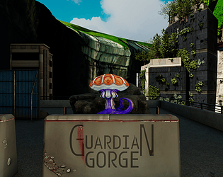
I am sure this has been said a couple of times but your game is gorge-ous. I like the hexagrid, you really need to think about how the placement affects the fight.
My laptop is burning due to the graphics lmao.
Looks gorgeous and I like the innovative party system.
I didn't feel like I obtained any sort of mastery in my limited time playing.
I might have enjoyed a gentler on-boarding, with fewer hostiles in the starting area.
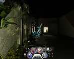
Looks like a great game though, even though I party-wiped twice within 50 steps of the start.
And there I was foolishly worrying that I might have made it too easy. :)
The formation mechanic is definitely intended to have a lot of depth to it; unfortunately I didn't do nearly as good a job of tutorialising it as I wanted to, so it's pretty opaque to most players (and as you say, the game asks you to deal with a lot very quickly). It really needed more careful instructions (and pausing) to make sure players were ready before they moved on to the challenges ahead.
Thanks so much for playing, and good luck with the rest of the jam!
Did you know that hexagons are the bestagons?
I loved the UI for applying upgrades to your character. I could see this being developed further into something really great! Any future plans?
Graphics were solid, music was nice, and the sound effects were very satisfying.
Overall, great work on this one!
The grid system for character formation/equipment/upgrades is definitely something I have a lot of detailed ideas for, and I feel this game didn't really have a chance to explore (or even communicate) it, so I think it's very likely I'll revisit the mechanic; maybe not in another Guardian Gorge game, but certainly somewhere!
Thanks for playing!
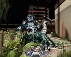
Graphically this looked really good, and it was nice to be in a bright sunny environment. Some of the assets didn't quite gel, some had realistic textures but some didn't, although the enemies were all very interesting to look at and consistent in themselves. The combat UI was nice, hexes are good, although we weren't sure whether they represented physical locations relative to the character or whether they were just combat upgrade slots. We didn't get the drag and drop mechanism from the inventory for a while. When we won or lost a battle we were never really sure why. Were there any puzzles or was it just about combat? We didn't seem to do anything apart from fight. Great job on producing such an excellent looking game for your jam entry. We look forward to see how you develop your game further.
Thanks! Yeah, I get what you mean with the textures; I tried to unify the environment as a videogamey "slightly glossed reality", with the guardians as a surreal layer on top of that, but that's pretty difficult to maintain - especially when you need detailed near-field and low detail distant environments to look plausibly like they're the same thing.
I'm glad that you noticed the possibility that the hexes represented physical location! I don't think that was clear to anyone; I was definitely relying on the "front rank" and "back rank" buffs and debuffs to communicate a lot. In retrospect I should at the very least have had a "Formation" heading above that side of the inventory screen. The intention is that that positioning and those rank effects, alongside the limited space for weapons and equipment, have you make tactical decisions to maximise damage output while keeping stamina loss and damage taken under control. In practice, though, because of the very passive tutorials and my desire to balance the game to be very easy for the jam, there's not really much motivation or opportunity for the player to figure that out (nor is there much assistance in doing so).
Unfortunately only half of the planned dungeon got built due to time constraints, and the puzzles were back-loaded; one (two if you're generous) did make it into the jam build, but they're both in the final area so easy to miss unless you take the time to complete the bestiary.
In any case, thanks very much for playing, and best of luck with the rest of the jam!
I really like the setting here, the kind of post apoloclyptic city ruins theme is very cool. I wasn't 100% sure how the mechanics worked, but think it's fun to build and equip my party with the guardian tokens even if I wasn't sure exactly what was happening.
One thing I really liked as well is the movement, the ability to go down drops with that smooth tween was really satisfying and not something I've seen a lot in these types of games. In general moving around felt really responsive and smooth, and the ability to move onto different types of terrain and not be constrained to a very obvious grid made the exploration more interesting (Especially that last bit moving out onto the wall and dropping down).
I did end up completing the bestiary, it was a nice touch to have the bunny and the flying monster a bit out of the way and requiring a kind of diagetic inventory thing to get as opposed to just running over them.
Really nice entry, visually striking with some cool concepts that I think would make a really fun game if you decide to take it further. I'm a sucker for the whole nature has retaken the city post apocalypse vibe.
Great job!
The game is gorgeous and doesn't feel like being a jam but a true game!
The mechanics worked well even if I do think I didn't understood how items were working at first glance and had the tutorial instruction being buried pretty fast ^^"
I also noticed a strange thing : right key does turn to right but not left - while playing on keyboard, using these to turn around is more comfortable than using Q or E. Tho it's very minor and we can edit the controls which is a true blessing! Also the game does use Physical key so playing on Azerty is comfortable! :D
I just wished we could heal the beast but when I ended up with many of them in the inventory, it was fine at the end. Very great job!
Thanks! Yeah, my biggest regret with the game as it is now is that it doesn't push the explanations of the mechanics enough. Fortunately most people seem to be figuring them out fine (and the jam build is easy enough that you don't need to to progress), but I would like to have been able to give them more focus.
I did actually have a mechanic for a kind of health recovery/armour item that used the equipment grid, but in the end for a jam game it made more sense to me to push people to use the new Guardians they were getting, as their old ones got too damaged.
Thanks again for playing!
Nice environment and monsters, I am very curious how you made them! The nature taking ahold of the ruined building was really lovely and the inventory system was fun to play with!
Thanks! I would definitely like to write a devlog about how the characters were built, as there were a few neat tricks I found that I think people will be interested in. I don't want it to eat up time that I could be using to rate and give feedback on other entries, though, so we'll have to see what happens.
OMG what a gorgeous looking game with the amazing environments. The polish is spot on all around; sound, graphics, ui, settings, movement, controls. Even the startup screen with logos and zooming background looks rad!
The inventory grid and combat is super unique and interesting. I want this to be a fullly fleshed out game!
There was a pickup with a bunny icon behind the building where you start that I couldn't pick up. Looks like the rock formation geometry prevented me to move there.
You nailed the perspective view and both movement modes worked great.
The rebinding of controls didn't work for me. Whatever I did I couldn't assign the keys properly as I wanted so I ended up using WASD.
Thanks, that's all great to hear!
The bunny pickup is intended as kind of a "tutorial puzzle", I guess? Since you can't move into it, it's supposed to teach you that you can pick up items with the mouse straight from the world, the same way would would pick them up in the inventory. In retrospect I should definitely have added an obvious barrier to make it much clearer that you weren't supposed to be able to step into that space, rather than relying on "it's just slightly too small".
And ugh, looks like you're right about the control rebinding; it works fine in editor, but I guess I must never have tested it on a player build - that's annoying. Thanks for letting me know!
OK, that was brief but amazing. The environement looks great, movement is perfect and the party and combat system are super good. Now I want more.
Many thanks, glad you enjoyed it!
Yeah, unfortunately I only had time to build about half of my planned-out dungeon (and only about 75% of my planned units); these environments take a lot of time to set up! Fortunately switching to a "collectathon" completion goal meant I could get away with just building as much as I had time for, even if it does make the ending a little less cinematic.
Yes, it does feel like a proper ending this way.