On your photo, the text is offset and overflows your screen, and the font doesn't resize like the steam version by changing the resolution.
This problem needs to be solved because it happens to you too.
OK, I understand better.
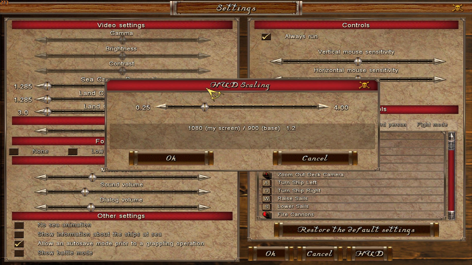
The game was originally designed for 600x800 and some people complained that the stretching and small icons/fonts at newer, wider resolutions was too small to read so I hardcoded a factor into the scripts for the land/sea displays. For better treatment, I copied an option from ERAS to this version that will allow you to rescale those, separate from the screen resolution where you can choose the scaling factor with a slider.
Update the COAS scripts from the Itch update, load your saved game, go to Options, click HUD button lower right, and slide left to a value closer to 1.0 (you can go lower if you want). It does not take effect immediately, but if you are at sea, just enter your ship cabin, then exit.

Here is .77

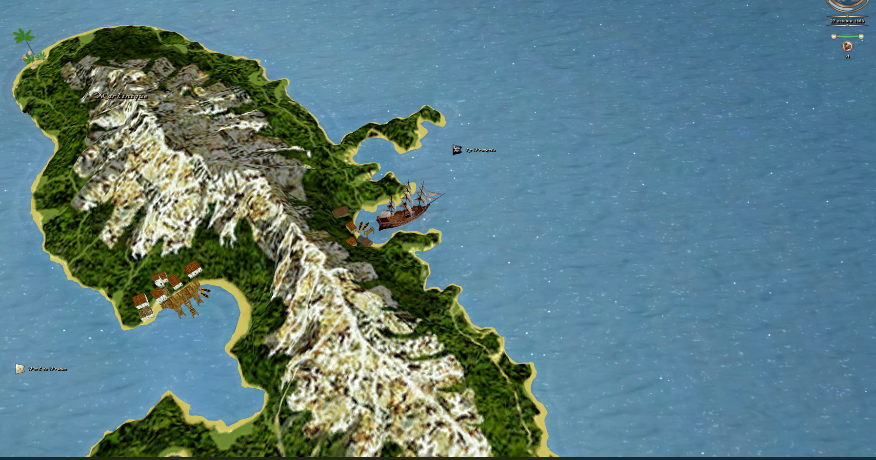
I'd just like to point out a few little bugs in the world map, texts that are far too small compared to the rest of the HUDs, which should be made bigger by default :

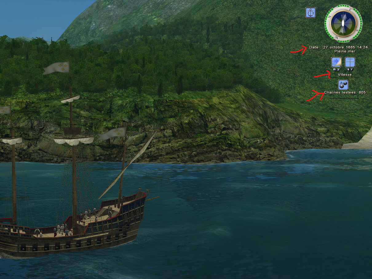
When you are ship view, some text doesn't center correctly, I know that in some games it uses a variable like TEXT_ALIGN_CENTER or others to keep the text aligned with its position even if it is dynamic, there are also black lines visible below the texts, which should be removed :

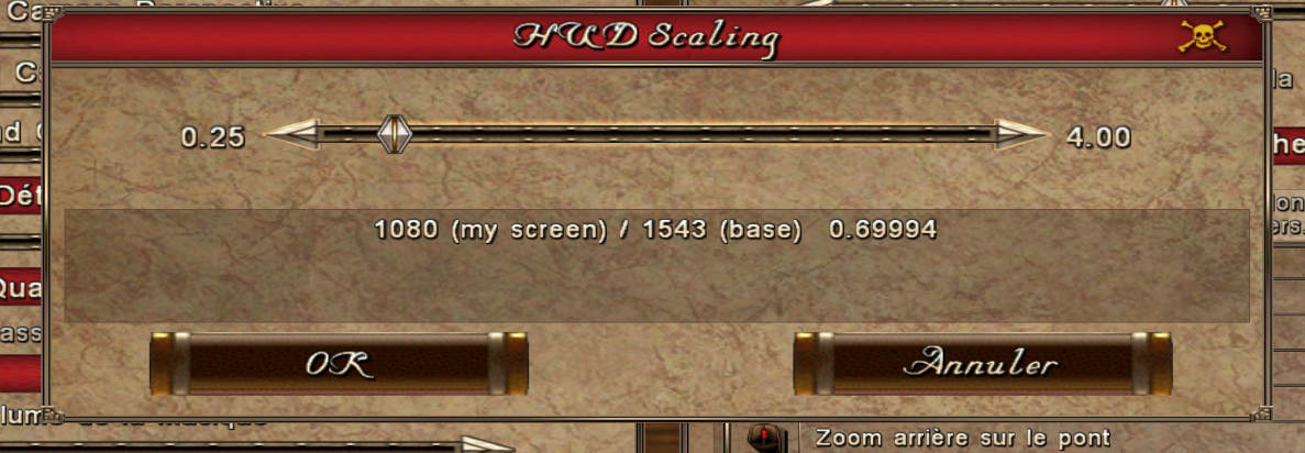
My HUD settings :
