Indie game storeFree gamesFun gamesHorror games
Game developmentAssetsComics
SalesBundles
Jobs
TagsGame Engines
(+1)

You have a VERY FUN game here. The strategy in the actions flow nicely.

The only turn off for me was the UI clutter and the card presentation. I'd prefer just seeing the map, centering the character, and hovering over icons and get drop down menus instead.

A few things I noticed that should be fixed:

  • Sleeping or resting doesn't show what my penalty will be for hunger and thirst.
  • The jetty drink action should just get me 100% thirst since there are no penalties or at least none that I saw, this way I'm not clicking unnecessarily. 
(+1)

Thanks, your feedback is appriciated. I like  the points you noticed. Both make sense,  they are now on my list of improvements.

The cards however, they will stay. It was  my whole reason of starting  9 Dayz, to explore how a survival and exploration game  can be played  when cards represent locations, actions, events etc.

(+1)

May I ask how far you  came in your run? Was it the jetty at the first camp side in the west (Lake Campside Resort)?

(1 edit) (+1)

I got to the next town after the jetty

(+1)

Well done! This is roughly 1/2 of the way to  safety.

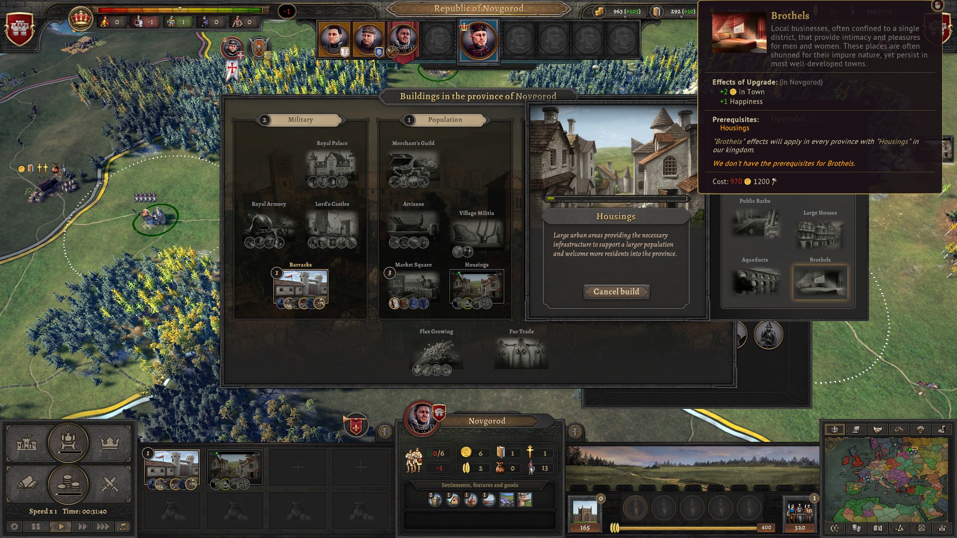
One more question came to my mind. Would you consider the UI of such a game also being too cluttered? If not, can you name the difference to the 9 Dayz UI?


If I am getting too annoying with coming back to your feedback, just ignore this  comment - I  could understand.

(1 edit) (+1)

Yeah, that's pretty cluttered. The top and bottom panels are okay by themselves since they're neatly tucked aside. Of course the windows and tooltips can be closed and opened when needed so that shouldn't be an issue.

9 Dayz UI cards just felt like an unnecessary layer that defeated the experience for me. The map was what I was interested in, but I had to dig through the cards to find out what something was and vice versa.  The map felt crushed to give room for the cards. 

The way I would've done it was to just have the map centered and hover over icons to reveal the cards.

(1 edit) (+1)

Alright,  thanks again. Think I understand what you mean. Stumbled over this game just this morning and  was remembered on your feedback. It is a completely different setting, but the map   in this game is in the center of attention, together with stylized troops, different icons and players giving commands in context of that environment. https://macondos.itch.io/command-control-3