Hi thanks for playing. I agree that many aspects of the game could be taken to a whole other level, but the budget, time, and audience just wasn't enough. Glad you enjoyed it.
Pisces Studios
Creator of
Recent community posts
Very well done. The dialogue kept my attention and made great segues into learning the game while having fun at the same time. This was one of the best spins on vampires survivors I've seen. There's not much to improve here, but If I had to find something I'd say the periodical upgrades should have icons to make them more memorable and identifiable. Very optimized, ran great with low settings on my crappy laptop which is a major feat. 5/5
There's a free demo available on the page. You have to scroll all the way down to see it using the mouse wheel or the scroll bar. Not sure why these jams don't make them more apparent, but if you're still having troubling finding the demo, here's a quick link: https://pisces-studios.itch.io/deterrence#demo
Super simple yet interesting. The art is nice, the spear mechanic kept me occupied, and can be picked up easily which is a huge plus. The game ran at a good 20 FPS on my crappy laptop so that's not bad. I got stuck at the door that required me to crouch or slide.. or something... which I couldn't figure out how to do it.
Was it fun? YES!
What did I enjoy the most? Super simple and nostalgic
Was it fun fighting the big slime with other AI players? Those were AI? I thought they were real! Yes it was fun.
Did you enjoy the goblin king boss more than the Big Slime mini boss? I only played the first 2 quests. Time restraints.
Did I encounter any performance issues? No, it ran great on my crappy laptop.
The game is super simple and easy to learn which is a huge plus for any new players. The beginning tutorial was perfect. Just wished I could interact with the tomb stone :3
The dialogue was just perfect, not super heavy and not too thin. Just the right amount of character building and engagement.
Somethings I noticed that could be changed/fixed:
When I click on UI buttons, my character attacks.
When I wanted to assign my potion, I was only allowed to assign it to 1 or 2, but I wanted Q
This looks and sounds pretty early, like a pseudo gameplay version so I'm assuming a real version would save your progress on a server etc etc. Anyways, that was super fun.
Yeah, the downloaded version ran much better. A bit of stuttering here and there, but overall okay to play. These are my laptop specs:
Processor Intel(R) Celeron(R) CPU N2815 @ 1.86GHz 1.86 GHz
Installed RAM 8.00 GB (7.87 GB usable)
System type 64-bit operating system, x64-based processor
Intel(R) HD Graphics
Driver Date 2014
Driver Version 10.18.10.3496
Windows Home 10
Fits children theme: Yes
Fits Doraemon: Yeah, the characters are recognizable
Overall nice game, the endless matches could be a good thing to keep kids occupied for a while. The AI gives the player chances and can outsmart the player, perfect difficulty.
The game ran slowly on my laptop which shouldn't happen with a simple game like this. I'd say around 3-5 FPS. Optimization is really needed. I doubt it's the code, it's probably the engine.
Yeah, that's pretty cluttered. The top and bottom panels are okay by themselves since they're neatly tucked aside. Of course the windows and tooltips can be closed and opened when needed so that shouldn't be an issue.
9 Dayz UI cards just felt like an unnecessary layer that defeated the experience for me. The map was what I was interested in, but I had to dig through the cards to find out what something was and vice versa. The map felt crushed to give room for the cards.
The way I would've done it was to just have the map centered and hover over icons to reveal the cards.
I dig the anime vibes here. Story was engaging and captured my interest right away, I wanted to find out more about Trout. Unfortunately, I could not get to Chrystollil because I couldn't get past the.. forgot the name of them creatures protecting their young. I gave it countless attempts and am pretty stumped.
The game mechanics were clean and tidy. Especially the grapple hook mechanic. The slowness of the gravity and character were a turn off though. But I am on a crappy laptop and did see the game lag, so it could just be my computer; In that case, the game just needs more optimization. It did take quite a while for it to startup as well, which was concerning.
Overall, you have something good here.
You've got a nice adventure game here with an interesting story and characters.
As a developer myself, I know it can be hard to judge if something is too easy since we have so much experience playing our own games. And I've to tell you this game was extremely difficult. I'd suggest having less mobs in the beginning and get the player slowly acclimated to the combat.
BTW the combat was cool. I didn't get far enough to see if the character gets more things to use in combat.
I'd also suggest adding customizable key binds.
The dialogue was a bit excessive for me, some voice acting would be a nice addition.
You have a VERY FUN game here. The strategy in the actions flow nicely.
The only turn off for me was the UI clutter and the card presentation. I'd prefer just seeing the map, centering the character, and hovering over icons and get drop down menus instead.
A few things I noticed that should be fixed:
- Sleeping or resting doesn't show what my penalty will be for hunger and thirst.
- The jetty drink action should just get me 100% thirst since there are no penalties or at least none that I saw, this way I'm not clicking unnecessarily.
I can understand the tutorial being there. I see why you have to display 3 weapons, but it's messy and make the controls confusing. I'd suggest going with traditional controls, switching between what you hold all in one list like Half-Life. The vitality, armor, stamina could be cleaned up by representing them as a percent or health bar. That's just my 2 cents, I don't understand the game fully to really know what's important to gameplay. But from experience, most people like games they can pickup really quickly and that means sticking to FPS traditions.
This game looks amazing, but I didn't get through the tutorial. The UI was pretty overwhelming. Things just didn't feel responsive (maybe missing sound). Once I got to the gun rack, I tried a gun and it disappeared.. I couldn't change weapons to make it reappear again.. not sure what to do there. I'll have to give it another go some other time.
I gave this a shot, and thank goodness for a tutorial cause this game is deep. But unfortunately the tutorial is lacking. I couldn't make it through the tutorial. First, I was confused on what bed to use.. I used the $8 bed, not the $3 bed. Second, I didn't know where the prayer book was. Third, I guess I wasn't suppose to make time go faster cause that's what broke the tutorial.
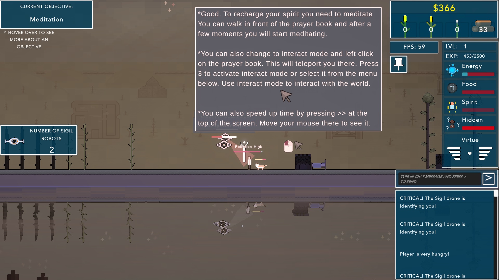
I couldn't get much further cause a bulldozer kept knocking my stuff down.. and then the tutorial just stopped and I had no idea what to do. I'll have to give this another shot later.
Pretty basic platformer you got here. I couldn't find any bugs. The music sounded great. I couldn't explore far to see much else of the game since I was constantly running away from enemies until they were in my kill zone. To improve the game some, I'd suggest adding a high score cause I can't remember what my high score is.. I think its 500. Overall, I think you have a good base here to expand on.
This was pretty fun and addicting once I got the hang of it. For some reason the [?] on the menu didn't work, which I figure was a tutor. Also found a bug where if you start the game on a level you just lost on, you lose instantly.
Some things I think could be improved with the game is having some sort of special attack with limited uses to help when you get swamped with enemies because once you fall behind, it's pretty much game over.
Some things I would change is instead of having the player lose if the player goes out of bounds, just prevent the player from going out of bounds. Also the player bounds don't match up to the enemy bounds because I've knocked a few over the line, but were not killed.
Neat twist on the vampire survivors like gameplay. You have a really good idea here. The pixel graphics conveyed what objects are, the music was catchy, and the objective of the game was clear.
The only issues I had with this game was in the balance of difficulty. The normal mode was super easy. All I had to do was upgrade my turrets and walls and the game won itself. The chaotic mode was very unfair and impossible.
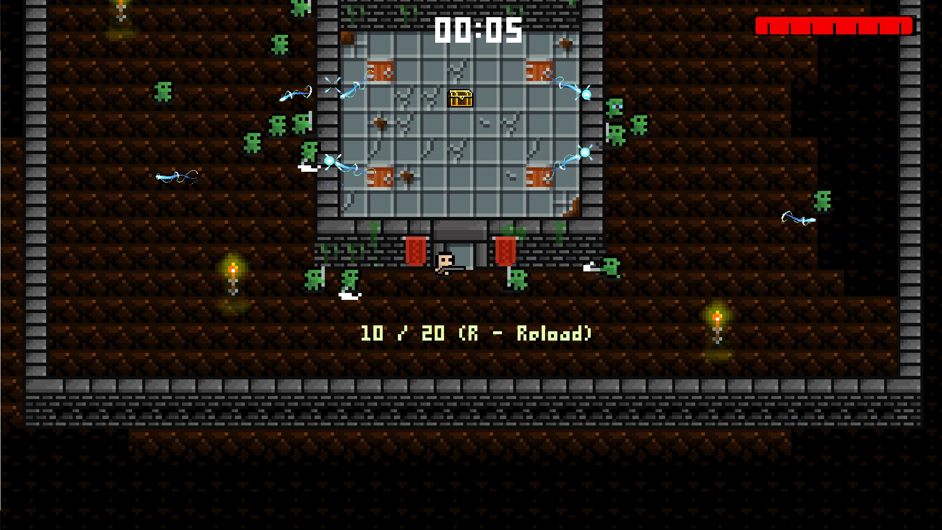
The other issue was with some pixel text that made it very hard to read.
You have a solid mobile SHMUP here. The graphics are good and the music gets me in the mood to play. The current enemies and background are good, but get old. I'd suggest spicing things up with level progression and introducing new biomes with new enemies.
One issue I had with the game was the player shooting sound. It either needs to be toned down or done away with because it's simply annoying.
And my final suggestion would be to get an online scoreboard so I can compete. Here's my high score: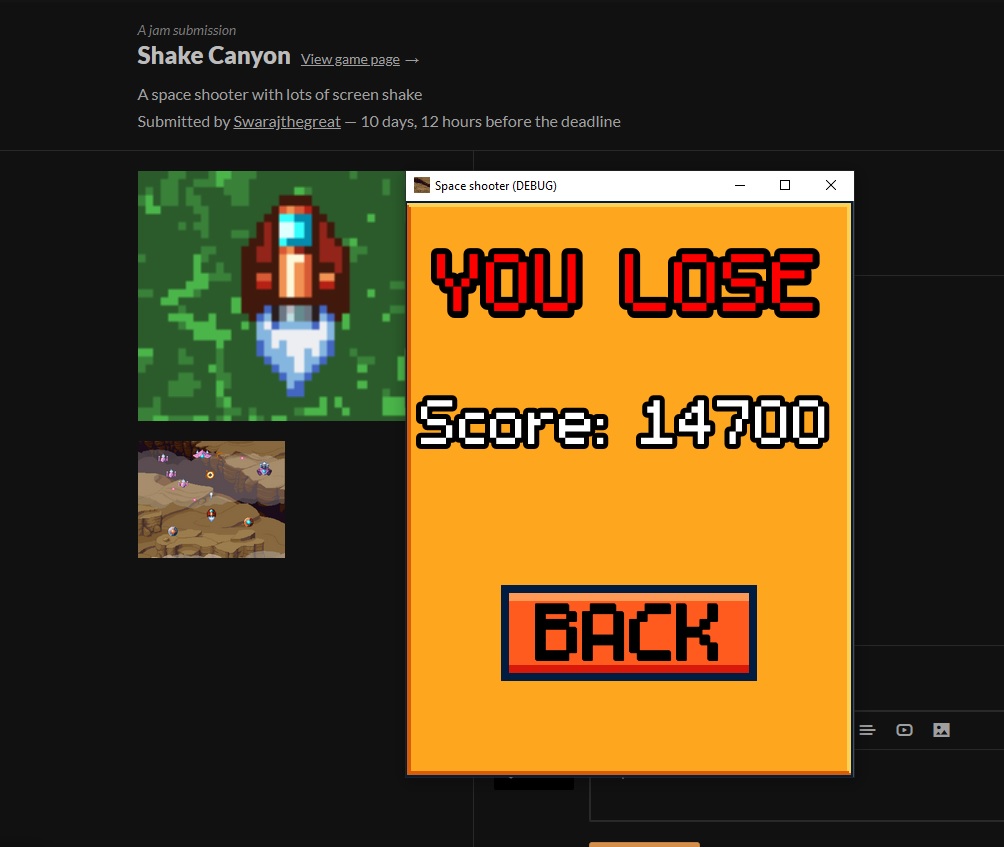
So this is my initial thought on the game that I feel like needs improvement: The game needs to ease me into it instead of just dropping me into it. The levels should start off easy and simple and work their way up. I was completely lost not knowing what I'm doing.. A tutor would be awesome too.
On the positive side, the game conveyed the controls well, the environments felt full and intriguing, the sound effects were spot on, and the game had nice depth in gameplay.
Very cool point and click adventure. I liked how all the scenes were filled with things to do, the world felt wholesome. I like the theme and the ghost at the lake nailed the theme. I'd suggest getting rid of cycling through actions with the right mouse button when trying to interact with things because that really ruined the experience for me. Also, when talking to other characters, sometimes what they say disappears too fast and I miss what I'm suppose to do. Just a few tweaks in my opinion and this will be an awesome game!


