Slightly less than a day later ..
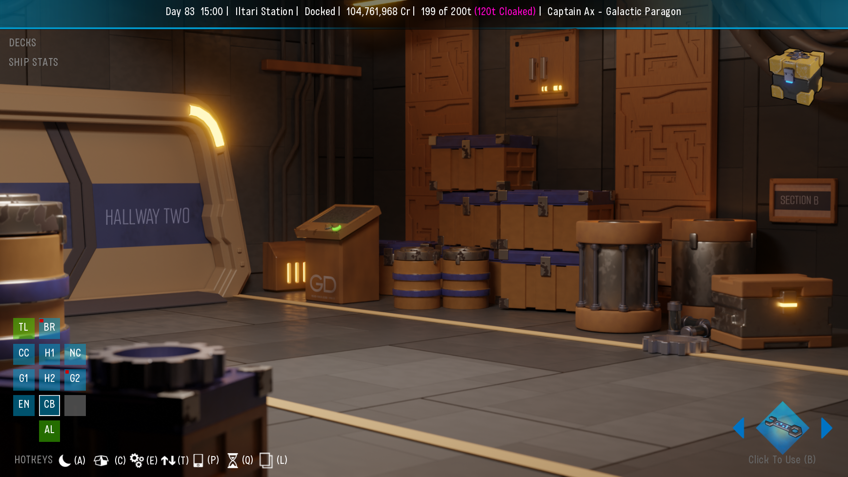
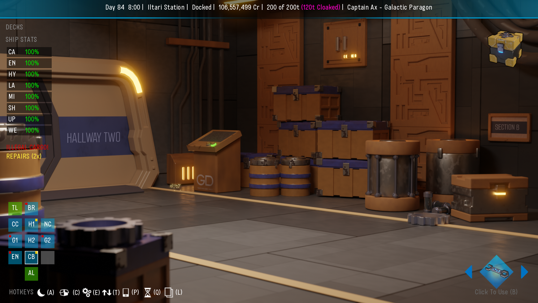
I kept tripping over the in ship mini-map .. thanks for leaving your code accessible .. i've managed to get it laid out more to my preference liking.
Again .. probably been mentioned elsewhere, but prefer to keep my comments all in the same place.
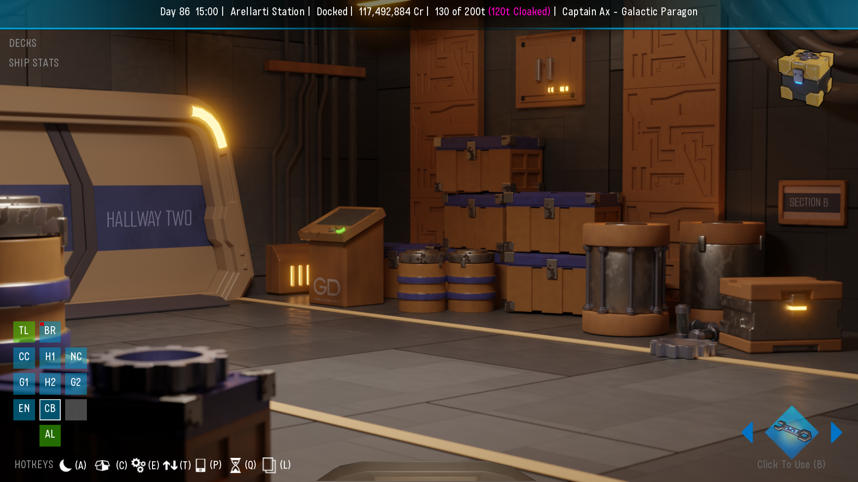
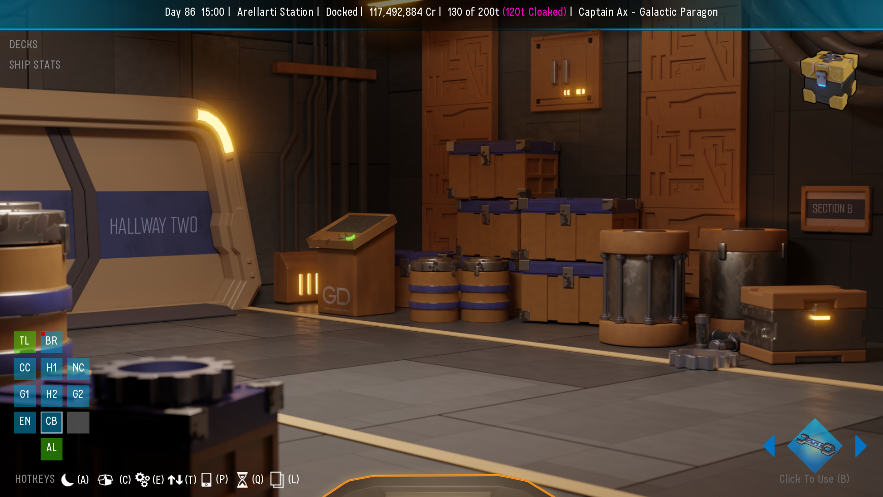
In ship navigation .. start in the engine room and there are doors you can follow through the ship, but no way to navigate backward without using one of the mini-maps .. a nav hotspot at the bottom of the screen that goes to the previous room/hallway/(accessible airlock) would be nice for consistency .. (something like an arc about the width of the quick menu, and say 3 or 4 x the font size height of it ) .. that could also make the mini-map optionally hideable. It's also faster and easier to click the big doors than the small maps, and it feels more like traversing through the ship.
.. apologies .. once the thoughts start, sometimes they're hard to stop


 .. i used the top of the Maintenance door frame ..
 with and without the quick menu ..
 no expectations obviously .. these are just to illustrate the basic idea i have/had