On Sale: GamesAssetsToolsTabletopComics
Indie game storeFree gamesFun gamesHorror games
Game developmentAssetsComics
SalesBundles
Jobs
Tags
(+1)

Most of the functionality is missing. Visually, the game looks wrong when it’s stretched to full screen and there is no way to play windowed. I know that this is a thing that happens in game maker when you scale the visuals by a non-whole number so I’m assuming it looks correct on your screen at least.

The correct strategy ends up being:

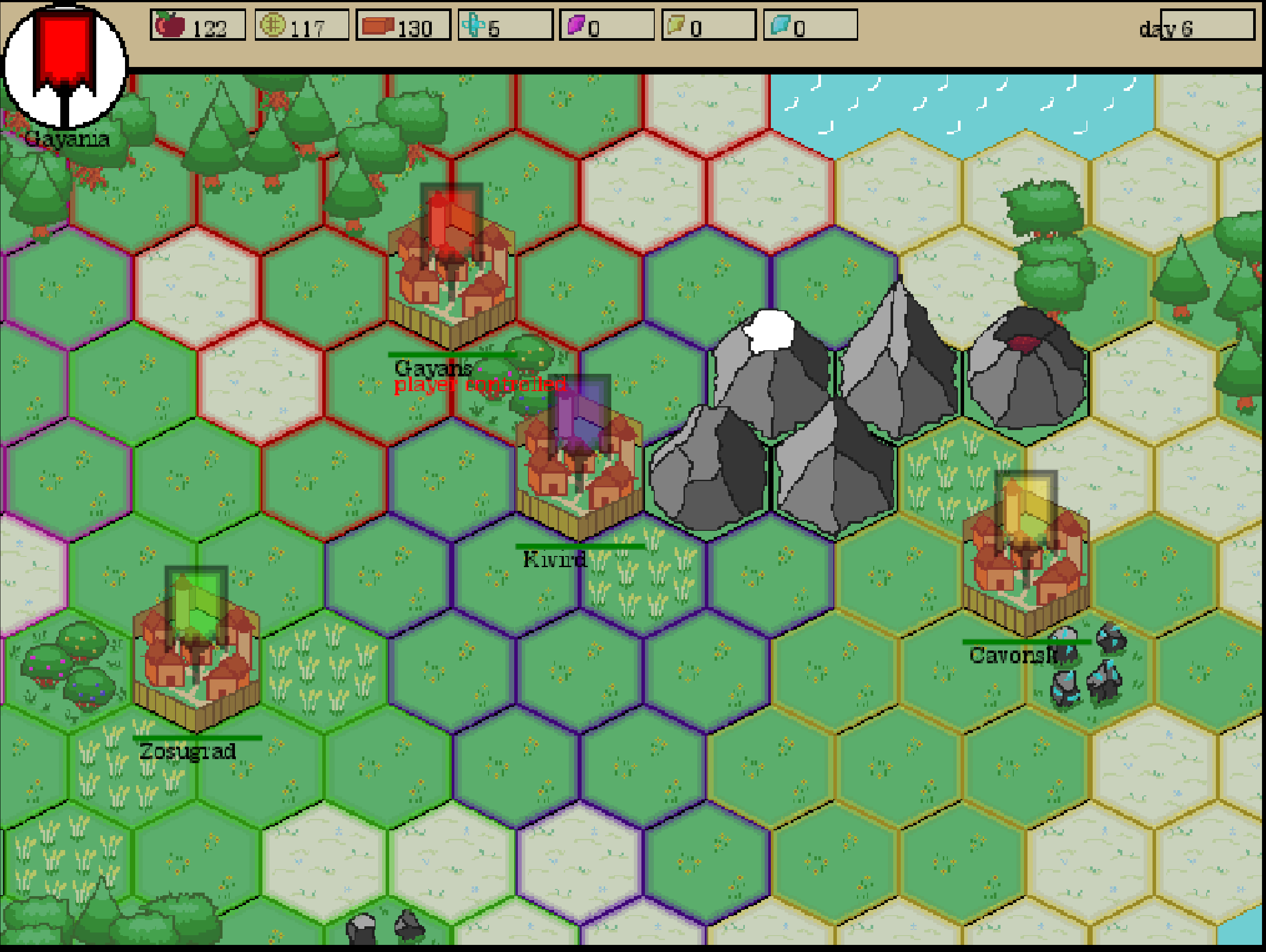
  1. Get a spawn where you aren’t too close to an enemy city. If you are close, they will usually attack and destroy you before you can create enough units.
  2. Put all your materials in material production first, you can keep doing this for as long as enemies don’t bother you. Since everything needs materials, you can easily create an army of thousands and destroy the whole map in a single sweep.

If I hadn’t played similar games before I wouldn’t have known I needed to click left click to select my units and right click to move them. Also hitting Space sends you back to the menu which is very weird.

I don’t know anything about you and what kind of developer you are so I don’t want to criticize too harshly based on a game that is clearly not finished. I would recommend preparing a game design document before starting a project so you can better see how much time you would need for each part. Personally it really helps me not lose sight of what I’m trying to achieve and prevents me from running out of motivation or getting burned out.

Thank you so much for the detailed review! It seems to me that even novice developers should be subjected to professional criticism, so I don't mind. The more flaws you point out, the better the game will be in the future. Unless, of course, the author gets depressed after reading it.
You made a good point about the winning strategy. Due to the fact that I didn't have time to implement everything I had in mind, the game looks boring. Artificial intelligence in this project is generally a stub. There are only a couple of lines of code. I spent most of my time drawing graphics. This is my first project where I tried to follow a common style and chose a single palette.
My game design document was a notebook with a couple of drawings. I really spent most of my time coming up with the game as it was being developed.
If you show a screenshot of the game where the artifacts of the image will be visible, I will be grateful. I will take this fact into account in future projects.

So for example, if you look at the “117” next to the coin on the HUD, two number “1”s next to each other look completely different even though they use the same font. I believe this is because the width and height of each pixel is being multiplied by a number that isn’t a whole number.

For example, if they were being multiplied by 1, obviously nothing would change. If they were being multiplied by 2, every pixel would correspond to 4 pixels (2 by 2). But if they are being multiplied by 1.5 or something, this causes some pixels’ width/height to be multiplied by 1 while others are multiplied by 2. Or at least, that’s what I assume is happening.

I hope I did not make you depressed. I really like the visuals and I would love to see what you end up doing with this game. And I can tell based on the things you did implement that you are capable of overcoming the problems the current version of the game has.

That's right. I understand that now. I don't want to use higher resolution graphics, but the user interface will have to be implemented in higher quality to avoid incorrect rendering. When the jam is over and I've played all the games, I'll think about solving this problem.