Play game
FoxValley at War's itch.io pageResults
| Criteria | Rank | Score* | Raw Score |
| Art/Graphics | #53 | 2.268 | 3.000 |
| Theme | #54 | 2.173 | 2.875 |
| Audio/Music | #56 | 1.795 | 2.375 |
| Overall | #58 | 1.913 | 2.531 |
| Fun/Engagement | #61 | 1.417 | 1.875 |
Ranked from 8 ratings. Score is adjusted from raw score by the median number of ratings per game in the jam.
Judge feedback
Judge feedback is anonymous.
- I was unable to figure out how to play or even do anything tbh. It didnt seem like I could interact with the game in anyway. The game is in dire need of a tutorial or better onboarding. I'm sure there's a cool game somewhere in there, but I was simply unable to play.
Did you work alone, or as part of a group? (If in a group, list their names)
I worked alone
Disclose if you used any public domain assets or not.
I used only the resources that I made myself.
Leave a comment
Log in with itch.io to leave a comment.


Comments
It's a good game with a lot of potential.
I had to wait for about 600 days so I could gather many resources, after building and sending out my men, a large number of enemies gathered and lagged the game, so much that I had to force quit.
The game quits to home screen whenever I hit spacebar while playing and the only buttons that work there are the quit and play.
I love the customization in the beginning, though.
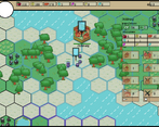
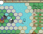
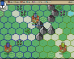
The art style gives me flash games vibes, kinda nostalgic. I couldn't really figure out what to do, seemed like a lot of the buttons didn't do anything and I couldn't look around the map but if you'd come back to this I can see it being very fun.
I really liked the level of customization that was available at the start of the game. The game itself was somewhat confusing and unpolished, but it would be nice to see this get updated in the future.
Cool and ambitious project!
I cant wait to try the updated version.
I'm a fan of these styled projects and i feel that it fits the theme too!
Small Feedback:
I also think adding your .exe to a zip would alleviate the false positive virus scans.
I am also a fan of this genre of games and I would like to see more similar projects on the site. Thanks for the feedback!
If possible, can you drop something similar?
Maybe one day i would try to make something similar ! It would certainly be a fun and cool challenge!
Most of the functionality is missing. Visually, the game looks wrong when it’s stretched to full screen and there is no way to play windowed. I know that this is a thing that happens in game maker when you scale the visuals by a non-whole number so I’m assuming it looks correct on your screen at least.
The correct strategy ends up being:
If I hadn’t played similar games before I wouldn’t have known I needed to click left click to select my units and right click to move them. Also hitting Space sends you back to the menu which is very weird.
I don’t know anything about you and what kind of developer you are so I don’t want to criticize too harshly based on a game that is clearly not finished. I would recommend preparing a game design document before starting a project so you can better see how much time you would need for each part. Personally it really helps me not lose sight of what I’m trying to achieve and prevents me from running out of motivation or getting burned out.
Thank you so much for the detailed review! It seems to me that even novice developers should be subjected to professional criticism, so I don't mind. The more flaws you point out, the better the game will be in the future. Unless, of course, the author gets depressed after reading it.
You made a good point about the winning strategy. Due to the fact that I didn't have time to implement everything I had in mind, the game looks boring. Artificial intelligence in this project is generally a stub. There are only a couple of lines of code. I spent most of my time drawing graphics. This is my first project where I tried to follow a common style and chose a single palette.
My game design document was a notebook with a couple of drawings. I really spent most of my time coming up with the game as it was being developed.
If you show a screenshot of the game where the artifacts of the image will be visible, I will be grateful. I will take this fact into account in future projects.
So for example, if you look at the “117” next to the coin on the HUD, two number “1”s next to each other look completely different even though they use the same font. I believe this is because the width and height of each pixel is being multiplied by a number that isn’t a whole number.
For example, if they were being multiplied by 1, obviously nothing would change. If they were being multiplied by 2, every pixel would correspond to 4 pixels (2 by 2). But if they are being multiplied by 1.5 or something, this causes some pixels’ width/height to be multiplied by 1 while others are multiplied by 2. Or at least, that’s what I assume is happening.
I hope I did not make you depressed. I really like the visuals and I would love to see what you end up doing with this game. And I can tell based on the things you did implement that you are capable of overcoming the problems the current version of the game has.
That's right. I understand that now. I don't want to use higher resolution graphics, but the user interface will have to be implemented in higher quality to avoid incorrect rendering. When the jam is over and I've played all the games, I'll think about solving this problem.
As a fan of games such as Catan and Civilization, this was a treat to see. Also, the artwork is very clean, simple and effective. However, the lack of any tutorial or guide (the guide button did not work for me) really hampered my experience with the game. It is very hard to understand what I was supposed to do, and how I was supposed to do it. I did eventually figure out some of it, but I was pretty much confused for the entire time I played the game. Otherwise, it is very impressive you were able to make such a mechanically deep game in such a short timeframe, and I'm sure it is a lot of fun if I had spent the time to fully understand how it works,
Thanks a lot for the feedback!
The artwork seems lovely but the way it scales in full screen makes it hard to see and read. Also, to reduce false positives when you upload projects, put them in a zip file first :). an .exe file will often get flagged by your browser or virus scanner.
Thanks for the feedback, I will take this into account in new projects!