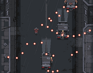
Looooove the vibe, and pretty fun! Would be cool to see some additional mechanics and maybe the balance smoothed out a bit, and maybe some additional visual indicator of where/how he's going to shoot to allow for better reactions.
actualfint
Creator of
Recent community posts
Thanks so much for playing and for the kind words!
RE: the death issue - not one I've seen yet! Do you happen to remember if it was from an enemy's attack or a blood loss tick?
EDIT: I think I figured it out - due to the timing of blood loss damage you currently actually have 1 turn to pick up blood when you get to 0 lol, which thematically is sortof fun but confusing!
Thanks a bunch for playing and thanks for the feedback - controls and usability are definitely some of the biggest pain points that are on our radar. All items that are interactable highlight with a white outline when you select the interact ability, but currently usable ones will also have a red square underneath them when you are next to them. Definitely a confusing setup that can lead to things feeling broken. Really nice idea with the weapon switching as well. Thanks again!
Thanks so much for playing! The submitted version is definitely on the harder side and needs some smoothing out around the balance. Also noticed in the video there were times you were right next to some of the healing interactions and maybe didn't notice you could use them - stove in the kitchen and medicine cabinet in the bathroom. Could use a lot of work around communicating that stuff. Thanks again for playing and the feedback!


