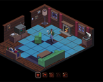
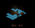
Neat game- we have rated over 70 games and this is the first turn-based game we've come across. There are lots of different mechanics, which is cool, but means that it takes a couple of goes to get in the swing of it. It would be really cool to add in some kind of measure of success- since you always die at the end, a counter for how many turns you survived or something like that could give a sense of progress. It would also be cool if the interactions were always highlighted, so the player didn't need to keep clicking to swap between moving and interacting, but that's probably just a matter of preference. Overall the game came across as pretty polished, especially the aesthetics and sound, which were very good. Nicely done :)
Play game
Cursed Night's itch.io pageResults
| Criteria | Rank | Score* | Raw Score |
| Aesthetics | #4 | 4.643 | 4.643 |
| Enjoyment (Best Game) | #15 | 3.857 | 3.857 |
| Sound Design | #16 | 3.714 | 3.714 |
| Horror | #37 | 3.286 | 3.286 |
| Story | #61 | 2.571 | 2.571 |
Ranked from 14 ratings. Score is adjusted from raw score by the median number of ratings per game in the jam.
Comments
I love tactical turn-based games like this, so I was surprised to see one in a horror game jam! Great game all around. I think the other commenters have done a good job of hashing out exactly what this game needs: a tutorial, better indicators of what to do and how to use things, etc. I picked up repair kits but couldn't figure out what to do with them. I also wasn't sure if there was a definitive ending—I played it a few times and walked around slaying monsters, but always died in time. Still, this was a lot of fun! Genuinely looking forward to seeing what else you can create.
This was actually a neat concept!
I will admit I was thrown off at first as I expected my turn to end and the enemy’s turn to start, especially when I seen action points. However, I am not going to complain that it did not work that way as I actually ended up enjoying it more without that style.
This is a really interesting concept and executed rather well. I feel like it could use a slight more polish when it comes to user interface, but otherwise this is overall a pretty solid game!
Good job!
One of the most underrated games in this jam! I really enjoyed playing it!
I really liked the concept of this game, a really well polished which is always a plus!
I had a similar problem to some of the other comments where some things were highlighted weren't usable, I figured the electric box was only truly usable after a black out, but never figured out when the windows were supposed to be used. I think a tutorial would go a huge way with this game.
Great work all told, hope you carry on working on this!
I like the art of the game and the click based actions. Monsters looked great too! Is that the electric wizzard album cover in the first room? :DDD
GG
This looks like a whole lot of work went into it. I couldn't do very much but walk around fighting... it seems like interactions were broken on some things... they were highlighted but nothing happened when I clicked them. I really think this would make a good full-length game. The major problem I have was controls were a bit annoying. I would have had clicks to interact with something be context sensitive... ie. click on a door, you go through it, click on a workbench, you use it, click on a monster, you attack it with the currently-selected weapon. You could have either right-click switch weapons or have a button on the screen that did it for you... or a number hotkey.
A really nice start to what could be a really great game!
Thanks a bunch for playing and thanks for the feedback - controls and usability are definitely some of the biggest pain points that are on our radar. All items that are interactable highlight with a white outline when you select the interact ability, but currently usable ones will also have a red square underneath them when you are next to them. Definitely a confusing setup that can lead to things feeling broken. Really nice idea with the weapon switching as well. Thanks again!
Totally agree -> the Design and Art are Great! The Gameplay is also interesting!
I like the creature design much too :-)
Thanks for sharing this game! Cool work -> RATED!
Wow! Good aesthetics with this pixelart game! Also, the sound is very good!
I've enjoyed but it's a little difficult, I must play more time :)
Hi! I’ve played your game and put the playthrough video here:
I really like the gameplay and that’s a really good work in a week!!! The game is well polished. I’m really bad at it, don’t know if it’s about the complexity or that I’m just terrible at managing my actions XD anyway I tried multiple times but always end up getting killed really quickly
Thanks so much for playing! The submitted version is definitely on the harder side and needs some smoothing out around the balance. Also noticed in the video there were times you were right next to some of the healing interactions and maybe didn't notice you could use them - stove in the kitchen and medicine cabinet in the bathroom. Could use a lot of work around communicating that stuff. Thanks again for playing and the feedback!


Leave a comment
Log in with itch.io to leave a comment.