Indie game storeFree gamesFun gamesHorror games
Game developmentAssetsComics
SalesBundles
Jobs
TagsGame Engines

Anomalous Underdog

46
Posts
44
Followers
14
Following
A member registered Apr 12, 2016 · View creator page →

Creator of

Recent community posts

So, the emission color had nothing to do with the problem at all. I found the cause of the problem here, might be worth giving a warning to people converting this to URP:

Just turn off "Enable Mesh GPU Instancing" (it's turned on in the prefab) in the Renderer module of the Particle System.


White emission color doesn't work btw, it would just change the entire thing to white, the colors won't show anymore.


I found black to be the correct emission color to use.
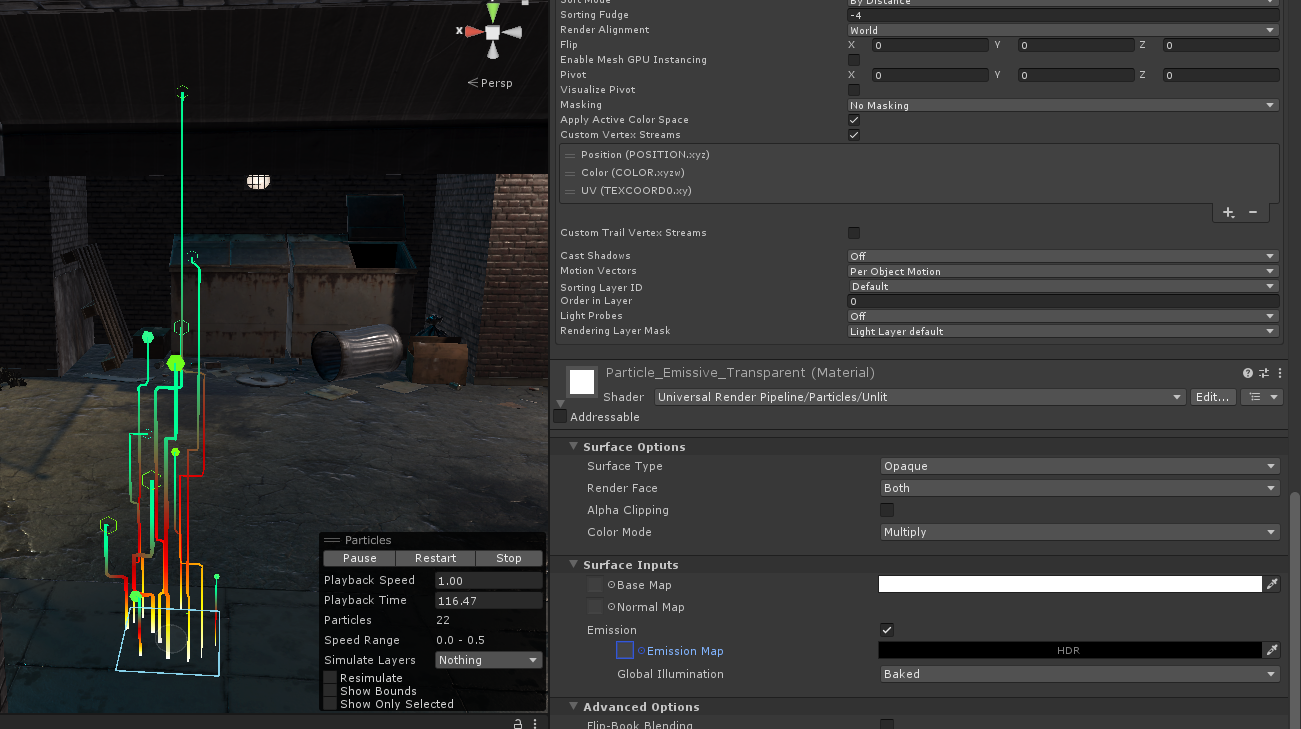

Switching to urp > particle > unlit doesn't work, it just becomes invisible. I really don't know what I'm supposed to do here.

Hi, I bought this cause the description said it's compatible with URP, but there's one custom shader "Particle_Amplify_Transparent" that's made as a surface shader and it doesn't work in URP. Switching materials that use it to use "Universal Render Pipeline/Particles/Lit" instead just makes the material invisible. Any help with this? I'd want to just recreate "Particle_Amplify_Transparent" in URP, but the code is kinda unreadable cause it turns out it's made in this plugin called Amplify Shader Editor.

My problem is I haven't finalized yet what minimum specs is needed. As I add more graphical effects, it could go higher. But if I ever get to implement some sort of toggle for a cheaper alternative (code that will turn off cloth physics simulation on characters, in which case, the cheaper bone-based animations for their clothes would take over) that could go lower.

Best way to mitigate framerate slowdown for now is to drastically reduce the screen resolution.

But if you're asking what specs I use to test the game. It's:

  1. Intel Core i7 (4th gen)
  2. 16 GB RAM DDR3
  3. GeForce GTX 970M (this is a gaming laptop)

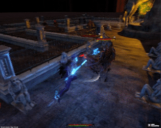
Thanks for trying it out! My reference is more on Nioh and Bloodborne instead of Dark Souls. But just like your assessment, it's not there yet.

Hammer was meant to be useful when you're surrounded because of the wide sweeping arcs, but I too, find limited use in it because I get hit before my attacks connect. I'm thinking I'll add flinch resistance to the player  for the hammer so the attack still continues when you're hit. Spear charged attack is an impale, I'll experiment with adding some forward push to help with the range.

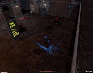
Submissions don't have a description so I'll post this here: This is a minor update since I'm wearing my artist hat right now and working on the player's 2nd armor. That means I haven't had much time coding any new features. This has improved target switching controls on gamepad, and nothing else. If you've already tested the previous Demo Day 18 build, you won't notice much different.

Thanks for playing!

  1. Right now motion blur is using version 1 of Unity's post-processing stack. Once I upgrade to version 2, it'll probably look better.
  2. It's basically the distance of a roll/evade in Dark Souls (I think), but I could tweak it in the future. I'm also thinking of making a passive upgrade to allow a quick tap on the dash button to make a short distance dash, and holding it would make a longer distance dash. But since the RPG part of the game is not implemented yet, they're just plans for now.
  3. I'm actually wondering if spear impale (and other charged attacks) would require some mana cost of some sort, or maybe it has limited times you can use it. I haven't planned that part yet.
  4. I'm not sure about the NPCs spinning around, if you can record it in video I could look into it. Though I do have a bug where they keep turning and doing their walk animation even though I programmed them to stand still.
  5. You're the second person to have mentioned DMC to me recently, I should probably get back to playing it!

For this combat prototype? I'm going to guess all the things I have planned for it will be completed by next year (take note I only work on this during weekends).

(1 edit)

Thanks! You're still seeing an early work-in-progress, so features and functionalities will normally change a lot from one release to another. I have a lot more planned for the long road ahead.

Thanks for the suggestion. I'm open to experimenting with "you automatically pass through your own spear walls" as a passive upgrade in the future.

Didn't realize this was a board game. This is obviously more fun if played with friends. Nice music, the weird dice roll is cool. I can't understand the crossing bridge minigame. Should I step elsewhere if I hear creaking sounds? Or does the creaking mean I'm in the right spot?

(2 edits)
  1. The F4 for fullscreen worked fine for me. Khryse probably didn't read through the help text at the start so he didn't know, so you might want to take impatient people into account. Usually an info dump right at the start won't work for that reason. I'd suggest an options screen when pressing ESC, with the help somewhere inside that, but I'm guessing you already have an options screen planned.
  2. The BG for the intro (the one where you get the phone call) takes too long to transition to the game proper. This is more evident if you rapidly kept skipping the text that shows up.
  3. This is the kind of game where sometimes I want to be able to play it completely by mouse, meaning classic point-and-click adventure controls where I click somewhere and my character moves there. I'm hoping you have something like that planned.
  4. Mouse doesn't seem usable during dialogue. I tried clicking on a dialogue option, but it seems click just confirms the already selected dialogue option regardless of where the mouse position is, and the only way to change it is via the W and S keys. I'm hoping mouse can be used for dialogue in the future.
  5. I had no idea my client was in the CellShock building (I don't think that was mentioned at all, even by the client during the phone call). It might help to say that, also have the main character say that when you click on him.
  6. Overall the premise of the story doesn't seem bad. The setting is ok, even though there doesn't seem to be anything that makes it stand out from similar games in the genre, a lot of thought is put into it, with the political climate being evident from the news to the gossip that people say.
  7. It's amusing the main character doesn't wear pants but I'm not going to question this fashion sense.
  8. The client should have proposed how much to pay, and what the method of payment is, before the main character agrees with investigating the case. As it is, the main character looks gullible just going ahead and saying yes.
  9. The client should probably have mentioned the general gist of what products/services his company provides.
  10. I would have wanted to talk to the client in detail and ask more questions (as dialogue options), such as:
    1. How many people in your company are working on this prototype? Who are they?
    2. Isn't this project kept secret from the rest of your employees? (this should be a yes, because if a regular janitor knew about this, they could just go ahead and steal it and sell to a rival company, unless security is tight, but having the main character easily get into the client's office, I'm guessing not)
    3. Are there people outside the company who might have known about this?  Friends/family? News reporters?
    4. Are you sure the video wasn't tampered with? Who's the head of security here?
  11. I'm curious about the energy bar. Usually, story-driven games don't need this kind of life sim game mechanic. It depletes in realtime, and getting it empty means you need to go sleep, and have to continue the investigation tomorrow. To prolong your energy you spend money to buy food to replenish your energy. So my question is, does the game really need this? Or is it just an extra hassle getting in the way of the "meat" of the game (the story, investigation, puzzle solving, etc.) If the experience for the player is the same with or without this energy mechanic, I'd say just remove it for simplicity's sake. But if it will affect the story, as in, maybe you got something planned like a calendar system for the game (and that the investigation can go wrong if the player takes too long) and maybe you need to pay rent at the end of each month (requiring you to save up on money), then I'd say that's the time this energy and money thing is worth having.
(1 edit)

Yes, right now it's intended that the game is "target-lock heavy"where you are constantly targeting enemies. I had been wondering if it's worth it giving the combat a soft-lock system (i.e. when not in target-lock, doing an attack will turn your character automatically to the nearest enemy). Definitely worth exploring later down the road.

(1 edit)

Thanks for playing!

  1. Yes, that's part of the plan. I meant it that you could easily combo switching back and forth between different weapons, but I realize I need to tweak things to make that more easy to pull off. Later on, you'll have more swords, pole-arms, and blunt weapons available, so you could mix and match what 3 weapons you have at the ready. Ideally I'd make it that each weapon has a different moveset (i.e. a Schiavona having different attack animations from a Falchion, even though they are both of the one-handed sword variety). I plan that the player could even make the 3 attack buttons assigned with only swords (of different types), or only pole-arms, or really, any mixture that fits their liking.
  2. I received similar feedback regarding dash after attack. While I'm not thinking of input queuing, I was thinking of letting the player phase dash during the recovery part of an attack animation (I had that disabled because I think it made fights too easy, but I'll experiment with it more).
  3. You can phase dash through anything that's not too thick, and it just so happened that the brick pillars were thin enough. I might just keep it that way. As long as you can easily tell where you'd end up in, I don't think it's wrong. Perhaps later on I could design stuff like secret rooms accessible by phase dashing only.
  4. Sounds good, I'll make it that the fire effects die off if the impaling spear is left intact but the impaled enemy died.
  5. Spamming LMB and it causing the player to keep repeating the first attack is not intended. I think it happens right after you dash. I'll look into it again. But to use it to discourage button mashing? It's an idea worth exploring. But I bet there will be people who won't get it and just complain that their attacks don't work.

Thanks again! Glad you had fun with it!

Thanks! I appreciate that you were persistent and didn't just give up after the first few deaths. I can see a bug there where you are canceling impale into a charged attack of a different weapon, so the enemy is breaking free prematurely and your spear is replaying the blood hit effects (it's not supposed to happen). I've added that to my todo list.

Thanks for trying it out! You can actually use the numpad for rotating the camera: numpad 8, 4, 5, 6 for camera, and 1, 2, 3 for attacks (I assigned those more for debugging), but I guess it wouldn't hurt to add IJKL too (as some people use keyboards that have no numpad).

I had been thinking about that, regarding charged attacks being too powerful. I'm hoping more variety in enemy types will offset that (a ranged attacker would easily disrupt your charging). We'll see as I implement more stuff in the future.

Thanks for trying it out! I'll look into that bug regarding mashing LMB, RMB, and 1. Was the player character unresponsive to move input forever? Or did you get to make it move after doing something else?

I'm fine with the Spear taking two attacks to finally flinch the enemy, as it's only a flinch, and enemies can recover from that easily. But the Warhammer charged attack does feel cheap and I'm wondering what to do there. Maybe the first pound attack only does a flinch, and only the 2nd and 3rd pounds finally flattens your target.

I'm not super worried about it though, as the enemies I have there right now are only the easiest type (they just run straight at you and attack as long as they still have stamina, and they only have a low amount of stamina). They don't have any gimmick or tricks up their sleeve, and their only advantage is to overwhelm you, but as long as pick them off one-by-one, it's easy (and is meant to be so).

"When the spear charge misses it plays the rest of the animation" is intentional and is meant to punish you if you make a mistake with releasing the charge at the wrong moment. The impale attack is very powerful since it makes the enemy immobile and open to attacks, so there needs to be some form of risk in using it. Although now I'm thinking if there should be controls for canceling/aborting a charge if you decided you don't want to do it anymore.

(3 edits)

Thanks! Missing your attacks may mean you're simply too far away upon pressing the attack button, or it could be a bug. If you could make a video recording, I could look into it.

Also, attacking without targeting the enemy can be difficult but still possible. If you want to concentrate on one enemy though, it's better to target them.

You could also try the top-view camera if you're having a hard time judging distances (press C to switch camera styles).


Stamina management is a big part of combat, so don't go crazy attacking too much since it will deplete your stamina quickly. Stamina is there to prevent any character from just attacking indefinitely (i.e. infinite combo).

Lag after dashing is intended. But to eliminate the lag, you can cancel the recovery part of the dash into an attack (provided you have enough stamina) if you time the attack button press properly. You can also chain multiple dashes together if you time the button press right.

I may increase his max stamina though, to compensate for all the new attacks I gave him. I'll see how it goes.

Thanks for the feedback!

  1. The rapier's attacks indeed doesn't reach an enemy that's sort of in a crouching position, I was thinking of making your character lean downwards in those situations so the rapier can hit, but that's not at the top of my things to do right now.
  2. The part about you not being able to move too long after getting hit is a bug. You certainly are supposed to be able to reasonably  dodge away after getting hit the first time, so you don't get combo'd. I've fixed it in my current build, and now it ignores movement input only for a short span of time when you get hit (I'm still tweaking how long it should be).
  3. I haven't really planned for anything regarding poise/flinch resistance, and I'm only wondering about it now how to go about it. For one, the purple armor type the player currently has should not have much flinch resistance, if at all, as he's the speedy type in contrast to the 2nd armor type I'll be making later on: a brutish offensive kind which I'll certainly give a lot of flinch resistance/poise.
  4. I think I'll also experiment with making the spear not instantly break enemy poise.
  5. The AI right now is very simple/dumb. They're easy to kill, and their only threat is if they attack you in groups, and even then they don't coordinate. Generally, for these one-eyed enemies, I think I'll keep them that way. In the lore, they are just mindless golem-like creatures created out of scrappy wood and cloth. Right now I'm implementing more of the player's abilities, then I'll work on the AI again after. Perhaps a new enemy type later on.

Totally fine! It's normal that not everyone will like a game. You have to keep watch your stamina bar (yellow bar at the bottom of the screen) because attacks consume stamina. Deplete that and you'll have to wait until it fills up enough. Dashing also consumes stamina.

However the part about not being able to move even though your character has already finished playing their hurt animation is a bug, and I've been trying to fix that for a long time.

Thanks for trying it out! I will fix the input detection for attacks (I only found this out recently because I always used a gamepad for testing). Obviously you're not supposed to be able to charge two weapons at once, I will fix that.

But I won't change the dash. Unless I'm misunderstanding your statements, the timings are as I intended. The player should only commit to making an attack when they think it is the right moment, because there is either a long buildup at the start or long follow-through at the end, or a bit of both, so they can get punished if they misjudge their distance to the enemy or the timing of when to press the attack button.

>Can't use the warhammer with my apple magic mouse

The game is really meant to be played with a controller, but as a last resort, you can use the numpad: 1, 2, 3 in the numpad corresponds to the attacks, so 3 is the warhammer.

>It takes a fucking long time to kill the dudes with the rapier

You might have been fighting the one nearest you, I buffed the health on that one because I use it as a practice dummy. That said, I'll look into tweaking the damage values. This is the first time all 3 weapons have been implemented so I need to look over all the player's attacks again.

The walk animation looks like he's hobbling, is that intended? I'm ok with the controls and movement speed, being familiar with Dead Space and RE4. The reload thing with the bar, it seems I could quicken it with the right timing of a button press, but I couldn't figure out which button to use for that.

I definitely think enemies should go down with lesser amount of bullets, especially if you aimed at the head, or some weak spot. That would be better especially since you already have an aiming system.

That part about not being able to move when swarmed, was it because you keep getting hit before you had a chance to move? It's something I'm trying to tweak a lot. I wasn't able to completely fix it by the time Demo Day came up, but I will continue to work on it.

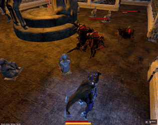
I hear you. There'll be more defensive options later on as I implement them: parrying with the rapier, summoning a wall of spears that come out of the ground (I'm thinking there's options for shaping the spear wall as a circle so you can trap enemies inside, and not just as a line), impaling enemies to keep them immobile, etc.

But he's not gonna have a shield because it just doesn't fit his style.

Thanks! I was thinking about the stamina too, and I was actually wondering if it's better to move the player's health and stamina bars to the bottom of the screen (below where the player is), it's in my todo list, so I'll be experimenting on that. I was also thinking of making the stamina bar glow when you're almost empty, and have the glow brighter the more you get closer to empty.


About the meatiness, I'm hoping that once I add sounds, that would help, although I will not be worrying about sounds for now, while I implement other things.

@Norberto: Yeah I'll definitely do something about the respawn. Dash certainly will allow you to go through walls, but yes, you're not supposed to attack enemies through walls, I haven't added the code for that yet (and probably not for some time while I work on other features first). Will look into about that bug with the attack input on the rapier you mentioned, thanks!

@crabowitz: Yeah, there's a delay between dashes. He's not all the way powerful because he's suffering from a terminal illness. But perhaps an upgrade to the dash that you can unlock later on, I'm ok with adding such a thing.

About the weapon combos, yeah, there's not much differentiating rapier and spear right now. Rapier is supposed to allow you to parry incoming attacks, while spear will allow you to impale enemies, but I haven't implemented those yet.

I'm now planning on removing the rapier's ability to hit stun the enemy and lower its attack damage since right now it's too useful (it's just as good as spear in terms of dps and yet it's faster and keeps the enemy in hit stun for longer).

@Sinoc: The "life sim" part doesn't have any plans at this point, other than that I'm aiming it to be like in Persona where you do activities per day, have responsibilities to attend to, etc. but instead of being a high-school student, you're a guy in his mid 20's working on a job.

@Rokas: Will work on that, thanks for the feedback!

@AttaBoy: No worries. Later on I plan to add a "Toaster Mode", which would disable everything in the graphics that isn't critical.

@boxes: Thanks for the feedback!

>weapons mapped to separate buttons

This is intentional. Once I add the third weapon, plus some other ideas that I'll do, I'm hoping combat will become more interesting.

>recovery phases on attack and dodge animations are bit too lengthy

It was actually faster before, which made the whole thing too easy. I increased the recovery on the spear, because the spear really is supposed to be slow, but maybe I went too far. I'll try to find a sweet spot.

Effectively, the rapier is your light attack, then the spear and warhammer (3rd weapon that isn't there yet) are your heavy attacks.

>Took me a while to figure out how that stamina bar works

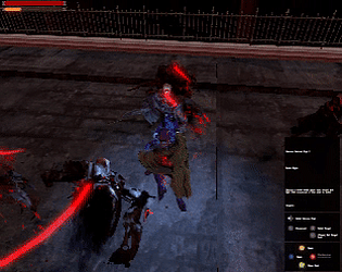
I was supposed to make your character heat up visibly as the bar goes higher. It's representing the excess heat and overexertion in your armor, but I haven't taken the time to do that yet.

I probably should just make the HUD bar a standard bar that goes downwards instead.

  1. Thought this was medieval fantasy, judging from the cover image.
  2. Although I'm not into this genre that much, the story was interesting enough to hold my interest until the end of the demo.
  3. The white text can get hard to read. This game has lots of snow, right? Maybe decrease the transparency of the text background so text is more readable.
  4. I find it a little weird that conversations take place in what looks like the pages of a book. I would have been fine with the usual visual novel style of conversations.

@IdiocyOverdose: noted. will get to that when I get the time

1. Clicking on "Spell/Item" button during combat doesn't work.

2. Music sometimes begins to overlap when I go to different screens.

3. Going to main screen ends up registering a click on the first inventory item. Going back accidentally clicks the investigate button.

4. I almost always lose in the dice roll in combat so I keep getting hit. Don't know if that's intended.

5. It's tedious to heal (go back home, go to additional actions screen, click rest at home, and for some reason, you automatically leave home, so you have to go back home again to repeat). Hospital treatment doesn't work yet.

6. Maybe I simply remembered wrong but I was pretty sure my mystery was the found footage one, but the resolution I got was about the mansion.

7. It's weird that the sound for resolving any event is also the sound for getting damaged.

Had fun with it though. I'm fine with the UI layout being convoluted. It reminds me of old DOS games that needed manuals.

I was thinking, if you want to ease the difficulty curve more, give the player a gun that shoots in bursts of 3 (like what the enemies currently have), and then have the enemies shoot only one bullet at a time in the first few rooms. After that, the player gets the machine gun (what the demo gives you), then you can put in the regular enemies.

All in all, had a good time. Looking forward to the updates.

Don't know wtf was going on in the story, but I don't think it really matters. Gave me a Cave Story vibe.

I get the feeling the combat is a cross between a side-view shooter and platformer, which is cool. I love space shooters. I think this is a good mix between the two. In that regard, I think the jetpack having no gravity is fine.

Noticed the sword enemies have a rhythm to their attacks, which is key to defeating them. Maybe some sort of obvious telegraph when they're about to attack to help players with the timing? Maybe the sword shines/twinkles right before the attack, or some sound effect.

Noted! Didn't think it mattered much, so I keep forgetting to add something like that. The seams in your armor should actually be emitting some fire too, including the feet. I'll get to that when I have the time.