Hi, thanks for playing!!
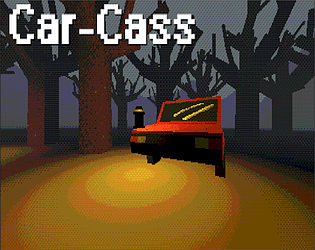
I'm glad you liked the style I was going for, it's the first time I've attempted this kind of PS1 style visuals. Definitely a learning curve, but it's nice to see that it paid off! The concept of the car repair was inspired by the fact that I've been working on cars a lot here recently as a sort of hobby, and the car themed monster was an idea I've had for a while now, I thought I'd just combine the two and see where that would go.
I agree with you whole heartedly about the monster though. It was my first time creating an AI, and I wanted to try to make it as unique as I could. I've gotten some wonderful suggestions on how to improve it, and hopefully in a future update it'll be a little harder than just running diagonally lol. I feel as though if I make him a little more expressive he might be a bit more intimidating as well.
I'll keep the visibility of the monster in mind, the original plan was for the game to take place in a warehouse of sorts, however a spur of the moment decision led me to just making it a forest, which is why the lighting is kind of lackluster and almost an after thought.
As for the engine noise, I'm genuinely surprised you encountered it. This was also my first time using Godot's sound system, and with how I had my scenes set up, I couldn't get the audio to work at all, which is why he makes no sound normally. The loud engine sound is a remnant of that, and doesn't trigger properly at all.
As for the houses, yeah they aren't the best. I really wanted them all to act as a unique puzzle, but due to time constraints I had to leave them pretty bland. Because the houses were so small, I decided not to allow the monster to go in them because it would be an instant death if he could. This is something I would really like to fix now that you've mentioned it!
Thank you so much for leaving a comment, it really means a lot! Hopefully in a future update I'll fix a lot of these problems!


