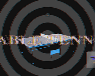
To be honest, I was quite disappointed with the UI, and struggled to understand why nothing is happening, when I click those buttons. I guess you can improve on the UI and add better graphics to support the main concept; liked the idea, though. I appreciate your efforts. Nice job!
#calcifer_3118
Creator of
Recent community posts
The perfect use of the theme; great humour added to the game; really enjoyed saving Calamus from those crabs. The gameplay was excellent. As a suggestion, add more animations to the crab or make those animations dynamic (ragdoll), because right now it plays the same animation no matter how it gets hit by the ball.
ps: Calamus should stop messing with those crabs!, coz I can't save it for more than 2 minutes, LMAO!!!
It's a nice game, I like the overall concept. It could be made damn addictive and enjoyable, if there was a way, I could loose; maybe If I press the wrong key for 3 or 5 times or maybe if I hit an obstacle or something like that. Also I felt, there is a need to add more fun elements to the game and improve a little on the art--especially the land-- the charcter, though looks great. I didn't understand why those yellow circles were there, Initially I thought they were points I had to collect, but if so, there is no animation nor any highscore system, so that should be clear.
I truly appreciate your efforts. Nice work!!!
Nobody can even think of such a game. The moment I saw that DVD logo, I just recalled my old summer days, so yeah! 5/5 on creativity, Although it wasn't clear what to do initially, it was when I read the description then I understood, so maybe a how to play UI can be added to the main menu.
As a suggestion, you can also add images of some old comic books or posters in the background instead of the black screen to give it a good old-summer feel.
Definitely, one of my favourite games so far!!!
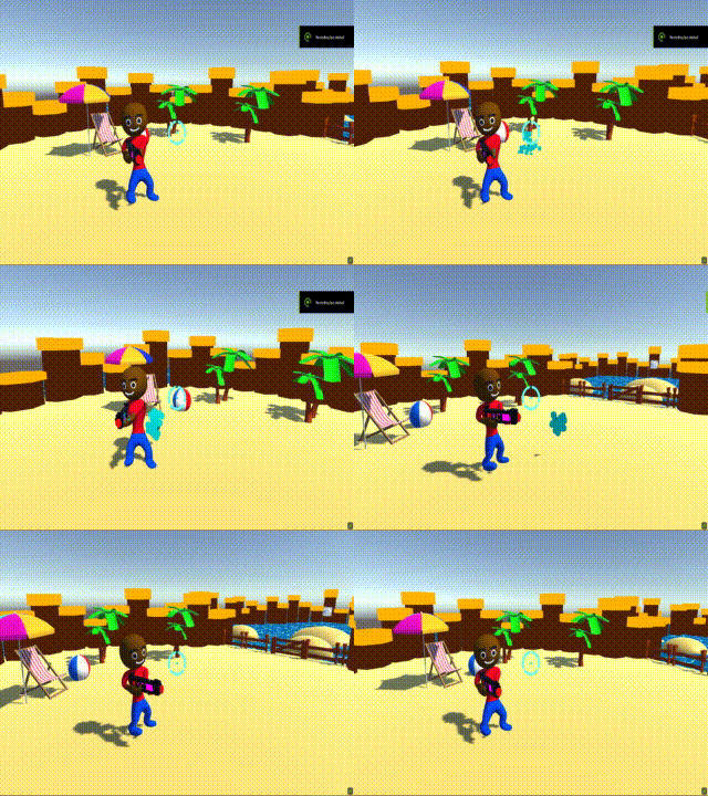
The charcaters are cool and the map is good. The loading animation is great, but the rest of the UI needs some work. The main objective of the game is not clear, but it can be a starting point for a future project. There is a bug though, the gun sprays in the direction of the camera, so when I'm not aiming and look towards the player, it sprays like this:
I like the game. The idea is quite unique and with some more wotk it can be turned into an interesting casual game. But it could be more challenging, maybe by adding some enemy system (like crocodiles or anything) and a global highscore system. Also it would be a lot better if the camera chased the player, because sometimes the people are really far back. Apart from that it's a really interesting concept.
The character itself is very cute, the animations are superb! and the world looks nice. One thing I like about the world is that all the trees, grass and other objects are dynamically instantiated--which optimizes the game a lot.
One small bug: there's a gap between the hills
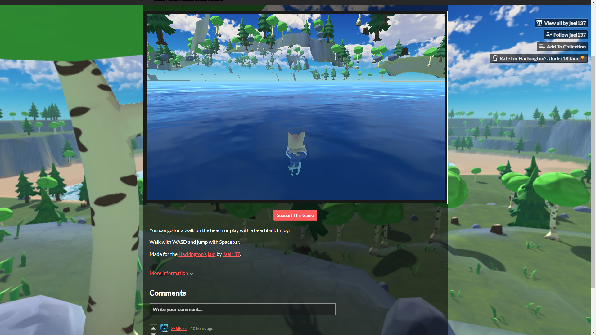
As a suggestion, I would say, it would be really better if I could look around through the mouse. I think it's a great starting point for a future game...
A nice and cool beach game!!!
The gameplay is smooth, the water in background and the shadows, give a real touch.
In my opinion , the UI could be better and it would be even more interesting if you made it in 2d or if you allowed the player to change the camera perspective, because it was little difficult for me to play in this perspective. And also as everyone already commented, a AI system would be really great...
Overall a nice casual two player game!!!
Now this is a really cool game!!!
I mean the initial cutscene, fabulous, just like old summer comics, really smooth!!! The movement is great. The art is highly appreciable.
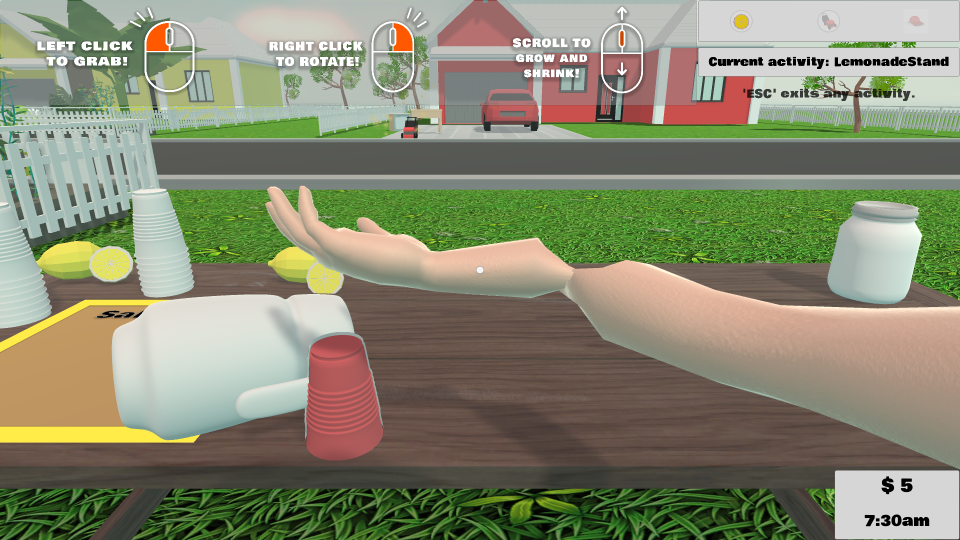
But the IK system could have been better, specially if it is the core mechanics of the first task and the difficulty should be little less in my opinion. Also the colliders were missing between hands and the jug:
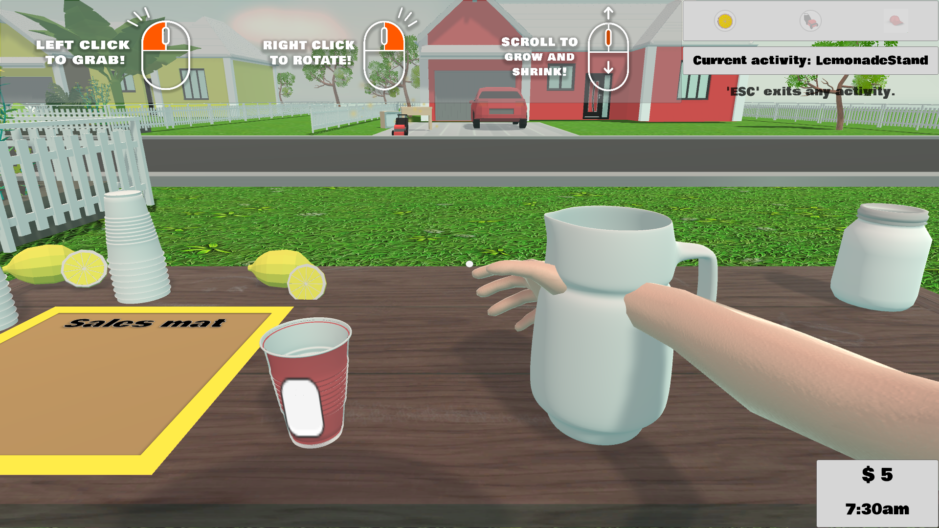
But overall a really nice and fun game with a lot of potential. I highly appreciate your efforts!!!
Thanks buddy, even I was amazed with this mediapipe model and I thought we can do something cool with it, so yeah!!!
And yes it is challangeing, maybe because we are not used to this new input system, but ya we'll get used to it very soon and beat that AI🤣
So initially I thought of having a beach house where you're on a vacation playing table tennis, but I couldn't finish that on time and also it was quite heavy for browser, so I decided to move ahead with this...
Anyways, Thanks for your valuable feedback!!!
Hey, I just saw my game is disqualified. But I didn't violate any rules, what could possibly be the reason for this?
My submission : Table Tennis https://itch.io/jam/hackingtons-under18-summer2022/rate/1648457
Please help me with this,
Thanks for your response!!!


