
Indie game storeFree gamesFun gamesHorror games
Game developmentAssetsComics
SalesBundles
Jobs
TagsGame Engines

cannice

212
Posts
12
Followers
12
Following
A member registered Apr 11, 2023 · View creator page →

Creator of

Recent community posts

(1 edit)

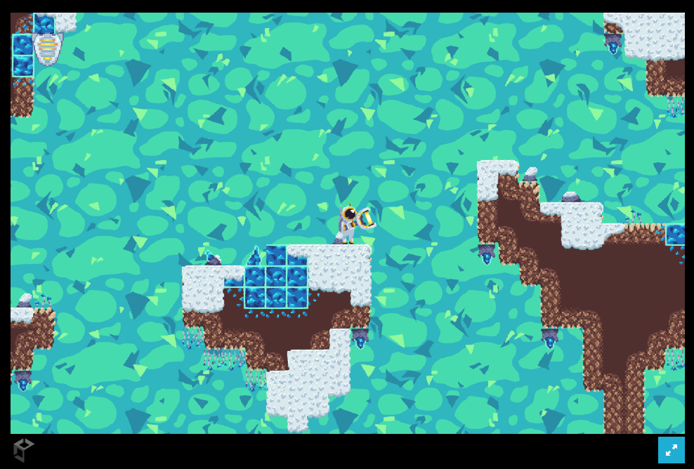
Thank you for your feedback! I'll let my colleague speak to your controls feedback (I think I'd like the schema you suggested, actually), but I wanted to give credit for the platypus idea to my spouse (not in the jam technically, but helping from the sidelines). I was trying to think of a protagonist for a bioluminescent cave environment, and he happened to know platypuses can actually glow under UV light. Also, I personally like to think (though this is not canon) that his fast fall is due to his juicy platypus booty. But I digress.

Thanks for playing, glad you enjoyed! <3

Oh thank you for your reply! I definitely did not realize the wall jump was a thing, and you're right - it was a breeze after that. I went back and succeeded in finding my spaceship. I'm blasting off agaaaaain

Alrighty so here are a couple more notes from my journey!

  • I experienced a graphical error where sometimes gridlines would flash over the terrain. 
  • I also experienced a bug (?) where if I had one health left and pressed P to open the menu, I was teleported to the tree. 
  • The tree looked pretty unique and was a nice addition to the environment, but I would suggest adjusting it a tad to better reflect where colliders are. Most of the collision surfaces were lined with the green foliage, and since its bright green highlight is the lightest part of the sprite, that's where I expected colliders. However there were some areas that had foliage but no collider, so I kept accidentally falling off the tree. I didn't have this collider issue anywhere else in the game, though, everything else felt really clear. 
  • One other note on the tree - I might be misremembering, but did it grow convenient extra branches to get up to the spaceship at some point? Without a map, I really struggled and almost gave up trying to find the spaceship. It was only because of the Pause > Teleport to tree issue that I even came back to the tree and happened to notice that additional path. If it does indeed get added at some point to unlock that path to the ship, it might be better to have it there initially but blocked somehow, so that the player notes that it's a path to revisit later. 
  • I thought it worked really well how you changed the environment when the fire for that zone was lit. I totally see what you mean now about the mud. It definitely feels different to the ice. I wished there was a bit more of a change in the map rather than just the visual / terrain swaps (like additional paths that open, previously iced up), but even so I think the zone's visual shift was a really smart way to indicate which zones you had "finished" and which zones still had a nearby fire to find and light. 

Despite a few bumps along the way, I still really enjoyed playing this one start to finish! It was so exciting each time I managed to find a fire and ultimately finding the ship. Solid little game, and I would love to see some updates!

This was a very (unfortunately) accurate parody of the state of working for large corporations today. The tedium and ridiculousness of the formulaic and unhelpful online chat interactions made me exasperated in the best way - you really nailed it, haha. 

Needless to say, I loved your concept, and I was impressed with all the written content your game included. Usually I don't like reading a lot in games, but the way you did it made me want to keep reading to see what ridiculous corporate-speak thing would happen next. 

The main issue I had was sometimes not being able to engage with something I needed to, like using the computer, talking to the robot in Terminations, or picking up a keycard. It seemed like the hitbox for these things was a bit finicky, so if I wasn't far enough away or approaching from the correct angle, I couldn't get the little "hand" interaction cursor to click on these. I still persevered and was able to finish the game, so it wasn't too bad. 

Although the map was a bit difficult to navigate because everything looked the same, and you could probably find some points of interest to help orient players better, I wouldn't completely change it. I think the grey, barren, unremarkable and repetitive nature of the environment perfectly suits the story you're trying to tell. It is a sad soulless building owned by a sad soulless corporation. Nobody is decorating their cubicles. Everybody has been declared a cost center and terminated. Truly a scary scenario!

I can't promise I'd commit to 37 more floors lol, but I would definitely come back and play more if I saw an update here. Really love where you're going with this one. Great job!

Awesome entry. One of the games I spent the most time on while rating. I love a good golf game, and being a sentient golf ball bug is just 15/10 delightful. I have basically no notes that aren't glowing compliments. The only thing I encountered the entire time that seemed buggy was when I'd broken one of the unstable rock ground areas (over the spiky pit), after falling in the spikes and being respawned, I was sitting where the rocks previously had been, just floating as if they were still there. Other than that, though: 

  • Loved your tutorial character who popped up throughout the map
  • The zoom in/out felt like an extremely good implementation of a mini-map feature, so well integrated and like zero friction to access, loved it. 
  • Colour palette, sprites, grass tileset, and little grass particle effect and beetle trail effect all felt so polished. 
  • There was generally great user feedback for things like collecting strawberries, using abilities, and so on.

Occasionally I found I moved too fast and my cursor hit the extents of my screen before I'd fully wound up my shot, but I think that's something that is probably pretty hard to avoid, because I've experienced it in most golf games I've played. Overall, really amazing work, and one of my highest rated games. 

Hey there! I really wanted to get on board with this, because the pixel art (minus black background squares) looks great, and I think you created a really nice world in terms of the cohesion of the visuals with the sound effects and music. Unfortunately I found the player movement really tough to wrap my head around. It took a while to realize I could actually walk at a reasonable pace, but it seemed I had to do multiple steps to achieve that:

  • Pressing nothing else, just IJKL to face the right direction first
  • Hold the corresponding WASD key that matches the direction I chose to face to start moving
  • Hold the corresponding IJKL direction again to actually move at a decent speed

Was this the intended flow? If so, a rethink here would probably be best, because it is just a lot of steps for movement, which is a pretty big barrier to gameplay. I can understand in a hunting game why you would want the option to be able to "creep" slowly to not alert prey, but most of the animals didn't seem to react to me anyway when I got close to them, so it felt like a slow movement wasn't really necessary - especially with how fast the enemy sheep (?) in the first field runs you down. Not being able to change direction quickly and get up to speed there felt kind of game breaking. 

Unfortunately I just found it too tedious to traverse the map so slowly and I didn't get out of the first zone. I would love to see some improvement on the controls / movement so I felt a bit more motivated to come back and explore more of the map! Definitely wanted to go take a look at some of those points of interest I could see but not access. For one thing, it would be really great to be able to change your direction while moving instead of having to come to a full stop. That in itself would be a huge quality of life upgrade! If I've not moved as intended and you wanna give me some pointers, I'd totally come back and give it another try. Good effort on this entry nonetheless!

I think this is a great entry, especially for not having a lot of time, like you said. I had a few issues along the way: 

  • The first few platforming challenges felt pretty tough for early game - I found myself back at the first checkpoint many times because of the portion just after the first "up and over" rope bit where you have to quickly jump off a moving ramp, having gotten enough momentum and also avoiding floating obstacles. 
  • I found the ropes a bit frustrating, maybe mostly because I had to do the first section so many times. I kept trying to speedrun from the first checkpoint to get back to the ramp I described above, but every time I'd jump and wind up just stuck slowly sliding down the rope. It would have been nice if you could, while sliding, use the directional keys to nudge yourself into the center of the rope to enter climbing mode rather than sliding mode. If there was a way to do this, I didn't figure it out. 
  • With one of the platforms that moves you quickly upward, it took off before I jumped on it, and then I had to R to start again from the last checkpoint. I think I got too close to its side and touched it, instead of jumping right on top, and then set it off. 

Literally everything else about this was awesome. The sprites were great, the VFX implementations were super cool, and the music and graphics came together really well to create a really immersive experience. It felt like playing a retro game in an arcade that had a futuristic/post-apocalyptic theme. Loved the in-game tutorial overlays, the rails were great, enemies were cool. I especially liked the subtle parallax and how well the background assets worked - they had just enough detail to add interest without overtaking the player's focus. Overall such a cool and cohesive game. Awesome work!

Hey there! I think you have a lot of potential here to expand upon! As the game stands currently, unfortunately I had a frustrating time, as much as I wanted to have fun with the grappling! Here are a few things that stood out for me:

  • For me, the green stripey background competed with the player and terrain. When I was flying around with a lot of momentum, the effect produced by zooming past the stripes quickly was a bit ouchy to look at, so something more subtle might be a better choice. That said, I liked the player character and terrain tileset you chose!
  • It feels like you achieved the type of movement you were going for with the grapple, but I think there needs to be some kind of UI system on the edges of the camera view or something that helps you to identify in which directions there are surfaces you can grapple to, and maybe how close they are. As it stands, movement felt a bit frustrating to me, because I had to sort of test in directions where I couldn't see walls, and then when they were really far away I'd zoom away super far and fast without meaning to. At one point this resulted in me being flung out of the play area at a sickening speed and into a void of blackness lol. I wanted to spend more time exploring, but even when I got more of a handle on the grapple, I found it really hard to figure out how to go in a specific direction or how to get up onto the top of ledges / platforms.
  • I never found any of the mentioned energy I was supposed to be collecting - maybe I misinterpreted what that means, or just couldn't progress in the map as intended. 

I think this idea definitely has legs, and just needs some more development so the player has a bit better sense of control over their movement through the map. Great effort!

Firstly, gotta give a shout-out to the poop emoji terrain blocks, 15/10 environment accent. 

I've seen a few UI-themed platformers out there, but this is one of the coolest implementations I've seen of this idea. I played with an xbox controller and it felt really intuitive to play. Here are a few of the notes I wrote while playing:

  • In-game tutorial notes seemed clear and well-placed, but didn't detect I was playing with game pad, so they unfortunately didn't help me too much. Definitely would have appreciated them otherwise!
  • I probably didn't "think" enough, but I didn't find much of a use for the player-created teleport folders, even though that was a pretty cool mechanic. If there was an intended use for them other than just a way to get back to somewhere you were before faster, it would be great to see the map tutorialize an example use case. 
  • Movement felt good, and I liked the anti-gravity paths you included. The map also felt nicely laid out to encourage me to retrace my steps to find new paths I could take once I unlocked the double jump. I didn't find any other power-ups though. I did play to the end of the timer, only made it to the green area with the water.
  • I liked the way notes opened - how they'd appear and fade away as you moved. That said, in reading the notes, I did feel pretty lost trying to string together all the content and understand what the lore of the game was. There were a lot of thought-provoking notes and points of interest, but even with the exposition at the beginning, I couldn't quite tell what was going on story-wise. There were also some prompts that confused me, like something about figuring out a password, but then there didn't seem to be any progression-blocking things around related to entering a password.
  • I LOVED your attack implementation. It made great use of the click and drag selection ability of the cursor player character. Really, really cool, and I had a lot of fun with it. 
  • I didn't experience anything that felt buggy - everything seemed to work as intended and everything felt fair from a gameplay perspective, if sometimes confusing. One example where I felt a bit confused was why there were a bunch of one-off sprites used to teleport, like apples and a cat. Were these images somehow tied to the story, or were they just unique to help you remember certain paths? In any case, the sprites themselves were beautifully done!
  • Music in the first area seemed to use a really short loop. It was quite jarring unfortunately, and while that did fit the vibe of a timer-based game, I ended up having to mute the Chrome tab because it felt too stressful and distracting. I didn't realize until I got to the green area and unmuted that you had different music in different areas, so I am really just commenting on the loop for the first area here. 

Overall I really enjoyed playing your entry! Even though I didn't understand what the story was, and ultimately I got "USER shall not pass" (LOL), I had a lot of fun playing (probably one of the games I've spent the most time on so far), and I really enjoyed the wackiness of it all. Great work!

From the small portion of the game I did get to experience, here are my thoughts: 

  • I really liked your tile map terrain textures. The snow, icy blocks, and dirt visually look great. One gameplay thing I noticed though, is that no matter what texture I was standing on, everything felt like ice, very slippy. I would have expected that movement while on ice tiles, but it was on everything, so that felt a bit off. 
  • The movement and jump otherwise generally felt nice and responsive, but as noted in my first post, it felt like the jump's vertical and horizontal limits were too low for some of the jump challenges in your level. 
  • I really like the design and animations for your player character, really nice work there. Unfortunately I did find it a bit odd that it always faces the cursor location, even when you're just running around. It broke my immersion a bit when I was just trying to explore to the right, but my cursor was slightly left of center, so he'd run backwards. I wonder whether you could override that cursor focus temporarily while you have no new cursor movement, and then only make him face the cursor when new movement is detected? 
  • The enemies were cute but I barely had to fight them, because they'd notice me and yeet themselves off the edge of their platforms before I even got close to them. This was actually super funny, but probably not the intended way to move forward lol. When I was fast enough to get to them before they jumped, I wished there was a bit more feedback when I hit them with the weapon, like a sound or more of an effect. 
  • Loved the vibrant colours of your background, though it did feel a bit busy, like it took a bit too much focus away from tracking your player. Something as simple as adding a gaussian blur so that the edges of the background texture's shapes are less defined could help a lot to offer a bit more depth and separation from the player and collision layers, while still keeping your vibrant vibes intact.

Hope to hear back from you on that jump so that I can play a bit more of this one! :)

Hey! I want to see more of this game, but I simply cannot get across this gap, no matter what I try. It seems like the jump always falls short, even if I try to get a bit of speed up. I'd love to know what the secret is that I'm missing? 

Let me begin by describing the point in this game that broke my spirit (lol): 

  • Riding a platform on a horizontal track that moves to the left through a narrow corridor
  • Thorns/spikes line the ceiling and floor
  • Little zappy electricitybois float within the corridor, requiring you to jump over them and resume platform riding

I tried this segment so many times and once or twice I made it through, but with so little health left that I almost immediately died afterward and got zoomed back to the lamp post to try again. I found it really difficult with the keyboard controls and quick jump to ever land back on the platform after trying to jump over the buzzybois. So unfortunately, this was the end of the road for me! To be transparent, I am a mostly cozy/survival-craft gamer lurking in a metroidvania jam, mainly here to contribute art, so take from my experience what you will. 

I am sure there is a ton more game to see, but from what I did see, I was really impressed with the visuals in this game. It is clear how much expertise and care were put into everything from the character animations to the little lamp posts to the imaginative sprawling backdrops. I totally appreciated the parallax and the sense of depth it provides; if I had one critique for it, though, it would be that because there is so much detail and colour in the background, visually I sometimes had a hard time tracking the grey player character. It might be helpful for him to have higher contrast relative to the backdrop.

As mentioned above, I really struggled with precision when trying to land jumps onto small platforms - the controls felt responsive, but I also felt like they were so responsive that I often overshot small platforms I was trying to jump to. I also wished the attack felt a bit more snappy - the animation is awesome, but the attack itself felt a bit slow and I often just tried to avoid enemies instead of engaging them. 

Overall, great visuals, great sound, and I also really loved the exposition and the sort of "guide" character you meet and follow. It gives a great sense of purpose for moving forward and feeing curious to learn more about the story. Nice work!

Such vibes! I really loved the Hollow Knight / Gris feel to your main character's flowy design. Unfortunately I encountered an issue in which, when the game launches, there is no music or sound. I can't reproduce it today, but when I played a few days ago, when I eventually got back to the title screen (I can't recall now whether I finished everything or just died), the music and sound actually kicked in, and it was great. I just wish I'd had it on my first playthrough. With the dark palette, painterly background, and music, this game has a great feel. 

Generally I found movement felt good; the only issue I had was with the wall jump. It felt like some of the gaps were too wide, or maybe I just wasn't using it correctly. Visually, your chosen colours had great, readable contrast and in combination with your UI, I found it easy to determine what to collect and what to avoid. I would love to see how this game develops visually given more time to make unique assets for the abilities and such, because the backgrounds and character art are awesome. 

I did wish for a bit of story about your character to help me feel more connected to their quest, but as I said above, it still felt pretty clear what I should be doing, even if I didn't know what the motivation was. 

Great work, will watch for updates :)

Hey, really cute entry :D I really like your concept, and I adore the animations you did for your froggy main character and all the robots. The tongue lick animation for attack is very cute, and I thought the way the flying enemies moved looked great. Great opening cutscene to set the stage, and the music you chose worked really well with the environment (tropical sounds + palm trees = noice). 

Honestly (unfortunately) I had a really hard time getting my fingers to do the right things (I think I generally have a hard time with any games that use Z as a keybind) so I died repeatedly and ultimately ended up giving up. The farthest I got was the little springy jumpy robots. But here are my notes for the portion of the game I did experience:

  • The music was super loud for me, so a volume slider would have been great.
  • There were some contrast issues colour-wise:
    • The grey text on the title screen against the various backgrounds seemed too close in value. One helpful trick is to test your scene in black and white. Viewing your colours in greyscale can help you identify where you do not have enough contrast. 
    • The frog's shading colour appears to be the same as many of the background hills, which has the unfortunate effect of appearing to change the shape of your carefully done froggy sprites when they overlap. I like the vibe your bright palette has, so one option could be to give your froggy an outline or to darken/lighten him.
  • Some colour modifications could also help make it more clear what is in the foreground, what is on the collision layer with the player, and what is in the background:
    • The grey tubey structures (pipes?) looked like they should have colliders to me, and 
    • Where there are some pillars that all look the same, but some are in front of the player and some are behind, colour variation could help to make this a bit clearer and seem more intended. 
    • One thing you can do to help this is make foreground objects more saturated/darker/higher contrast than the midground / collision layer objects, and make background objects less saturated/lighter/lower contrast. This is how we are used to seeing things in the world because of atmosphere, so it is pretty intuitive when we do it with colour in games. Thinking about it that way helped me a lot with similar issues in my games!
  • It wasn't clear to me what the coins I was collecting were for, but I suspect if I'd managed to survive a bit longer I might have figured it out?

Overall, I think this was a lot of fun, and a few colour shifts could do a lot to take it to that next level. However despite that, I think it looks great and you've done some amazing work with sprite design and animations! I also didn't experience anything that felt particularly buggy or broken, so it was a smooth experience. I only wish I could have survived longer!

(1 edit)

Hey, super enjoyable entry here! 

I really loved the vibrant colours you chose for the bugs and foliage, the cutesy bug designs (and their funny little eyeballs), the tree / foliage textures, and ofc the music was a BOP. It all made for a really fun, upbeat vibe. I also thought the concept was original and the tutorials in the game world and journal were clear. Nice touch with journal colour customization, and IS THAT YOUR ACTUAL HANDWRITING?! WOW.  

From a controls side, I found the player movement was generally easy to get used to. I made it up the (great deku) tree to the first ability on my first try. I did struggle a bit with the sprint, but I figured it out after dive bombing from the top of the tree a couple of times, which I wasn't even mad at because I was just hoppin' and vibin' to the tunes.

A few opportunities I noticed: 

  • It would be great if there were edges in the world; I defs yeeted myself off a few times (fun though, tbh)
  • I had one issue where I kept pressing Esc automatically to try to close the journal (my bad), but when I full-screened again, my cursor was stuck sort of off-center, and so the camera movement felt a bit weird. That might be more of a me problem than an actual coding issue, but thought I'd mention it just in case. 
  • Visually, I think the wall and ground textures were a bit taxing and could benefit from perhaps less contrast and/or a bit more variation here and there. I think also divesting from the ideas of "dirt brown, rock grey" and trying out less obvious colours (like a blue or green that has a higher grey content for rock, for example) is something I've found helpful, and it could help to support rather than clash with the beautiful vibrant tones you picked for the trees and bugs, as well as the beautiful warm texture for your tree bark. 
  • I agree with some other comments that sometimes it seemed like I should be able to inspect an item that I couldn't (like the yellow lumpy pupa (?) and YUMMY LOOKING glowy worms), and it was a bit tough to get the moths in my sights or tell whether I should be able to inspect them. 

Overall, as my friends who were in Discord with me while I played this and streamed could attest, I had so much fun boppin' around in your game. Had my silly confused fingers not accidentally somehow closed the game tab, I would have kept going after getting double jump. Nice work! <3

Just wanted to also say "hi!" from the art department, and thank you so much for your compliments and descriptive feedback and suggestions. I really enjoyed watching you play on your channel (sub'd!) and I hope you'll enjoy the other biome's vibe when you find it if you play again :) Cheers!

THANK U FRENNN

Thank you for playing and sharing your feedback with us!

What amazing feedback to receive, thank you!

Oh! Thank you for the compliments! We are glad you enjoyed it :D

hey vaprocaraleo! Thanks for playing. Do you mean you got stuck? If we can help, let us know :)

hey bigjus, thanks for your feedback! There is lots more game after that point. Try looking for another vertical path up (hug the rightmost wall) It’s a bit tricky but you can make it up there :)

build is too cursed, refuses to be poast *hisss*

(I had the same issue - if you save the screenshot first and then use the image upload button in the comment field, it will work!)

A showcase phase is a great suggestion! I've already fixed a few bugs and plan to upload another version after the jam, and I'm definitely hoping to be able to refine the selection functionality a bit. I know it can be a bit iffy! Thanks for playing and for MEOW

wow! A romantic, candlelit pizza dinner with a side of extra extra extra cheese and a horn with which to sing a sultry siren song to lure you to dinner. Truly exceptional 

Glad you enjoyed. Do you mean you wished there were more parts to use? This is the first game I’ve programmed myself for a jam, so the art and content totally took a hit D’: but I would love to add more pieces and scenarios!

Simple and well done, with clever and funny writing. Nice work! It took me a bit to realize how my decisions would affect the scale, but when I did it made more sense. The scenarios are definitely thinkers in some cases, so I feel like you did a good job of not making them totally obvious in terms of the effect they'd have. Nice work!

Simple and well done, with clever and funny writing. Nice work! It took me a bit to realize how my decisions would affect the scale, but when I did it made more sense. The scenarios are definitely thinkers in some cases, so I feel like you did a good job of not making them totally obvious in terms of the effect they'd have. Nice work!

This was a really creative and cohesive idea, and it fit the theme really well. Love your graphics and how it came together visually and in terms of sound. Unfortunately I found it quite confusing how to use the different power ups and in what order they'd apply, and I got stuck and couldn't proceed quite early. Maybe a bit more tutorial content would have been helpful here. Definitely a great vibe, though. :)

This was a really creative idea. I definitely struggled a bit with placing items. A grid feature might help with depth perception, and it would be nice to be able to rotate pieces in both directions. Often I'd juuuuust overshoot what I wanted, so being able to nudge it back the opposite direction would have been great. I really loved the tiny truck test drive phase - so cool! Would definitely play more if the controls felt a bit less like they were fighting you lol

I liked your concept, I think it just needs some testing. I got stuck in a few places where it seemed like maybe it was a path I wasn't supposed to take, and it left me stranded having to restart. I also experienced a bug where when I tried to move to a new area, the camera ended up to the right of one of the scenes in a grey zone. The movement otherwise worked well, except it was a bit tiring to have to press for each move instead of being able to move continuously by holding the key down, for example. I think with some work this would be really cute and fun to play! I like the puzzles you laid out and wish I could have gotten to the end. :)

Love the style you achieved for this one! The concept was hilarious and made no sense in the best way. The controls were tough to get used to, and even when I did get used to them, I still struggled a lot. More tutorializing might have helped prepare me for the leaping? But I still had a good time. Nice entry!

I like your concept - definitely a funny one! I am pretty impressed with the vibe you accomplished in four days, as well as how many different level areas you have. I really liked your platforming controls in the sense that I was able to immediately get a feel for and land those jumps onto small platforms with accuracy. However, I found the wall jump mechanic really tough to get the hang of, so I think that could do with some refinement. Overall, a very cool entry!

Love the aesthetic - style on point! The mechanics are also super clever. It's simple but challenging in having to look at two places at once. Great work!

15/10 would adopt. tysm for playing!

the tiniest hint of a challenge in an otherwise fully cozy game, haha. glad you enjoyed!

Really creative idea! I made a chaos town of danger and instability. How thrilling

Very cute! I love Overcooked and Plate Up, so this was a cozy one for me. Love your spin on it, and just moving from station to station with a click was a good mechanic for this I think. Also liked the way your ovens worked - very straightforward! Nice job.

Really awesome submission! The selection mechanics are so clever, and I feel like this puzzler really stood out as a truly unique concept among the games I've played so far in the jam. Plus, it's super polished. Nice work!

Great job gradually increasing difficulty and incorporating tutorial content into your levels!

This was a super fun little game to play. I streamed to my friends in Discord and everyone was so invested. The little misdirection in the last level was deliciously cruel lol. The game also functioned really well, no bugs encountered. Nice work!