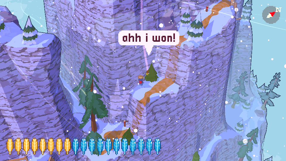
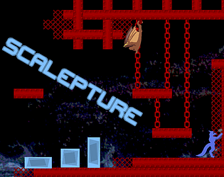
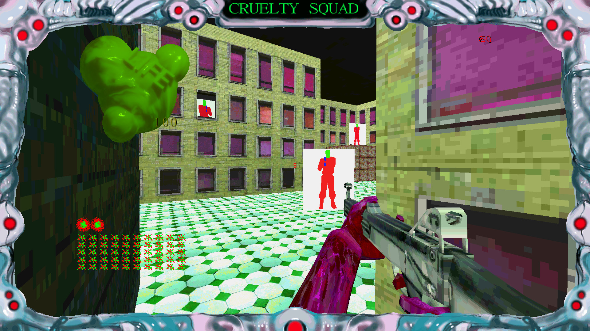
The current system is good enough, but giving sellers an option to disclose how much they're sharing with itch.io would be a nice option. A dedicated [support itch.io] button would not even be necessary then - people could just add a small purchasable file to their game page and send itch.io 100% of the profits!
Charlie Vermin
Creator of
Recent community posts
That's about as much as I figured! Between him and notimetoplay, I can confirm that itch.io has at least two employees.
Greetings!
itch.io is a wonderful thing and there is very little I feel the need to ask for. There may be some features I would really like, but I don't need any of them. Everything is just fine as it is. There is, however, one feature I require from itch.io - existence. I would like to be sure that itch.io will exist, preferably for the rest of eternity, but another decade or a few would be fine too.
Hence why I would like to know how itch.io is doing economically. Searching the web for a while I was unable to find any information about it since (understandably?) every single search query just sent me to posts/articles about how much the game developers are making. Similarly utopian Cohost seemed to be fine, and now it's dead dead dead - I imagine you're doing better thanks to the high quantity of popular commercial content on your website, but you do also host an immense amount of files for free, so I really have no clue.
If you're doing well, then that would explain the fact that I can't find any way to directly support itch.io, instead of revenue-sharing. But that doesn't make sense. You can never have too much money. I want you to grow big enough to buy out Steam. And Google. Maybe you just really want to make sure that every $ you make is accompanied by several $ for the gamedevs you host? But in that case, the big [Support itch.io] button you're lacking should just link to a random person's game and say "pay for this game to support us" ;)
On a semi-related note, what happened to the team page? Who even are you people? I'm obviously not entitled to every single detail, but more clarity would be nice. Right now you just have a dead link on the press kit page.
I hope you have a good day!
First of all, I wanna say you've been leaving some great detailed comments on people's games!
I also played your game, and it was very engaging - I definitely spent plenty of time on it. Maybe I'll return to it, even if parts of it were tedious... re-climbing the tower over and over got annoying, but there was a satisfying element to it too. It was like a whole journey, through a world I've built out of junk all by myself! It's just like when I repeatedly re-play my own game levels :P
I have to admit, nothing about the description is untrue. And the flavor text is all very nice too. I can 100% get behind adding weird creatures to your game for the heck of it! It's too bad the screenshots show pretty much the entire game, but I was pleasantly surprised by the expeditions! How many of them are there in total? I went on four before finishing the game in 55 days, and one of them repeated. Regardless, adding one of those to the screenshots would be a good idea, to reassure the players they haven't seen the entire game 10 seconds in!
After my initial disappointment, I gave it another try and enjoyed the entire game - I could always just imagine any of the missing detail! I wish your team a lot of success in gamedev, so that one day you can make high budget videogames about cats recruiting snakes into cults :P
Very exciting premise. Would make a great writing prompt, possibly for a novel exploring the psychology and sociopolitics of a cat starting a cult for snakes who want to have legs. If the game actually showed anything described on the game page, it would be 10 out of 10, but sadly, it's more like an excel spreadsheet with platforming thrown in. I haven't seen a single snake in the game, which is disappointing even in games whose developers don't promise snakes at all.
I beat my record, now I'm at 375 feet! But then I got stuck in an inescapable spot again... it's my bad, but it was a shame to see all my amassed stamina go to waste. Maybe if you update it in the future, you could add an extra button that spends 10 stamina to move one tile backwards? That would add an extra layer of strategy and be a huge lifesaver! But anyway, you already made an addictive game, so congrats :)
I wonder if they couldn't get it to run at all, of if they struggled to figure out how to place the first tile, like I did. With such a mix of genres, it wasn't immediately obvious!
It still feels a bit confusing that the new piece's head must point towards the existing head, but it may have been too easy otherwise.
You really gamed the algorithm by putting "scale" in the title twice :P
A very fun concept, and well executed too! Took me a while to understand how to actually start playing, but once I did it was smooth sailing. I made it to 180 feet until I got myself stuck in an inescapable spot. A fun challenge of space and resource management, and the aesthetics were nice too!
Edit: I think the difficulty continues to scale up (heh) after you lose and reset. I replayed the game many times and the amount of rocks got crazy! But then I reloaded the whole game and it was smooth sailing again.
Well, some of the visual choices are definitely... cheesy. But overall, the visuals are definitely the strongest point of the game! So many interesting looking creatures, and the selection of music is enjoyable too.
I really wish dying would restart the level instead of the whole game, but that's my only major complaint gameplay-wise. The creatures and objects move in unchanging patterns, but that makes gameplay nicely forgiving.
I'm surprised I didn't find any mentions of it. It didn't seem difficult to trigger that glitch! I updated the route several times, and he keeps slipping off as soon as he reaches the endpoint. It's a good thing the visible flight path is there, or I'd never be able to find him afterwards. I'm pretty sure he clipped through the ground a couple of times, too. A really amusing bug.
Funnily enough, the first time I won, I was actually the one to accidentally tumble off as soon as I reached the goal... but it's not like he tracks the player after the race's over, right? Not to mention I changed to a faster route all those times.

There he is, stuck in a tree. Far from the longest fall he took.
"i wish i knew how to adjust my own mouse sensitivity"
- a Sewer Rave attendant, probably
I finally got around to playing the updated version! The possibilities granted by the double jump totally exceeded my medium-low expectations. I was able to climb back up from the bottom of one of the two rap battle rooms by jumping on the pipes. I found out that the snake's tongue actually has collision, so you can stand on top of their head. I jumped on top of the train, of course, but also on top of the metro sign after jumping from the top of someone's ratsona. I climbed on top of the queen too. And finally, I reached a secret exit in the screaming rat face sky room. All in all, I feel like it gave me a taste of what Sewer Rave 2.0 could be, and it certainly let me have a bunch more fun.
Well, I'm a little disappointed now, but that's what I get for reading too much into "Much more!" (although I'm not sure what it could actually mean...) and seeing the title of the "A secret way to beat Endling?" blog post but deciding not to read it at all before I play through the whole thing. I played it in the past, by the way, and it was all around lovely, but I saw a third ending as soon as the other two showed up. Too bad it was only conceptual, and didn't exist outside my head... but it seemed so obvious, that I somehow assumed you'd also think of it, and add it in an update while you're at it. Oh well, it lives in my head and that's enough. I'm not sure how you'd implement it, anyway.
"why do tomorrow what you can do today"? That sounds like a minor shortcut. I managed to skip a brief cutscene, but if that's not it, I don't know what it is. There's really not much to do there, and I tried everything. The surprisingly interactive bathroom door is intriguing, and a bit glitchy (in some ways... in other ways, it's one of the least glitchy videogame doors ever). But you said it's not a coding error, so no clipping out of bounds, I suppose.
Oh, by the way... there's a bug that prevents you from picking up items... in a green room. So that's preeetty bad. I'm not sure when exactly that happens, but there's also a late doorway that makes carried items vanish, so maybe that's related. Maybe I'm somehow carrying and not carrying an item at the same time.
Okay, I went through the whole thing. It definitely feels like a game that deserves to be even bigger than it already is. Plenty of good writing in there, though some parts did feel like they squeezed too much plot into too little space. The moment right after contacting HQ in particular seemed to have a lot of personal stuff and intergalactic politics mixed together very rapidly. Didn't always feel natural, and some of it was deliberately invoked by the meta-videogamey theme which I enjoyed, though it wasn't always as clear cut. There were a few parts I felt like I would've written differently, but those are just details. The story as a whole is great.
(I just replayed with a different path, and found something that feels like it crosses the line from odd phrasing to an outright error. A phrase "BoredAlien" shows up, differently capitalized and punctuated. It would've been an appropriate deliberate placeholder at the start, but it wasn't used anywhere else, and at that point it seemed less apt than ever.)
Sweet! I do love how it's not just a sci-fi themed romance thingy that happens to feature a lizard guy, but the unconventionality of it is a central part of the game.
I'm partway through the Twine version currently. The spaceship interiors look nice, but I didn't really want do download all those megabytes just to get less story. At the same time, I'm glad the graphics are here on the game page to provide some extra immersion either way. Maybe you could sprinkle in a few screenshots within the Twine game as well to give the players a better feel for their surroundings? It can be more fun to leave things up to imagination, but a glimpse of a location here and there could really help set the mood, I think.
Wait. Jumping?! I got a high score of 2000-something and completely forgot about jumping. Now the game seems even more forgiving than it already was. Can't wait to see how many lasers show up once I get further! A really good modern spin on the snake with nice smooth difficulty. Both more and less difficult in good ways.
The only issue I had was the moon lasers - not entirely obvious when they stop being damaging. Also, I don't see a way to actually see my high score. Other than that it's really perfect.


