Much appreciated!
ERIC_MACK
Creator of
Recent community posts
I am glad you enjoy it!
While I didn't intend on doing something as off the wall as last year, it did lean that way a bit since I did want to explore fun approaches to the theme. These jams are, in my eyes, an opportunity to get a little funky so I will likely take a similar approach next year as well.
Interesting stuff about the screen types, thanks for sharing! Talking about the use of the original Game Boy's LCD display made me think of the Game & Watch and what a different style that is. Video games, and handheld devices in particular, are a platform to build something that feels like so much more than displays. Displays that are often, in comparison, much smaller than the vast worlds that they spark in a player's imagination.
I like what you mention about each developer highlighting what sparks their interest the most. That feels particularly apt for this jam as I've seen a lot of different approaches to the art. Each piece reflects their respective creator and showcases something new to the viewer. It's been a blast seeing all of them!
Woo hoo!
I just finished browsing through all of the submissions and will do so in more detail later. Just wanted to say congratulations to everyone who submitted. So many folks joined this year and it's been a really fun weekend to create, chat, and enjoy some cool creations :)
Excited for next year!
Beautiful artwork as always.
Interesting twist for this game, both the themes and the gameplay, I'm excited to see this expanded!
Particularly I wanted to note about when the grandpa says something along the lines of "It's been so many years since I've started, I only have these three now" - I thought that was a fantastic way to juxtapose this game to Pokémon. Normally you'd expect someone who's experienced to have quite the haul of 'mons, so the "only three left" really showcases well the darker themes and elements here.
Thank you so much for your engagement with the game! It is NOT an easy game, especially when going for all of the bananas so I'm happy to hear that you were invested in it.
The glitches that occur are, as far as I know, related to the GBS 2 Beta 5 engine as opposed to a logic issue in the scripts. Many OnUpdate scripts are used simultaneously for enemies, camera, and other things. I believe that in running so many, some events are either skipped or even overloaded in the RAM. So while the logic is good, the design does not make the proper accommodations for this, though there was certainly attempts! Level 3 is actually a good bit different because the original layout triggered these glitches far more easily. However, it was still not enough to be totally glitch-free.
That being said, I had a blast getting all that I could out of the engine (even if I pushed a little too hard) and who knows? Now that GBS 3 is out and has all of its great features, it could be a good time to build out a game closer to the original plans.
Thank you again for playing and for your thoughtful post! I'm glad to hear that you enjoyed :D
It's nostalgic to see that old-style YT playbar :,)
This is a cool choice for subject since that era of the UI lends itself so well to recreating in GB (as opposed to the current day YT) with its 4:3 ratio and big visual elements that it itself needed due to SD monitors of the time.
I like seeing personal discoveries with this jam theme. And it being the mid 2000's adds more flavor to it. I've always thought it was interesting the idea of playing a console past it heyday by a few years and, while this may not have been intended, displaying a 2000's subject matter on a console from (mostly) the 90's feels very much in the spirit of discovery to me. I can imagine it being the mid 2000's, browsing YT and playing GB, perhaps still finding out about new games from online or getting the most out of the games one has had for years.
Nice entry :) And congratulations on your very first jam submission!!
Very nice, I enjoyed reading the poem alongside it. Though I feel that you did a good job capturing the essence that the art stands on its own!
It's very cozy, and I think the view-port border helps with that. I wonder, was that originally part of the composition or born out of matching the tile limit?
The pose and light of the raccoon and leaf make it feel like a proper Zelda setup when the player finds a new item, which is super neat to have that GB DNA in the composition. Though, the diagonal line of elements from the top left to the bottom right gives it more of a feeling of a traditional painting. That's a cool balance!
Thank you!
Originally, I actually wanted it to be a totally linear succession of unique tiles starting at the top left and then having the remaining 168 tiles be just a blank bottom half. That would've really hit home the "192" idea. However, since the point of the piece was to push to the limit with what new techniques I could discover, I took that opportunity to make the two large sections of plain/dithered tiles to explore how they would look blending into one another.
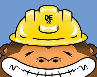
The limitations of GB/C can be a lot of fun to max out though. The gorilla face on the left is from my game DE '22 and you might have noticed that some of his face is dark green instead of light green. This is because I needed a different color palette to help show the buildings in the background too. So in the final game, his face is all one solid color. That was a technique a lot of GBC devs will come across and I first discovered it for myself on that game hence its inclusion here.
Working within 192 is certainly tough! It can be frustrating and take some patience and testing, but I think it's very rewarding to have the final product.
So much fun :D
I had a blast playing through this, the pre-battle dialogue really brought a lot of character and the art was real eye candy. There were one or two questions that I didn't know but I was quite surprised that I had this knowledge of some games that I've never even played haha
The only two things about this that I wish were different are:
1) The time to answer questions felt very short. Despite knowing the answer, there were some that I got incorrect simply because I didn't have time to read all of the options clearly (example, I didn't see that "Famicom" was an option for earliest release and chose "NES" instead).
2) The length! I would love to see a longer version if y'all keeping working on it.
Nice job y'all!
PS - Regarding the wolf's question, I do have a copy of Nintendo Power Issue #285 thank you very much! B)
Just played it through in one big play session this morning. I really enjoyed the art and was surprised at just how much dialogue there was and it never felt boring. I mostly focused on talking to Raven but would often talk to the others along the way just to hear more.
For a good while in the beginning I was grinding in the magma area since I couldn't find anything to do in the forrest. After dying a lot and feeling like there must be something I'm missing, I talked to the parrot and learned about the order of the 4 areas and the bosses. The forrest temple had me confused because I went there multiple times and didn't realize that the tiles on either side of the statue were an entrance.
After getting the upgrade I felt like I had a chance at going through the whole game. I played the patched ROM so I don't know if things were different before, but I felt like grinding didn't bring me much benefit. The only thing that really made a difference was getting the power ups.
The only thing I found majorly frustrating was how enemies can still deal damage even as they are blowing up (and still moving around) post death. This even happened to me on the final boss where I won, got the victory text box, then died from the boss's explosion moving into me.
The amount of content for such a short dev time is crazy, it's clear you put a lot of work into this so kudos! I had quite a fun time playing :)
Going into this, I heard from a lot of people that this was their favorite submission of Game Showdown 2023 so I was looking forward to checking it out! Even after hearing all of the excitement, this still managed to surprise me throughout the whole game.
For a 7 day jam, the amount of well designed content packed in here is really fantastic. Really great job!
Super fun!
I really got a kick out of the dialogue; it's brief but so funny.
I noticed that when I played, the "friend / hunger / rage" notes did not have the placeholder icons like it does in the picture on this itch page. For example, I never saw any yellow goose icons - it was an empty row until I got a red goose head.
I also happened across the debug menu. not sure if that was intentionally left in as an easter egg or not but it added to the chaos which is a plus in my book hahah
Really dig the look into the process here.
I think that the decision to bring in color is definitely the right choice here! I can relate to basing creative decisions on a core element or theme and am trying to get better at seeing where I can stray from the strict boundaries while still embodying the element/theme (in this case, the small accents of muted color working well).
Did it take some trail and error for placement of the cat and boy? Imo, the layout works very well to the tone of the game. Having Midnight be higher up than Leif and looking at the viewer gives the impression to me that the cat is quite literally on top of things while Leif is (pun intended) spacing out. I also like that the fonts follow with their respective characters.
Cool to see the process!
The first few backgrounds remind me of the early days of the Pokemon TCG with sets like Jungle and the Base Set featuring the Sugimori artwork on top of a somewhat-edited stock photo.
I think you made a good choice though with the ground textures and can relate to the memories of excavation :) To me, the scenes of nature are good for showcasing the lifestyle of a creature while the ground textures represent more of an unknown excitement to the viewer. It's like an invitation to dig deeper and discover all you can.
Looking forward to the next devlog!


