On Sale: GamesAssetsToolsTabletopComics
Indie game storeFree gamesFun gamesHorror games
Game developmentAssetsComics
SalesBundles
Jobs
TagsGame Engines

Esther

28
Posts
2
Followers
21
Following
A member registered Sep 15, 2021 · View creator page →

Recent community posts

Just finished a few fights against Father Fernando. It’s a fun fight, that really increases the value of the game. But it’s also very difficult to figure out, and it brings out one big flaws in the controls: After the player get knocked down then recovers, there is no invulnerability frames, so it’s possible to get stun-locked to death.

Things that are more specific to this boss in particular:

  • Just like muscle-guys, his bayonet thrust has a very long wind-up, but he stays still for the whole duration of the wind-up, so the timing is difficult to intuite.
  • The attack where he jumps and shoots down is practically impossible to avoid. No time to run away, and the dodge action doesn’t last long enough. It’s possible to extend the dodge duration with a counter-attack, but often it’s still not long enough to avoid the last hit; doing it this way also feels like an exploit or a bug.

The key configuration settings seem to work! A shame this also affects menu navigation.

I haven’t noticed any fps drop; The game runs perfectly smoothly, even during screen-tearings. Screen-tearing also happens in fullscreen mode. I’m playing on Windows 10, with a dedicated GPU (nVidia 760M).

Looks great and plays nicely! Looking forward to future release.

Here are the points I think need improvements the most:

  • English translation does nothing outside of the main menu! The characters’ speech box are either untranslated, or completely empty:
  • I wish I could use Up instead of Spacebar to jump, that would be much more comfortable for my hands.
  • I’m getting some very mean screen tearing. A V-sync option would be welcome.
  • The timing of the muscle-guy’s overhead attack is pretty hard to figure out, because he stays still for so long. His wind-up animation could use one or two more extra frames.

Additional info for people who struggled like me:

  • You can press F1 from the main menu. The setting bar is very sneaky and is at the very top of the screen.
  • Once you’ve selected English, you need to scroll down and click OK.

What happened to the page of Tessa’s Fate ?

I’m not against you putting a project on hold and focusing your efforts elsewhere. But older projects being completely erased from existence is a different thing, and doesn’t exactly fill me with confidence. It’s not as if Tessa’s Fate was anything to shy away from.

Another game with stellar graphics and solid gameplay.

I really like the level design. Not too straightforward, but still satisfying to explore (1-2 in particular). I only encountered two major roadblocks in total:

  • In 1-2, I had trouble with the red block you have to push around. I didn’t know you could refresh its duration with more fire paint, and was using the baseball bat to push it away, so it kept disappearing before I could jump on it. The timing was tight, but not impossibly tight so as to make it obvious I was doing something wrong; instead it made it feel like I just needed to do things faster. I eventually figured it out by pure accident.
  • In 1-3, I had trouble destroying the block on the path to the Ghost Lady’s room. The first solution I found got patched in 0.1.2, and I had to look it up on discord to learn about the backflip-spray. I never suspected the backlip would have any mechanical relevance, I thought the difference with other jumps was purely aesthetical.


The character controls have solid bases, but could be made more intuitive. I don’t think they’re as bad as some people say, but I can see why they would be complaining about it. They did feel clunky until I was able to figure out all the little subtleties, and learnt to work around them. Trying to enumerate them all feels like a lot of nitpicks, but the cumulation of these is what gives off the overall feeling of clunkiness.

A recurring issue is actions being too dependant on the character’s state, and not so much on the inputs. Certain short animations (crouch, stand-up, turn-about) will lock you out of other actions for a split second, which makes the input for some actions very timing-sensitive: pressing the correct keys just a tad too fast will cause some inputs to get eaten away, and the wrong action to be performed.
Most cases can be fixed by implementing either input buffering or animation-cancelling for those action.

  • Suppose your character is facing left, and you want to do a frontflip to the right. If you press and hold [Right]->[Jump] too fast, she will do a straight-up jump instead, (despite still turning around to face the intended direction). If she was crouching and had to stand up before turning around, the delay before she can frontflip will be even longer.
    Jumping while holding a directional key should always result in a front flip in that direction. (This was a much bigger issue before v0.1.2 when trying to grab ledges. Letting the character grab them during backflip was a huge help, since backflips are a lot easier to pull off consistently than frontflips.)

  • Suppose your character is facing left. If you try chaining a light attack to the left with one to the right. Pressing [Atk]->[Right]->[Atk] too fast will result in both attacks going to the left. Pushed to the extreme, spamming light-attacks will cause directional inputs to be ignored pretty much indefinitely. This also applies if your try to crouch or stand up in-between attacks.
    This mostly happens to me while fighting the ghost lady, because she involves a lot of crouching and flip-flops. (She is still very fun to fight nonetheless).
    In this case, directional input should take precedence over the attack inputs.

  • If you try chaining a light-attack with a heavy attack, pressing [L-Atk]->[H-Atk] too fast will result in two light attacks instead. If you then proceed with spamming [H-Atk], the character will spam light attacks.
    I can’t picture a situation where I would want the heavy-attack button to result in a light attack. I’d rather [H-atk] be completely ignored until the light attack animation ends.

  • While running with a paint can equipped, pressing the light-attack button will instead result in a heavy attack (firing the spray paint).
    Again I can’t picture a situation where I’d want this button to fire the paint. I’d prefer if the character did the same attack as when no weapon is equipped.

  • When crouching, the character will refuse to start crawling until she has finished playing the entirety of the crouching animation. This including all jiggle physics, making it unexpectedly slow. It doesn’t usually happen in fast-paced situations, so it’s not a huge problem, but it still contributes to making the controls feel irresponsive.
    By contrast, you can transition into a slide-kick immediately after pressing [Crouch]. Optimally, crawling should be able to cancel the crouch animation in the same way.

  • From a standing-up position, the character will refuse to fall through a platform if you double-tap [Down] too fast. The delay you have to wait between taps isn’t as long as for crawling, but I still run into this a lot.


Aiming the spray paint upward is fine, but aiming it down is much more awkward. Using [Left]/[Right] instead of [Down] isn’t very instinctive. But mostly, there are a lot of cramped spaces that don’t really give you the freedom to take a step forward before firing. (E.g. when fighting smaller enemies like the toads or crawling shadows). To avoid taking that step forward, I have to press the two keys as fast as possible, at the risk of pressing them in the wrong order, and firing in the wrong direction.

I think it’d be a lot more comfortable by reworking the aiming mechanic :
Hold the attack button to aim, and release it to fire. While aiming, all other movements would be disabled, so all directional key could be used to adjust the aim. This completely neuters any risk of the character moving while trying to aim, and would also enable the usage of the actual [Down] key to aim downward.


I think the crouching pose is giving false expectations of what the character can or cannot do in that position:

Visually, When the character crouches, she faces directly at the camera, in a very symmetrical pose. It gives the impression that, from there, she could potentially turn to face either direction.
In reality, she’s already committed to face either left or right, and she cannot change direction without first standing up.
(She will also revert back to this pose after doing a light-attack, giving the impression it is still possible turn around after crawling. )

The crouching direction has some mechanical relevance, since this locks the direction the character can slide, attack, or throw kunais in. In the current state of the game, this doesn’t end up mattering; there are no combats taking place in the vents, and none where sliding is required. But for a new player, who doesn’t know what’s waiting for them, It could potentially matter. (And who knows, maybe this will end up mattering in upcoming levels).
I did waste some time trying to figure out how to turn around while crouched, so as not get bad surprises later on. I was a bit frustrated when I decided to give it up; it felt like I was missing out on something obvious.

Depending on what you want to achieve: Either allow the character to change direction while in that pose, or modify the visual a bit, so as to have her explicitly face a specific direction.

(1 edit)

I gave a try to the new grab mechanic (sorry, I’m late), and I don’t quite like it.


From a mechanical standpoint, it’s much more complexe and obscure. Personally I’m fine with the added complexity, but I just want to point out how much of a learning curve it has.

The og grab was very straight-forward: just fill the bar as fast as possible. You can’t make things any simpler.

With the new one, there’s now a lot of things to figure out, and that tiny sign at the entrance of the thief passage doesn’t covers the important nuances :

Why am I unable to fully fill the bar, am I doing something wrong? Oh it’s because I’m too naked, so it’s something I can figure out ahead of time. If I still partially fill the bar, do I get any benefit from it? Doesn’t look like it. So how much MP does attacking cost? Why do I get two different numbers? Oh, it’s because trying to partially fill the bar is in fact detrimental…

The mechanic itself isn’t very self-explanatory, and because it unfolds so quickly, you don’t always have the time to process what happened. I spared myself the hard part and looked up the details on discord, but I think things are more fun when you don’t feel compelled to do that.


From a horny standpoint (I daresay, the most important standpoint when it comes to grabs!), I’m just really sad that they unfold almost instantaneously. It pulls the game further away from the “spicy during gameplay” category, and more into the “spicy after game-over” category. I really prefer the former kind. (Also RIP the endless grab cheats).

If I could make one change to the new mechanic it would be either of two things :

  • Bring back a bit of the old grab; If you fail to escape, your MP are drained over time, and the CG only triggers when you have none left. This doesn’t fundamentally change the current mechanic, but it gives you more time to process what is happening (and learn from it), more reaction time, and more animation uptime. If you are charmed, this new timeframe could be made into a last chance to drink a purify before attacking, (or a druid’s potion if you just want to make it last longer. Long live endless grab cheats.)
  • Make it possible to actually survive the CG; Instead of it being an insta-kill, it would consume a large chunk of MP (or maybe HP), and automatically release you afterward if you still have some left. This would be the best thing for me. (I had been thinking about it for older versions already, but now feels like the right time to bring it up.)

Either is fine on its own, but both could actually co-exist if they tap from different gauges. (But maybe I’m being greedy here)

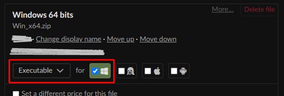
This is a quirk of Itch.io’s desktop app; it automatically filters out downloads that don’t match the client’s operating system.

You forgot to flag the download as “Executable for Windows”, so it won’t be available on the app.

(1 edit)

Love the premise.

The game is fun, but the bullets are unforgiving; they’ll just graze the tip of your dress and kill you. I’d make the bullets look bigger, but keep their current hitbox size; that way we’d get a better sense of danger from them, and it would feel more fair without actually changing the game balance. I believe it’s a common thing for bullet-hells to make bullets look bigger than they are, (Deltarune I know for sure does that).

That’s because the dev didn’t tag the files as being an executable for Windows. Itch’s app filter out downloads that aren’t for your system, but a lot of developpers forget to tag them properly…

Did Noire misplace her sister once again?

Hoy, how did you get the option to pay as a guest? The only options offered to me by paypal are “login” or “create an account”.

Issues in the order I encountered them:

  • Took me a while to figure out how to get past the very first wall of text. Either include some standard UI control scheme (with Enter or Space), or explicitely state what keys to use at the very beginning.
  • Walls of text are very slow to fully unwrap. Wish there was a way to speed them up without skipping them completely. By the way, not being able to replay Lorestones after accidentally skipping them is sad.
  • Probably an engine issue. On laptop, by default, the game runs on the integrated graphic card; this leads to bad performances, and to a nasty bug that causes the picture to completely freeze indefinitely after a few minutes of play. Took me some tinkering in nVidia’s control panel to get it running on the dedicated graphic card instead.
  • The colored text in some dialogue boxes is hard to read. Most notably the main character’s greyish-blue text, which I’ve mostly seen on top of blueish-greenish backgrounds. Not enough contrast between the two.
  • In the first battle against orcs, the second orc triggers a dialogue box. If you defeat him before ending the dialogue, you’ll become unable to act against the third orc, and forced to wait for defeat.

Feels like I must have missed something, but is there no way to simply pass time without changing location ? Getting in that situation where I can’t make it to a date in time because I’m early just seems absurd and unfair.

Looks like it could have been decent, but it is very punitive and frustrating. Not necessarily hard mind you; there is an easy mode that makes things more bearable, but easy mode doesn’t fix bad mechanics.

There are a lot of things to collect, often random drops. Death means loosing all progression since the last checkpoint and these are few and far between. You’re very short-sighted, so there are lots of traps or insta-death pits that you can’t know until you actually fall into them once, and lots of ways to get knocked into those pits with no chance of mid-air recovery.

A lot is questionnable regarding the mechanics of the character, but the worst offender of them all I think is the dodge roll. Using it is like casting a curse upon yourself. You get a barely enough i-frames to pass through one(1) enemy, and then are left at your most vulnerable for almost a second (an eternity on this scale) or until you can touch the ground. It can’t be canceled midway, you cannot alter your trajectory after launch, and it launches you so far away that your landing point will be outside the screen.

The dodge roll is also required in plateforming for some long/high jumps, but it’s a leap of faith every time, and the preconditions to succeed are often very finicky.

I love the crudeness/simplicity of the art style in this one. Makes it feel very lighthearted for the most part.

I wouldn’t say I’m new to indie genre, but we probably aren’t be talking about the same market. I am indeed unfamiliar with flash games, and it’s only since I started picking up games here on Itch.io that I started noticing this pattern.

Even though I now see there is a trend of tying menu navigation to character controls, I still think that trend as a whole deserves to be criticized :

Different games will have different control schemes, and with that, different ways of navigating menus; even being aware of the trend, I still need to re-learn menu navigation for every game I play. It also sounds like a funny little paradox to me : In order to navigate menus, I simply need to learn how to play the game; but in order to learn how to play a game, I first need to navigate through its menu…

The graphics and animations all look absolutely lovely, definitely amongst my favorite on Itch. However, the game gave me a very bad first impression because of its menu navigation.

Here I go describing the issues in detail:


  • Validate: “Attack” or “Jump” key
  • Cancel: “Block” key

This needs to be spelled out somewhere. It took me forever to figure that out by myself; until I did, I had a very awkward time navigating the various menus.

The default key for these actions (J and K) sound like they were picked by throwing a dart at the keyboard: they are amongst the last keys I would consider for menu navigation.

I don’t actually understand why the menu navigation keys need to be tied to the character control keys. Having the good ol’ reliable standards (Arrow Keys to navigate, Enter/Space to validate, Esc/Backspace to cancel) available at all time for all menus, regardless of custom keybinds, would have saved me a lot of confusion.

I also noted a couple of inconsistencies that contributed a lot to that initial confusion:

  • In all menus, “Jump” and “Attack” work interchangeably. Except in the keybind menu, where “Jump” does nothing, only “Attack” can be used to rebind keys.
  • “Block” can be used to exit most menus, except the pause menu, which can only be exited with Esc. This is the only place where Esc is used for menu navigation.

To give some concrete example of my experience :

The first time around, I could use space as a “Validate” key. The very first thing I did after booting the game was try changing the keybinds. I simply couldn’t do it at first; because I couldn’t figure out what key I needed to press to actually start rebinding. (I was J)

After trying out keys at random, I finally managed to rebind the “Jump” and “Attack” key. Suddenly I could no longer use Space to navigate menus, and I could no longer use J to rebind keys. That’s uneeded confusion right here.

The downloads are not flagged as being Executables for Windows, and thus are not offered for download by Itch’s Client App.

On the “Edit Game” page, you want to find an option that looks like this:

Oh, I see. I got it.

I think that’s actually the first time I see a game use the Registry instead of a regular save file, you should have led with that. A lot of people probably don’t even know the Registry is a thing.

I don’t have any “Software” folder under C:\Users\<username>. Searching from there, the only result I could find was C:\Users\<username>\AppData\LocalLow\HotPink Games LLC\Lewd City Girls, yet that’s still not the right one; deleting it does nothing.

On PC

How can I reset my save data? Can’t figure out where the save file is.

(3 edits)

(Edit: This was written in for older version of the game, a lot of these issues have been adressed since then.)


It is rough, but off to a good start. It works quite well as an horror game. I’m looking forward to futur improvements.


The controls are decent, but still feel suboptimal :

  • Why do I need to hold LMB in order to move the camera? Moving the mouse should be enough on its own. This makes it unplayable on laptop with a touchpad.
  • Mouse sensitivity is too high when aiming, makes it hard to aim at the small insects.
  • Being able to skip dialogue boxes by clicking anywhere instead of a specigic button would be a welcome QoL change.
  • The character can’t turn around on the spot. In most cases here that isn’t an issue, but it can make it tedious to pick up items if you accidentally step right on top of them.
  • The struggle mechanic (if that is indeed a struggle mechanic) needs to be better explained. I don’t understand whether it achieves anything, what it achieves, and whether I should spam it or use it at key moments.
  • The ingame tutorial says you fire the weapon with LMB, but in practice it’s RMB

As others stated, the result of pregnancy was anticlimactic. Personally, I’m fine with it leading to a game-over, (though I must admit spawning a new enemy would be more fun and interesting). I think the problem actually lies in the lack of spectacle; pregnancy has a very long build-up time, but leads to a whole lot of nothing: we don’t get to see the baby, instead we have an instantaneous cut to the same game-over screen as usual.

Speaking of which I think the game-over screens in general are too sudden. Almost all games I can think of have a few moments where you can see the incapacitated character; H-games in particular often make avail of this time by leaving the character vulnerable to whatever is still around. I believe giving some work to the post-defeat spectacle has the potential to make the horror vibe stronger.


The H animations have a certain stiffness to them. Every motions happen in perfect sync; they completely lack of the principle of animation called Overlapping actions. (If you’re not familiar I suggest New Frame Plus’ video on “Follow-through and Overlap” for a quick breakdown.)

On another note: If you skip the H-scene with the wolf, he doesn’t give you the green access card, then acts as if he did.

(1 edit)

Getting a fair share of frustration from the controls and combat:

  • During a jump, you can change direction mid-air by pressing the opposite drection key, but you cannot stop mid-air by releasing the controls; the character just keeps her momentum. This is pretty counter-intuitive, and makes jumping onto small plateforms (e.g: stairs) harder than it should be.
  • The invulberability frames after getting hit is too short; it ends as soon as you’re given back controls. As soon as too enemies get close together, I end up in this situation where one will knock me back into the other, dealing more damage, sometimes knocking me back into the first one, etc…
  • Dashing is pretty useless when it comes to dodgin attack. If you try dodge a projectile, you’re likely to land onto the enemy who shot it. If there are multiple enemies close together you’re even more likely to land onto one. This could be fixed by providing a way to interrupt/shorten a dash, making the invulnerility last a bit longer than the dash, or just making it so these enemies don’t deal damages on mere contact.

Otherwise the game looks pretty neat, so I’m looking forward to more polished controls.

What this game needs the most urgently is polish. Some design choices are poorly executed, and there are frequent game-breaking bugs during battle.

The worst offenders are the H scenes, which cause time-shattering mayhem for a good portion of the battle afterward: characters’ turn get randomly skipped, enemies play their turn simultaneously, or during your own character’s turn… (I’ve had occurences of two characters mutually knocking each other’s, which doesn’t sound like it should be possible.)

The battle also could use some visual clarity. The camera movements, (teleporting around whenever someone makes a move), actually makes it hard to follow what’s going on; I’d rather have a completely fixed camera. There’s also a parallax effect between the characters on the field and the field itself, making it look like they slide around whenever the camera moves.

When one of the girls is attacked, her health bars are not displayed, only the last girl to have taken a turn has hers displayed. More so, the first layer of the Lust bar does not always completely fill up when a girl reach 100+. This all just add to the confusion of the battles.

Finally, retreating from the from the forest causes you to forsake all gathered loot (as if you’d never entered to begin with), but engaging in battle and loosing lets you keep the loot ? What’s the point of retreating then ? This just makes it so the best way to gain money and prepare for a fight, is too give up on healing the girls at the monastery, give up on avoiding dangerous encounters, and just mindlessly send them back in the forest at 200 lust, until you have enough gold to fully heal them. (Which half the times, costs 100g instead of the adverstised 50g.)


Otherwise, the graphics are gorgeous; these are definitely the strongest point of the game. Having voice acting was unexpected, but very welcome and enjoyable. The Spine animations looks fine most of the time, but there are some H-scenes where something feels off. (Mostly: mouseXgoblin and Jess alone.)

(3 edits)

Hi, I can’t proceed through the tutorials in the wood. Whenever comes the slide about Object of Interest having Positive or Negative effects, the game seems to freeze. Nothing I can do gets me past that slide.

Edit: Figured it out. It’s just that the close button is so damn small and looks so much more like a frame ornament than a button, that I didn’t even consider clicking on it. Also it didn’t help that almost every other slides can be skipped by clicking anywhere, and not on a specific button.