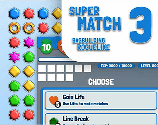
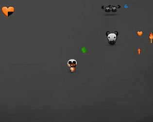
Gostei do conceito. Gostei mais da parte do inventário, mas ela podia ser mais estratégica (seguindo outros jogos como backpack heroes em que os itens tem interações e formas estranhas) e ter um momento dedicado fora do combate para organizar o inventário. A ideia de juntar os dois aspectos é interessante, acho que tem um jogo interessante aí estilo rogue like ou rogue lite se forem dar seguimento
Fabricio Caixeta Andriani
Creator of
Recent community posts
I read the rules for your game, I like the concept. I think I could understand most of it, but an example for a round can help. I understand that i can play as many cards as I need to perform a trick and can not use the previous cards played, is it right?
Maybe create a name for the tricks or place a number for each one, so the players can reference the trick on the sheet
check my solo game on the same game jam https://fabsca.itch.io/trick-a-solo
I liked the visuals and the concept. Sound and controls work great. The main game loop need some adjustments (I lose my fist game on the fist try because I did not have money to buy a card)
Check my game on the same jam https://fabsca.itch.io/trick-a-solo
Hello, I read the rulebook for your game. The rules are very clear and easy to read, but I think is possible the reduce the size of the rules reducing some repetitions
Confusion that I made on the fist reading, you say that the player will need three decks, and I understand that the player will need three copies of a 52 playing card deck
The turn order steps can be placed before, so the player can have an overview before read the next sections explain each step
What do you think about if the player had the chance to the the next face cards or choose the next face card in a limited subset? I think It will add an interesting decision for the player
Check my solo game on the same Jam https://fabsca.itch.io/trick-a-solo
Oi Jonny,
Gostei bastante da abertura do Jogo. Os controles do jogo e a câmera estão bons.
Bom trabalho com a mudança de música com o powerup. O efeito sonoro de tiro está um pouco estridente.
Talvez colorir o tiro com uma bolota preta na frente e o rastro branco para deixar mais visível
Não senti muita utilidade no powerup com space key
Talvez adicionar invencibilidade quando o touro está agressivo ou reduzir a quantidade de dano recebida. Você também pode fazer a câmera ficar mais perto do touro
A parte de score está conflitando com os comandos asdw de movimento. Não consegui salvar o Score. Meu melhor foi 510
I like the concept, but in the fist moment I did not understand that the monsters are your allies, Maybe start with only one and make them smaller and more similar to the player so the player can understand better what is yours and what is enemies.
The number of enemies increase too fast, but it was ok to test the concept
I like the concept and the art style. I think The enemies need some damage feedback and will be more fun if most of the enemies have only one life (in the first wave I think is a must)
The message of what upgrade the player gains is too fast. I think the upgrade system could be automatic, and give the player some choice, when the player collected a number of coins (similar to experience in Vampire Survivors), or a screen after the wave (like brotato).
I liked the visuals and the start animation. You have a good start for a top down shooter, good job! The screen on the itchio page is too small.
If my weapons have infinite bullets I would like to only press and the weapon continue to shoot. But click is ok too.
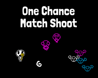
Check my game on the jam too, is a top down shooter too https://fabsca.itch.io/one-chance-match-shoot
I really like the art style of the UI, and the possibilities for the game.
walk with AWSD is not very good for this kind of game (I discovered that this was possible after read the game description), I would like to have places and in each one of the places I could interact with the things in that place.
If I can not do one thing would be nice to rearrange the cards and change the colors to indicate it.
The actions need time, but the time passes in real time too, for this kind of game is better if only the actions increase the time
On the combat is a little strange to use any item on my inventory. Maybe have cards that represent actions, and you can only perform a action if you have the item. And the actions can break your itens, so is good to have more than one in your inventory to swap
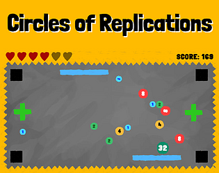
Check my game on the jam too https://fabsca.itch.io/circles-of-replications-day-2
I liked the game, but will be nice to have more vertical space to react to the bombs and the bombs to be a little smaller
Check my game on the jam too https://fabsca.itch.io/circles-of-replications-day-2
I liked the game, but will be nice to have more vertical space to react to the bombs and the bombs to be a little smaller
Check my game on the jam too https://fabsca.itch.io/circles-of-replications-day-2
The controls are ok. The only thing that I did was to click on the ghosts, but did not understand the diference between colors and the big one vs the small ones. The area of click was to large, some times I destroy more than one ghost with the same click or take damage. There is a way to fix the house? Do my actions affect the house?
Check my game on the jam https://fabsca.itch.io/circles-of-replications-day-2


