Another great title, although I still prefer Minivac (everyone should give that a play). The top down controls were tight and felt smooth and responsive. The sprite work is cute and the backgrounds for all of the levels were great. I played in the browser which means that enemies off-screen get cut-out rather quickly which makes it hard to predict their movement direction (seems that movement is random rather than pre-determined paths). Maybe this is better full-screen mode. If their movement is following a path the player would feel less "cheated" because you can plan your movement based on their movement (hope that makes sense). Also I would destroy bullets when they collide with walls, else you have to dodge bullets that are coming from an unseen enemy. Again it makes it feel unfair if you have to react to enemy behavior that is happening off-screen. The death animation needs some more juiciness (but this is just a suggestion and not a gameplay issue per-se. I enjoy your work a lot. Good stuff!!
FanieG
Creator of
Recent community posts
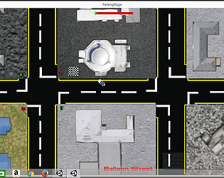
Thank you so much for the detailed feedback. This is my 4th GTA-2 like (I really love the genre) and i'm starting to get better at it (I feel anyway). This did help me for this jam as I could re-use a lot of code from previous attempts and just modify it for this. The car physics has been a pain for me and I think this 2.5d approach feels much better than my previous attempts. I also learned a bunch of new stuff for this Jam (shaders, 2D lights, blend trees etc). Most of this title (first 4 days of the jam) were actually written from a hospital bed (minor op) so I had a LOT of free time for this. I agree with all the points raised and REALLY appreciate the feedback.
I watched James play your game on the stream, and he mentioned your good level design and art already, but the thing that stood out for me the most while playing myself is the tight controls. Minivac feels weighty (that's a word right?). I'm a fan of endless runners and this one is great!!! Well done. Story is great too
I love city builder type stuff. Especially if it has lots of figures and financial management like this one. The tutorial is a tricky thing to get right, as players tend to skip over walls of text. You should maybe look at other games in the genre and look at the icons and pop-ups that they use to communicate what's needed or in what order (City skylines spring to mind). I can appreciate the amount of design that went into this jam game so well done. I'll be honest and say that I did not play for very long (as it is very late already where I am), but enjoyed my time with it none-the-less. Will jump into this again tomorrow to give it a more thorough play through
This just oozes style. The poncho rippling in the wind, the flickin' of the cigar, the bullets dropping when reloading, the pose, death animations, music choice and head shots - It all oozes style. Simple to understand mechanic which is great for a jam game. This game is absolutely great. Well done and thank you for making this.
The sprite work on the player character is amazing...That million dollar smile and the jock jacket. The parkour poses for the jump and the slides were great, especially with the nice particle effects. The backdrop was beautiful. Music choice was spot on...them claps were great!!!
My only critique would be to swop the shift for slide to the down arrow/s as that feels more natural with this control scheme, and maybe slow down the enemies a bit.
But I loved this spin on an endless runner/platformer.
Well done!!!
Just when I thought I was getting somewhere with coding, you guys go and drop this bombshell on my confidence :)
Fun idea and well executed. You could have made it a bit more like a gameshow with a quirky host and a fake crowd. Nice job on this. My very first game I made was a music trivia game (done as a windows form in Visual Studio) so I have a soft spot for this genre.
Well done all!!!
The sounds you chose for this was the winner for me. Especially the elf voice. Gave me a good giggle. The mechanic is simple and well executed for a jam game. You could expand this into a more complex rhythm game like guitar hero even. The comments were humorous and the faces and particles (hearts and tears) were a nice touch. Well done and thanks for making this experience.
The art in this is gorgeous, but the aiming mechanic needs some rethinking. Aiming is really frustrating. The audio is nice, but fits more with a Harry Potter fantasy kinda world than this awesome Anime vibe you created. Well done on finishing a game. Your next one is going to be even better. Also maybe look up game Juice. There are lots of little things like particles, lighting and screenshake that you can do to make your game feel more alive. Also research Vectors. That will help you a lot to figure out directions and distances. Loved what you created here even if it wasn't perfect. Good job!!!
@SkarOps - thanks for taking the time to play and comment. The number is your score. Kill the little black devils with a car to create flowers and the collect the flowers on foot to get points. Tried my best to describe it in the tutorial on the playable main menu, but it obviously wasn't clear enough. Thanks for catching the dash-on-dead bug, I will update it in post jam versions if I decide to continue this. Thanks again for playing!!!!
Wow...What a great little title and there is so much room here for things to expand on. One of my favorites for this jam. The music was sooooo nice. The controls and mechanics are great and easy to get even without a tutorial. People in my town booze way to much :) I was buying red boxes like crazy and couldn't keep up with demand. My only issue in this near perfect jam entry would be that the office door could be more clearly marked (maybe a hanging sign idk). 1st play I though the store room and office was the same room.
Bonus Idea - 4 player multiplayer (Cashier, Stock boy, Buyer and floor staff), or a single player mode where you jump between jobs. Just an idea
Those gunships are bastards...that mission was crazy. I really enjoyed this experience. The music and sound was very "Top-Gun-y". The controls were tight. Especially the slow down and accelerate. Once I got the hang of those the game got a lot better for me. The waypoint/Objective indicator was also really well implemented and I always knew where to go (except once where I didn't press spacebar one last time and I kinda just flew around aimlessly for a while). The dialogue system worked well and I appreciated that you could skip through text (nice touch when you have to replay missions). My only criticism would be to add a custom cursor for the mouse, like maybe a gun reticle, which would make the rocket mechanic easier to understand too. Oh and a better explosion (the one used did not really fit with the rest of the art). Very nice little game. Well done and thank you for making this.
One of my favorites so far in this jam. I loved the art direction. Mechanics were simple to understand and your dialogue manager was clear and concise. Had an issue with 1 of the tasks (cleaning cupboards) where I couldn't get to the task as the colliders on the walls were a bit unclear, but this was a nice little experience. Good Job!!!
I really enjoyed the art in this. The character design and props all looked great and had a cohesive style. The controls...I was not a fan of. It felt very floaty and unpredictable. You keep moving once landing and there is to much strange physics when in the air. Tighter controls would make this a much more appealing game. Sound was nice. You can maybe implement some more game feel like particles, lighting, shaders and screenshake. Please take all of these suggestions as constructive. Thanks for making this it was fun.
I really enjoyed this. Usually I prefer platformers that allow you to jump through platform right above you, but I can understand that, that wouldn't work with your stage designs. Getting to some of the platforms was tricky but fun, as you would sometimes need to go up a different tree to get to the top branch of the tree next to it...I liked that level design. The particle systems were minimal but good and added some nice game feel. At first I was avoiding the flames, then realized I can walk through them, then realized standing in them for an extended time caused damage. That was nice progression of the player learning the mechanics through play. My level ended the first time, when I saved all the squirrels but still had 2 acorns outstanding, it could maybe be made clear to player that the squirrels are more important than the acorns (maybe swap their UI spaces around as most players will look top left first and then top right. Or show a % complete next to the squirrels). Also maybe display the timer in the game screen so that the player knows that he/she is also judged on completion time. These are all just little criticisms on a very nice little game. I felt like an "Alpha". Thanks for making this.
Your command of particle systems is amazing...The rain hitting surfaces, the mouse over "Door Knob things", the dust at your feet...it's all wonderful. The game also gave me all the feels. Loved the color pallet changes on the different levels and the sound design was very fitting (whispers are nasty!!). I did not like the wall jumping mechanic used. It felt clunky and unresponsive. Sometimes I wanted to change direction, but would just double jump on the same wall and then slide down again, but it's really just a nitpicky comment. The game and premise was lovely and I really enjoyed this. The comeback mechanic was great too. Well done!!!
Nice landscaping sim. Very calming. Could have done with a little more to do or more puzzle elements. like having grass only growing around water, or flowers need to close to green weeds etc. The tutorial page says match garden to info in bottom right of screen, but info is on the left. You could have added a bit of juice too...screenshake when you smash rocks, particles when you plant stuff etc. Good effort!
climbing out of despair was great. The lighting as you get back to wall was especially nice. Got some funny joint glitches every now and then when reaching up for a big jump. You could have implemented a left-click-left-hand mechanic and vice versa for right for faster climbing, instead of click on hand and drag mechanic, but just a suggestion. Loved this little gem of a game
I really enjoyed this. The practice mode was a nice idea as a tutorial and helping the player get to grips with the controls. When I finally caught my 1st ball it felt like such an achievement. The art is lovely. love the hairstyles. This would be great to play with a twin stick joypad. Over powering the shot was common, but got easier with practice. The audio was decent, but an oppertunity was missed in having cheezy commentating. And lastly...if you can dodge a car...you can dodge a ball!!
Like me some old school asteroid action. The kidlike art was great and the particles was nice. Sound was competent with a nice arcade-feel to it. I would have liked a bit of a bigger play area, so that I could pull of some flying maneuvers. Like maybe having a full earth in the center of the screen so that asteroids could come in from all 360 degrees. This could also have given space for maybe having asteroids split in two. As is, I could just stay in 1 place and fire at incoming asteroids without moving around at all. This is just a suggestion and I really liked playing this
Like me some old school asteroid action. The kidlike art was great and the particles was nice. Sound was competent with a nice arcade-feel to it. I would have liked a bit of a bigger play area, so that I could pull of some flying maneuvers. Like maybe having a full earth in the center of the screen so that asteroids could come in from all 360 degrees. This could also have given space for maybe having asteroids split in two. As is, I could just stay in 1 place and fire at incoming asteroids without moving around at all. This is just a suggestion and I really liked playing this
Your command of particle systems is amazing...The rain hitting surfaces, the mouse over "Door Knob things", the dust at your feet...it's all wonderful. The game also gave me all the feels. Loved the color pallet changes on the different levels and the sound design was very fitting (whispers are nasty!!). I did not like the wall jumping mechanic used. It felt clunky and unresponsive. Sometimes I wanted to change direction, but would just double jump on the same wall and then slide down again, but it's really just a nitpicky comment. The game and premise was lovely and I really enjoyed this. The comeback mechanic was great too. Well done!!!
climbing out of despair was great. The lighting as you get back to wall was especially nice. Got some funny joint glitches every now and then when reaching up for a big jump. You could have implemented a left-click-left-hand mechanic and vice versa for right for faster climbing, instead of click on hand and drag mechanic, but just a suggestion. Loved this little gem of a game
I really enjoyed this. The practice mode was a nice idea as a tutorial and helping the player get to grips with the controls. When I finally caught my 1st ball it felt like such an achievement. The art is lovely. love the hairstyles. This would be great to play with a twin stick joypad. Over powering the shot was common, but got easier with practice. The audio was decent, but an oppertunity was missed in having cheezy commentating. And lastly...if you can dodge a car...you can dodge a ball!!


