Itch forgot to notify me so I missed this, sorry! I'm glad to hear it's addictive, that was one of the goals. I agree the commands are somewhat useless in this version of the game, but we'll try to remedy that. Thanks for playing and for the feedback!
Freezelance
Creator of
Recent community posts
Itch forgot to notify me so I missed this, sorry! Thanks for the kind words and great feedback. We've decided to keep working on this game and the main focus will be to find a way to make the programming a more core part of the game, so that you're rewarded for doing clever things there. Your ideas make a lot of sense to me. Thanks for playing!
Interesting, I like the idea of whacking the poor guy for no reason! His groan is very satisfying as well. Some feedback:
- The whole game is sort of cropped and you cant see the edges
- What's the timer for? I couldn't see it and it didn't seem to have any effect
- The timer and restart button is unnecessary IMO - just have a button to launch the next wrench
- Physics are not deterministic, so even if I don't change anything the wrench will take a different route. Makes it hard to plan and execute
- After I pressed H I was not able to close the help screen
This was amazing. The music, the random words, really gave me a creepy insane feeling, sort of like the movie Shutter Island. The idea was really cool, to find words to gain abilities and then use those to find new words. Well done, best one in the Jam for me so far (I've tried 10 or so).
Some small feedback:
- The STORY page was really hard to read
- Alt-TAB didn't work (on browser version) as it would not let you get back in the game afterwards. This was especially annoying with the bit.ly link
- Audio was really loud and had a lot of clipping - a shame on the great music!
- The game let you continue even if you made the wrong sentence, like "I am the guy dude who..."
- If you came back to a previous goal word it would act as if you were still going for that word. So you could "jump back" to a previous "level" and it would seem like you had to do that part again.
I liked this game. The music was dope, the pixel art was crisp, gorey and colorful, controls were simple and responsive, the premise was interesting even if it was simple. Gave it a fairly high review. Some random details that can be improved:
Attack animation should show the actual hit radius better, now it looks like hi swings more behind his back
"Press E to pick up almost invisible" text was often almost invisible
Hit corpses to move them - feature or bug?
Parallax background was nice but could be more pronounced
Mouse+keyboard control combination was a bit weird for a 2D platformer
Stairs were a PITA really. Took me many minutes to get past that part. You have to stand on one exact step and then press jump and move very precisely to be able to get up. Very annoying.
Hitting multiple stacked-up foes at the same time causes the hit audio to be too loud
Boss instakilled me, no idea how to defeat him. It's OK that he's hard and can't be killed on first attempt, but it would be nice if I had time to learn something at least.
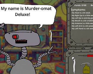
I made it so that you are (sometimes) punished for using the wrong tool - otherwise you can just spam every tool everywhere to fix all problems. But I agree it can be hard to know in the beginning, you have to really want to figure it out and I get that many players will not have the patience to deal with that. Especially if they're unlucky and get a hard problem in the beginning (they are randomly generated). Will have to think about that. Thanks for the feedback and I've rated your game, I really liked it!
Interesting idea but I could not figure it out. The video link didn't work. Some random feedback:
- how to play and intro text are hard to read
- the different gray boxes should be labeled so you know what is what
- very hard to understand - the icons dont seem to have anything to do with wings and engines
- labeled icons would also help maybe?


