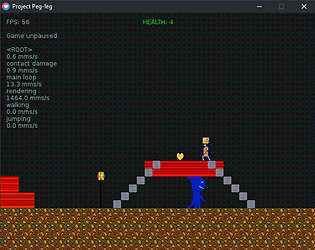
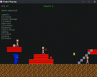
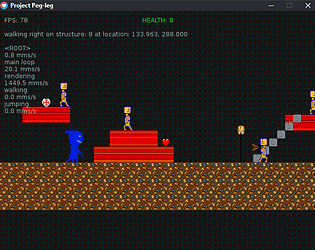
Thanks a bunch for playing it. Any suggestions beyond length?
General Vagueness
Creator of
Recent community posts
I look forward to this every time I go to play demos. It didn't disappoint. I can tell it's been improved in subtle ways since the last time I played. I like the aiming and the general responsiveness. I was a little thrown by the lack of a reload, and it took me a minute to realize the idle animations for the pistol had nothing to do with reloading, but I can adapt to that. The idle animations in general had a bad habit of getting in the way of my aim, I recommend only playing them if the player hasn't changed their position and/or aim for a little while. The usable item indicator could be more organic, but I like the way it shifts and scales with your position and aim. I think I got shot while in cover at one point, I was behind a bend in a wall. There was also a real problem with getting stuck on walls, sometimes even when I felt like I wasn't touching them. Overall I think this is still very promising.
This is one I've been rooting for for some time now. I got an error on startup about not being able to open a file for writing, and it popped up underneath the game so I had to bring it up to continue as it was holding up final startup. It happened again and worse trying to go through settings, I had to Ctrl-Alt-Del out of it, it seemed like Alt-Tab worked but nothing was actually visible. The red keycard readers and the ending button had some Z-fighting. I like most of how this feels, in particular good job on the recoil for the SMG, it takes focus to manage but after a little while I got the hang of it.
Maybe it's just because I haven't played a game like Diablo before, but the controls felt clunky to me. I'm not enthused about the art style but it is cohesive and consistent, so if you want it to look like that then I'd say you're on the right track. The lack of legs throws me though. Having things like foliage or even the building you're in get in the way of seeing what's around you throws me even more. Still, it seems competently put together.
This feels really slick except for some minor things. Switching to another program is a bit dicey, the transition took a minute and the game responds to the mouse even when it's not active. I really wish you fell faster, I'm just sitting there waiting to jump again, especially if I miss a jump. I got stuck in the corner of the wall directly to the right of the first save point, I could reproduce this just by walking into it. It would be nice if I could check signs without coming to a complete stop. This is another game that didn't run the best, in this case freezing for a split second at irregular intervals. I didn't like how the Enter key not only didn't act as accept but backed me out of menus. I'm not sure if this was intentional, but when standing still the hammer swing animation plays twice and consistently holds for a bit on the second swing, but not always for the same amount of time. I wasn't fond of how the dodge roll is always the same distance and required to be used with relative precision despite that. It took a long time to load but actually ran quite well. One curious thing is that it looked weirdly blocked out, and sure enough the 2x view was smaller than my monitor's full screen resolution but only slightly, so in full screen everything was stretched a bit weird. That all might sound a bit major but like I said this seems slick and I like it. In particular it seems to be another deep and expansive game, but it didn't give me a feeling of being overwhelmed by choice like some games.
This took a long time to load but actually ran great at 720p and "High" graphics. I did have about 3 moments of stuttering but that was it. When I pressed Escape it froze and then said it crashed, this happened twice. The game page said to check the controls under options but it took a minute to find them there. It would be nice to be able to navigate the menus with the keyboard. I was thrown by the fact the guns don't reload automatically when you run out the magazine, but assuming it's intentional I think I can get behind it given enough time. I'd really like to be able to keep some progress after dying. This game has a lot of personality, it managed to put pressure on me despite being goofy and simple, and hey, now I can say I've backhanded a skeleton-- in short, I like it, and I felt compelled to play it more than usual with proc gen games.
First off, this tripped Windows's antivirus. Second off, I think you nailed art at this resolution better than most. There seemed to be a health system going on but I couldn't make sense of it, seems like after the second or third bounce against something above you you die. I got stuck in corners and walls a couple times. I want to see more.
A bit sparse, as I'm sure you know, but it functions fine-- except for movement. I thought it was my controller, but I unplugged it and I still kept moving backward. I think it may have remembered the state the stick was in and kept it. There were also a good few things with what I assume is the default texture with letters on it indicating faces, if that's not a mistake I recommend covering them with a placeholder texture.
It's a crutch, but yeah I can work on visibility. I've been working on it for a while, but this is my first game so I guess I'm a beginner in that sense. I'll rename the super jump to high jump, I don't want to make it take extra steps to activate. I've actually been meaning to take jumping out unless you have the jump powerup since you're on crutches.
Thanks for the feedback and thanks for playing!
I think I grabbed a different version or something, those ghost enemies looked different in the demo I played and the third level didn't look like that, and I think the game page has been changed since I downloaded it. That said, no I haven't played Super Meat Boy or similar games before other than some other people's demos. Maybe if I'd played it with a controller the acceleration and direction changing wouldn't seem so jarring, but I didn't feel like it setting it up. The game is also quite a bit smoother in that video, so maybe my system had to do with it.
You've got a marvelous look and feel going on here, the graphical and musical style is great, the rest could use some polish. I think I understand where you're coming from with the general feel of the mechanics and I like them for the most part, but it feels clunky in some places. Attacking feels wonky in a way that's hard to describe, but that could be me or the enemies-- the lack of bodily collision with them feels weird either way. Jumping is a bit of an issue, there's always a recovery time before you can move again, and it's long enough that it's often noticeable. The animation and coding for getting off the top of ladders could use some work, and a dedicated dash button would be helpful because if you try to dash near a ladder you'll attach yourself to it, meaning you'll actually lose time by having to climb back up. Energy bullets claim to cost 1 energy but they actually cost 2. The tutorial is good, but it would be better to explain the UI too-- I figured it out but if you spell out some things for the player and there's something that you miss that they don't get it'll be that much more frustrating. This might seem small, but the text bothered me, it has some typos and it doesn't have much capitalization or punctuation-- except holy shit does it have ellipses. Having three text boxes in a row with just ellipses was annoying enough once, but you did it multiple times, and kept starting and ending with ellipses, it's like the character is falling asleep. Still, I quite like the general feel of the presentation and mechanics.
There's not a lot here, but you know that. I'm not sure which debug option it was or if it happened on its own, but something made the game really slow after I tried pressing the debug keys. Jumps are unlimited, as in you can not just double jump but triple jump and so on, I don't know if that was intentional. Otherwise it's a bit floaty but it seems to work fine.
The controls are way too slippery for my liking, mostly due to the high horizontal speed and the fact it goes from full stop to full speed immediately. I couldn't figure out the third level or how to get the collectible in the second level, and the tension involved in making the wall jumps actually made my hand hurt. However, other than the level design being hard to read or the controls being hard to understand, it seems to all be functioning as intended. I would recommend the keyhole/doorway change in some way (or just appear in the first place) once you've beaten the enemies to indicate you can go in it, at least for the first level.
Enemies are easy? I had people say it was too hard before, all I've done since then is to slow down the boss enemy a bit and to actually also slow down attacking slightly. Puzzle elements are an intriguing idea. What do you mean the fact there's an attack button is unintuitive, is it the placement of it?
Thanks for the feedback.
Thanks a lot for the feedback, it'll be helpful.
The next demo will definitely have more forgiving scrolling and fall damage, and I'll look at increasing the jump speed. The keyboard controls were just sort of thrown together to be easily reached with one hand, I was planning on mapping some of them to the directions, so I guess I'll do that for the next demo.
The fixed jumping is very much influenced by classic Castlevania. I like how that style makes the game predictable and gets you to plan your actions and know how the game controls, and it makes the game different from a lot of others, so it won't be changed much. You can actually slow down your horizontal momentum a bit by attacking while in the air. I might introduce more air movement at a later date.
After you got to the end your jump height was increased, that's why you started taking fall damage from normal jumps-- in the next release that will be more evident, and it'll be clear how fall damage fits the game further down the road. I'll also try to make a more proper ending for the next demo, or the one after that.
The stairs being able to be walked through are influenced by Castlevania too, but they're also important to player choice, which is something I really want to explore with this game. I'll have optional platforms that are only reachable by stairs, and I'll probably have branching paths in some places (levels themselves will definitely be branching).
The player's hitbox for enemy collisions actually is smaller than the player sprite, but only by a few a pixels; I may shrink it further in the future.
edit: will also look at size presentation and full-screen support
that's really weird, thank you for telling me
can you give me more details? a screenshot would be great but a description would help too
no one's reported issues with previous builds of the game, and there's no networking code active or anything that could modify another program, so I don't know what could be tripping it, but I'll look into it


