Really enjoyed the different take on "You are the monster"
GentalGiants
Creator of
Recent community posts
That was the idea I was going for, I really enjoyed that game too.
The AI can absolutely be improved. I was starting to overthink the whole AI and I have a bunch of useless checks in it now but if I keep working on it, it can become good I think. I've finished a more polished one (visually that is) which I'll put up once the rating is over.
You're right, I was having issues with trying to get something working to give an indication of which "Town" was selected and which one you're going to send units too. I've sorted it all out now and fixed a few bugs but I don't think we're able to upload our fixes which is fine, it'll just be in the final product. Thanks for the feed back.
I was trying to make like a "squish" effect when you select your town so you know you've selected it but it just didn't look correct and then I was trying "depth stencils" but then that didn't work either for some reason so I skipped the idea and I'll add to my "final" product once I'm happy with where it sits.
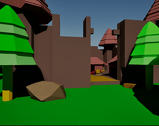
I was trying to figure out how to make the trees a little less static, I should have made the tree into 2 materials instead of just using 1 material and a UV unwrap. The "instructions" are always a last minute rush for me, sorry it was a little hard to figure it out. Thanks for play testing it! Art is not my strong suit, probably my worst skill.
Good game overall, didn't have any issues with playing it and art style plus audio all fit in really well. Nothing was overpowering anything (Audio wise) and it was easier to play after the first failed attempt. Only thing I had issues with was the speed of soliders coming in and leaving (or dying), if it started off a little slower to learn the basics of it, it would have been a great game.


