Thanks! Glad you enjoyed it.
Artdev Gil
Creator of
Recent community posts
My rating: 9.7/10 (very high for me, as I am usually a pessimist) -0.3 points because there could have been more depth to a mechanic (which I don't want to spoil).
I have watched almost every Sokpop game trailer because I love the visuals and music, however, I don't buy the game because I am cheap. However, I decided to give this one a go and I was completely blown away.
This was probably the most refreshing game I have played in a year. Even with it being targeted to a different audience than most video games are (as it is very beginner friendly), it is still enticing and the exploration, art, and puzzles were well put together. The art is what takes the cake for this game though. Even though the hand drawn style could be replicated digitally, the fact that Rubna (the specific member of Sokpop who made this game) hand drew on paper is such a beautiful touch. It really adds to the amazing aesthetic this game has and it is greatly in tune with the story itself as it revolves around human traits.
The only other Sokpop game I have played is Tuin - which I ended up really liking as well - and I noticed that some of the mechanics and SFX were taken from it, and even though some may see it as lazy, I absolutely love it as it makes each Sokpop game feel like part of one great artistically-unique universe.
Thank you so much Sokpop and Rubna!
Yeah, we kinda figured that the balancing was not done well the night the jam was ending with our first and last playtester. Kinda sad we didn't have to fix it, especially the boss fight since it was made the night before as well, but it is what it is. I'm glad you enjoyed the other parts of the game though and thanks for the review!
Ok, firstly, the art is absolutely amazing in this game. Character controller feels good. The difficulty level is also pretty mild which I like as I am not particularly looking for an insane challenge in a jam game.
I definitely think you could turn a game with this art style into a steam game. I think if you do, here are some things you might want to consider:
- The paper assets kind of detract from the rope and ripped out cardboard background, they don't really feel papery enough if that makes sense.
- The character is a bit fast for the precision of the platforming.
- The paper flipping during animations is a bit confusing, I thought it was a bug at first.
Other than that I love this game to its heart and great job!
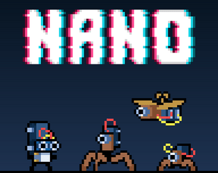
https://itch.io/jam/metroidvania-month-16/rate/1575097 - NANO by my friend and I!
Thanks so much for the kind comments! I'm the artist and programmer on the team and my friend is the audio designer. Both of us aren't level designers and I think we also noticed it while playtesting. Another thing that probably messed the level design up is that we were making it hard on our standards and for saying we spent a week playing our game while developing it, we got pretty good at it, skewing the difficulty of the parkour bits. Thank you for pointing this out though because we definitely learnt a valuable lesson for the future.
This is solid stuff. The movement feels really good (probably best out of any game in the jam) and I love the way you can quickly pull up the map as you discover more rooms + extra points since Godot is awesome. I think the art has a lot of room for improvement, especially the player in the level part of the game.


