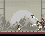
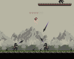
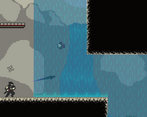
Everything looks amazing, the physics feel a bit off, and the movement overall doesnt feel that great but its understandable for a jam
Play game
Kitsune's itch.io pageResults
| Criteria | Rank | Score* | Raw Score |
| Overall | #4 | 3.894 | 3.894 |
| Presentation | #5 | 4.269 | 4.269 |
| Metroidvania | #6 | 4.038 | 4.038 |
| Design | #8 | 3.654 | 3.654 |
| Enjoyment | #8 | 3.615 | 3.615 |
Ranked from 26 ratings. Score is adjusted from raw score by the median number of ratings per game in the jam.
Engine
Unity
Team/Developer
Gearless June, PixiVan, Busy Hamster
Comments
Good:
- Really nice enemy designs. They feel genuinely challenging to fight, without being unfair. At least the Samurai do. I couldn't handle the ninja.
- Great art style. It feels like an old painting, or one of those wall-hanger scrolls. I love the pixel work on the background. Looks lovely.
- Good, interconnected levels, with lots of paths to explore.
- I was very amused by the merchant's fourth-wall-breaking comments.
Bad:
- I found the jump really awkward to use. It falls so fast, seems to have no coyote time, or leeway for jumping just before hitting the ground. I think the combat would feel amazing if I could reliably dodge projectiles, but half the time the jump just doesn't happen.
- It's a bit odd to have the map fully visible from the start. Hard to feel like I'm exploring when everything is marked on the map for me...
Overall, this was a really strong entry. I really enjoyed the aesthetic, and came very close to enjoying the combat. Some tweaks to how the jump works and this would be an amazing game. I hope you find time to develop it further.
Aw, I reached the end. If there was ever a jam entry that suffered from being unfinished, this is it: There's a lot to like here, which makes the emptiness regrettable.
I loved the graphics! The backgrounds in particular are beautiful. Fading out slightly as health got low was a nice touch. The music was quite good, though it got a bit repetitive. The "getting hit with a projectile" sound effect is weirdly cheerful for damage. The checkpoint sound effect is particularly satisfying.
Platforming controls were mostly good. But, as mentioned earlier the fall is oddly fast. I can remember no use for the dash, which is just as well because it'd be hard to use on the mouse (though I'd have liked to watch the fox dash more!) It was hard to use the mouse to attack: WASD and mouse might be doable, but WASD to maneuver and Space to jump and mouse to attack made combat too hard for my dexterity level. I ended up trying to run past enemies as much as possible, though this wasn't always feasible (at least until the fish dash): An individual enemy can have a whole lot of projectiles in the air at once, and they'll all catch up with you. There's a hitch when jumping and pressing into a wall that stops short of the full jump height, which made jumping up large steps more awkward.
Kudos on making the whole map available at once, that saved a lot of time going places with nothing but unusable money. I noticed that the gold doesn't actually get lost when respawning. Kind of cruel putting a checkpoint at the dead end of the forest. I found myself relying on the map to navigate, as I didn't get much of a sense of place out of the level layout.
I'd love to play a complete version of this game, I'll be following for progress!
This is a very good game! I really liked the art, sound and music (though it got a little repetitive). The level is well done and there’s lot to do.
I’d say the biggest detractor from enjoying the game is the controls. Having to use space for jump, but the right mouse button to dash seemed odd. Plus the dash didn’t go very far. I was able to use the left/right arrow keys to move. If jump had been the up key (or W for right handers), this would have worked a lot better while allowing the use of the mouse pointer to aim. Then the right mouse button being used for dash would have been fine - even preferable for a lefty like me – as no other key near the arrow keys really make intuitive sense.
I thought the enemies were a bit tough - but that could be the control issue.
When jumping right next to a wall, if I was moving into the wall, I couldn’t clear it to get the next level area above. I had to keep myself from doing this, otherwise I would be temporarily stuck. This also prevented me from getting away from enemies so I could come back at them on my own terms to compensate for the control issues. I died a few times because of this.
I went into the water just to see what happened. Insta-death. I’d either put in a warning about the fox being completely unable to swim or make it more forgiving and just take some hearts away every few seconds till the player exited the water.
I didn’t get out of the first area (assuming there’s more) and so I don’t know if I could spend the gold or not. But I think it’s cool to have an economy in metroidvanias. So, hopefully there’s a shop in the game or the game’s future.
Anyway, the game looks great and could be very enjoyable once the control kinks are ironed out! So, good job on this one!
We’d love to know what you think of our game! So please play, rate and leave a comment and let us know how we did! Thanks!
Great, your art and level design is pretty good, your control is good too, I love this game so much, there is nothing to complain GG!
This is the game I played for longest time, I enjoyed exploring very much, if you can polish hte movement and add a little more content it would probably make a commercial game
love the color pallet, and the title set, and the scattering coins, and that he turns ghostly as i hurt him, and the tutorial is so helpful, wow its such a beautiful world you've built. Pixivan i checked out your page, and wow!
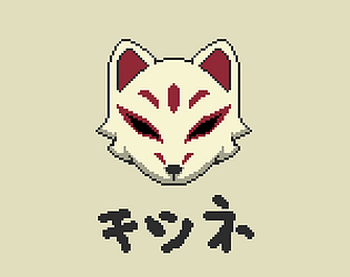
the cover image seems to read chishine.
I'm not super dexterous, but that game was difficult and the gravity seemed really heavy.
Beautiful aesthetic—really loved the art style and color palette. I wasn't a big fan of some of the sounds—for instance the throwing star sounded too mechanical to me, almost like a gun shot, instead of throwing a star. Minor nitpick, though.
Bigger issue for me was the control. Like others, I thought the gravity felt too strong, dropping the player really fast. I'm also not a big fan of Oni-style controls (WASD with mouse aim in a platformer). I personally just find the combat really inaccurate and hard to manage since the angle for fire changes both from the cursor moving and from the character changing position on the screen.
I disagree with Michael Greishofer's opinion on the merchant, and found him/her to be one of my favorite parts of the game. The look of the text was jarring, but I thoroughly enjoyed the commentary, and laughed out loud at the existential crisis comment. It is a jam, and we know that everyone runs out of time to do everything they wanted (except maybe Michael, his entry was like a full-length game and über-polished[!]), so I think there's room for being a little tongue-in-cheek about it : )
I do agree about the map, though. For me part of a metroidvania is the exploration, but having the completed map ahead of time takes away that part of the game. If it was intentional, I would argue that it wasn't helping the game. If it was meant to fill in, but you didn't have the time, well at least your heart was in the right place ; )
Overall I'd be proud to make something this pretty and polished in the time given. Nice work!
What I liked
- The art style and music were cohesive. It sounded like what I was looking at.
- You incorporated the shapeshifting theme pretty well.
- I always appreciate a map in my metroidvanias
- You really covered giving feedback to player in terms of attacking, taking damage, letting the player know exactly how much life they and the enemies have.
- Pickups are physics objects. I like that bouncing and rolling effect.
Suggestions/Feedback
- The tutorial/description texts stick out like a sore thumb. It would look more natural if the white panels weren't there. They also covered the player.
- Gravity felt too high. With coyote jumping some of the jumps were hard to make.
- The minimap has the same kind of problem as the tutorial/description cards. It conflicts with the rest of your game visually.
Overall this was a fun game and made well. Congrats on submitting!
The obvious problem with this game is that you weren't able to implement the shop.
This would have been fine, but there are a few things that make it really annoying. The first being that coins don't mean anything, and worse than that. They actively hinder the gameplay. I suspect they are physics objects that collide with the player and that's why you get slower when collecting them. But the real issue is that if you jump into a coin from below, you instantly fall back down. In some situations this issue had me stuck in a hole of coins for like 30 seconds without a chance of escape, while being shot at by enemies.
The second one is how you use the merchant instead. It functions as a story teller in the final game, this would probably have been a great use of the sprite, but the monologues he gives almost always break the fourth wall and just drive home the point that the game isn't finished.
I think you could have just made the best out of what you got, lets say you pay the merchant some coins and then he gives you a little bit of story. This wouldn't have been a massive time investment and would have made the game feel a lot more complete.
Another area where I feel like the game is lacking is the world design. Most areas area completely empty aside from coin boxes, which are not really that good of a reason to go there because of the things I stated above. Another thing that makes this even worse is that the entire map, including ability upgrades is visible from the start. At some point I just looked at the map to see where I needed to go next and skipped all the other optional rooms.
All of these things made the game feel way too big for what it was. When I reached the second map screen I was like "there is a second map ?"
And then after reaching the third one "Oh god there is a third one."
It really is unfortunate, because what good there is, is really good.
The transformations are really fun to find. They may be your metroidvania ability archetypes, but they were really well implemented and felt good to control. The combat, while simple was very satisfying and the enemy designs too were fantastic. Especially the horse riding boss that throws three projectiles at you.
The whole aesthetic was fantastic. Very reminiscent of traditional Japanese art.
Don't take this to heart though. It is very hard finishing a game of this scale. I would know, I have failed multiple times during the years. And the fact you have made this is amazing in itself.
Keep it up guys.
This is pretty fun! The controls were a little crazy (especially after getting all powerups, because you could wall climb on the ceiling) but the areas were pretty fun to explore and the merchant is a funny person. Great work!
(I love the background art btw)
Great game. It goes in a very good metroidvania-like direction. The game design is well thought out and makes sense. I also really liked that your game had a map. One weak point is still the physics, which makes it difficult to control the character. I bet you have the Gravity Scale or the weight of the player set very high. I would possibly set it a little lower so that the player has more time in the jump itself and can react to the environment there before plopping to the ground like a stone. You might be interested in this: http://www.davetech.co.uk/gamedevplatformer
If you found my review coherent and enriching, I would be happy if you could test our game as well :)
Beautiful game, amazing art and music. Gameplay and capacity are very cool. Enemis AI work perfectly and make very interesting movement. I love this game


Leave a comment
Log in with itch.io to leave a comment.