Play game
Cardventure's itch.io pageResults
| Criteria | Rank | Score* | Raw Score |
| Presentation | #1 | 4.560 | 4.560 |
| Overall | #2 | 4.050 | 4.050 |
| Design | #3 | 3.960 | 3.960 |
| Metroidvania | #4 | 4.120 | 4.120 |
| Enjoyment | #10 | 3.560 | 3.560 |
Ranked from 25 ratings. Score is adjusted from raw score by the median number of ratings per game in the jam.
Engine
unity
Team/Developer
Shahar Bengad
External assets
some sound effects were taken from zapsplat.com
Leave a comment
Log in with itch.io to leave a comment.


Comments
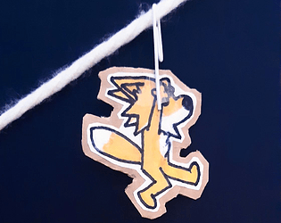
I love your art style so much.
I gave this game high marks. The design is wonderful, the pickups are impactful, the level design is solid, the music and sound effects fit well. More than anything though the game is polished. The game feels and plays like a polished game I would pay money for. So many other games in the jam feel rushed. They feel like they were made in a few days or over a long weekend instead of over the course of 30 days. You've really got something here.
More than all of that this is the game I keep coming back to. I find myself with 10 minutes to spare I might load up your page and play for a little while. Really, really, good job here. You should be proud of what you've made.
Adorable, clean, consistent.
I absolutely love the saving in form of the little burrow and the pickup sound is really satisfying.
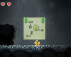
Map could be a pause so the butterflies don't kill us while checking location.
★ Enjoyment: 5/5
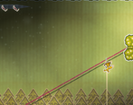
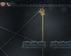
I enjoy the 'flying fox' mechanic a lot (the gliding on the string), it's really fun!
★ Design: 5/5
Gliding part is quite unique! It restricts movements to some patterns but still felt fun.
★ Presentation: 5/5
The art style is cute!
Notes: I died from the spider and loaded back to the cave before, but then I got stuck. Since I didn't know what I need to do, I refresh the page and then it sent me back to the start of the game without being able to continue.
Good:
Bad:
Overall, this is my highest-rated game so far. It's incredibly well-polished, with some really nice ideas. Fantastic work!
It's alright, but the ziplines are way too slippery and the spikes reset you instead of just doing damage, it makes parkour annoying.
I loved the concept and the art, gameplay is good,
Got stuck after spider boss though
I loved the concept and the art, gameplay is good,
Got stuck after spider boss though
As everyone has said, the art in this game is amazing! Coupled with the soundtrack which just matches so well, it’s presentation is off the charts! And the controls are really smooth as well!
But it’s too difficult. Maybe some fewer enemies, or maybe even more responsive controls are in order. I’m not sure. But there are parts where I was just resigned to tanking damage to get past and that’s not fun. I noticed that I could use a game pad’s left stick to move, but couldn’t use any buttons to jump. Not that the instructions indicate game pad support, but it would have been nice to be able to use the game pad.
As I made the level of our game I wondered if it was too difficult in parts as well. I would love to hear what you think about our game in that regard or any other that spring to mind when you play it! So, please try ours and let us know what you did and didn’t like. Thanks!
It's so cute! The artstyle has so much flavor and you've really made it work. The little details sprinkled everywhere really make me feel like I'm playing inside a cardboard box.
The platforming is great imo. I managed to get a hang of everything pretty quick~
Very inspired game, great job!
Ok, firstly, the art is absolutely amazing in this game. Character controller feels good. The difficulty level is also pretty mild which I like as I am not particularly looking for an insane challenge in a jam game.
I definitely think you could turn a game with this art style into a steam game. I think if you do, here are some things you might want to consider:
- The paper assets kind of detract from the rope and ripped out cardboard background, they don't really feel papery enough if that makes sense.
- The character is a bit fast for the precision of the platforming.
- The paper flipping during animations is a bit confusing, I thought it was a bug at first.
Other than that I love this game to its heart and great job!
Your art so cool, I very love it and I like the way you design the world too, this game so fun <3 I like the control and I can choose different weapons, but I think Choosing UI is hard to see (for me :( ). Yeah, I love this game so much, GG!!!
Really fun creative direction! I love all the little details with Scotch tape on the selector wheel, the cardboard edges, and even the cardboard texture on the loading screen. I personally wasn't a fan of the animation frames flipping effect, though—it was a little distracting for me as it looked like a mistake (like when an animation is missing frames), but I get what you were going for.
As far as gameplay, I thought the controls were a bit too loose. The character felt slippery and it was difficult to land jumps with much accuracy. I agree with some others that at times it felt like I had negative coyote time, falling off the platform before I expected to when trying to make a jump. The beginning, too, before you get a weapon is harsh. Too many small platforms where the enemy takes up nearly half the space was punishing while you're still getting used to the feel of the game's control. It was actually harder for me to get to the paperclip than it was to do anything else in the game and I nearly gave up at the beginning except for all the praises in the comments.
I did like the boss fight and the distinctive look of the different areas. The paperclip zip-lining is really satisfying, especially in long combos like the big vertical room. Going up the ziplines, though, wasn't clear, and I 100% agree with Starboi hooch that having the player have to use it to get out of the room/area with the clip would have been a huge help in teaching the skill.
Overall: could use a little love in control and balance but the mechanics are fun and the aesthetics are fantastic. Awesome job!
(PS - I'm jealous that you nailed the dust motes I'd wanted to do in our game xD)
Perfect. You have won. End.
THIS. WAS. AWESOME.
It wasn't very long sadly and lacked an ending, but its a game jam so that's excusable.
The movement feels great. The combat feels great. And the style is amazing (but you already knew that).
What makes this one so good in my opinion is that I actually had to think as to where to go next. The map is memorable and well designed and at the end I knew exactly where I was. This is what differentiates a good metroidvania from a great one. And you nailed it.
I also really enjoy the little optional heart pieces, with my favorite one being the one where you have to figure out that you can use the momentum gained from the zip lines for a big jump.
The boss was very good designed as well. I just think it had a bit too much health.
But I also have a few nitpicks:
This is my favorite game so far. Well done.
This game is so visually pleasing, and the music is very fitting. Sound design is on point as well. I loved the changes between the first scenario and the second, and the fact that the same ziplines that were so colorful at the beginning of the game looked like spider webs in the cave (at the point I got to the boss I was 100% certain on what it would be haha)
I found a bug while fighting the boss for the first time, all ziplines stopped working (I think I died right when it disabled the ziplines after hitting it, keeping them all disabled forever), however I got to the end of the game on my second playthrough. Oh, and the boss reminded me so much of the Donkey Kong bosses, including the camera movement, that was pretty cool.
I enjoyed the challenge of getting the HP UPs, it really added to the game.
My only issues were the platforming (especially while getting used to it at the beginning) and the combat, but nothing too problematic. As other people said, coyote jumping would probably help a lot. My grip with combat is that it seemed I had to be very very careful when getting up close and personal with the enemies, and some of them were waaaay too vicious IMO (lol I'm looking at you, bat). Also, I think the first one should be squishier, maybe die in a hit or two.
I personally think you did a stellar job with this one, the game is full of personality and creativity. I'd also love to see a game like this finished and polished.
Looks amazing.... sometimes feels like it has the opposite of coyote time (I think this is due to the soft round edges of the platforms).... I keep missing/dying trying to jump on the edge or from the edge of a platform... but minor gripes on one of the most stunning and interesting games in this Jam!
Great Job, bit more polish and this would feel like a profession studios release!
Visually awesome!