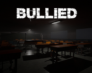
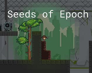
I would suggest to make the spacebar show the full line of dialogue when it is pressed during the dialogue typing animation. That way, I can quickly go through the dialogue if I wish.
Gothamz
Creator of
Recent community posts
Thanks for the feedback! The bug on the fourth screen was actually a known issue that we were only able to fix after the deadline for the submission, unfortunately. The bug later on is probably caused by bad checkpoint hitbox placement, which I'll look into. Also, if we didn't run out of time, we definitely would've created in-game directions and controls.
I do see where you're coming from about the brightness, as I think we were hyper-fixated on the few light sources that some parts of our game may be left in the dark.
Again, thanks for playing and giving us your thoughts.
Good idea, and great implementation of the scale model of the room. There are a quite a few submissions playing around with the idea of a large and small version of the same room, and this is a pretty well executed one, for sure.
I think if the scale model starts off in a diagonal view, such that the 3 circles used to control the axis rotations all seem to be different shapes on the screen, it would be easier to rotate the model correctly. Also, lighting could be a bit better.
Overall, a fun game!


