Play game
Shadow Escape's itch.io pageResults
| Criteria | Rank | Score* | Raw Score |
| Style | #3670 | 2.835 | 3.750 |
| Overall | #3952 | 2.740 | 3.625 |
| Creativity | #3965 | 2.835 | 3.750 |
| Enjoyment | #3989 | 2.551 | 3.375 |
Ranked from 8 ratings. Score is adjusted from raw score by the median number of ratings per game in the jam.
How does your game fit the theme?
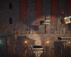
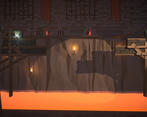
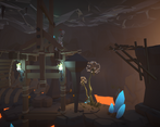
Players can step on shadows created by movable lights within our level. There are also scalable platforms the players can use. Press R to restart a level, and click on glowing blue spheres to move the light source. You can also move the light source closer or farther by scrolling the mouse wheel, which affects the shadows' scale. Left/Right click on outlined objects to make them larger or smaller.
Development Time
96 hours
(Optional) Please credit all assets you've used
Click on lights to move them, scroll wheel to push and pull them. 'R' to reset to last checkpoint
Leave a comment
Log in with itch.io to leave a comment.


Comments
The game Idea is really unique and one of the best this Jam, I had a lot of fun playing it.
Having slightly better UX and UI alongside SFX will help.
Usage of shadows is really great. and level design is awesome.
Also you sort of don't have a decent User feedback on when you die or lose so setting a level fail will help and also having a tutorial in game or just explaining what button and what object does what will definitely help.
One of my fav games this jam
Really special thanks for liking our game !!!! It really makes me happy that our work has become one of other people's favorite games !!!!
Based on the feedback we've received, we did focus a bit too much on the implementation of the mechanics and levels, and neglected the other part of the user experience, the UI and some feedback issues. We should be fixing these annoying issues in the ongoing development we're likely to do.
❤️❤️❤️
Interesting take on the theme, you start with basic size changing then go on to manipulating the light to control the scale of the shadows.
Not a bad and fairly polished idea, but there are a few critical bugs.
On the forth screen, moving the light source to certain spots just killed the player for seemingly no reason. And later on, at the screen after the ramp with spikes on it I got stuck in a perpetual loop of dying after a fall, pressing r didn't help either.
Overall some sort of in-game tutorial would go a long way. I didn't even know I could control the proximity of the light source via the scroll wheel until I checked your theme explanation whilst writing this comment. Which now I know makes a lot more sense in regards to how the game fits the theme.
Also as ironic as it is being a game about shadows, I think the game could be a little brighter overall, it was hard on my low brightness screen to see the character and obstacles when they weren't directly in the light.
But regardless of my nit-picks, good job on completing this submission.
Thanks for the feedback! The bug on the fourth screen was actually a known issue that we were only able to fix after the deadline for the submission, unfortunately. The bug later on is probably caused by bad checkpoint hitbox placement, which I'll look into. Also, if we didn't run out of time, we definitely would've created in-game directions and controls.
I do see where you're coming from about the brightness, as I think we were hyper-fixated on the few light sources that some parts of our game may be left in the dark.
Again, thanks for playing and giving us your thoughts.
Thanks for the review of our game.
Indeed, there were some bugs that were not yet fixed when we submitted the game. And as you pointed out, we may have overlooked the importance of UI hints during production, thanks for the heads up.
When I started designing the game, I did think about how to make the shadows stand out more to enhance the theme, while also trying not to confuse the player as much as possible as to where exactly they are.
Probably due to our technical limitations, designing the levels for this game on paper looks like it would be easy, but the difficulty of getting the levels in the engine to run as smoothly as they do on paper did exceed my expectations. :(
After this poll is over, we'll do possible ongoing development and make the player's path look uninterrupted by walls and such.
All in all, thanks for enjoying our game! :)
Insane amounts of polish here! Nice execution of the theme too!
Thanks! Happy to hear that : D
I like that you manipulate and take advantage of the shadows indirectly. You're not just resizing objects in the level, but you have to manipulate the light source and work out the shadow casting three-dimensionally. I just wish it was a little bit clearer which parts of shadow I could stand on. It'd also be interesting to see multiple light sources in a single screen!
Thanks for your advice! We have tried to make it clear which part of shadow players can stand on, but we can't think of a nice solution, and the only thing we could do is to make platforms that might confuse players to not casting any shadow.
For the second piece of advice, well, since many levels already have multiple light sources, I guess you're hoping to see multiple movable light sources —— this is possible, but we failed to design levels that are interesting and contain multiple light sources. Perhaps we'll figure out how to do that in the future.
The artwork is GORGEOUS and I love the idea of the shadow platforms! However I did get stuck in an endless loop where I failed the level but then I was being sent to the next one and then back to starting the failed one and so on
Sorry to hear that, and we're so glad that you like our core mechanics.
Could you please share a screenshot for the level you failed? Perhaps we'll be able to fix that.
By the way, pressing R allows you to restart a level, and you can click on the blue glowing spheres to move the light source. You can scroll your mouse wheel to make the light source closer/farther. You can Left/Right click on the outlined objects to make them larger/smaller. The controls are shown on the game page, but it seems that Itch is not showing the game page here.
So essentially from level 3 to 4 I tried this - questionable - jump and ended up in this loop. I did try to press R to restart the round but it didn't budge. This isn't me nitpicking, I understand I wasn't playing the game as intended but I thought you'd like to know this detail. Overall, great game and good use of the 'scale' theme!
Happy you enjoyed the game, and thanks a ton for showing us the bug, it was actually just a simple checkpoint collider placement issue!
Thanks for loving our artwork!
Really cool idea! The use of the shadow as platform is really cool. Nice game ^^
Thanks! Glad you like it ^^
The game doesn't scale with my monitor. It looks like it only works on 4K monitors or something like that.
Thanks for your comment, and we're sorry to hear that the resolution is not working properly.
Could you please try the following steps?
1. Set your display resolution to 1920x1080.
2. Open the game and then close it.
3. Set your display resolution back to your original setting.
4. Open the game again.
By the way, the designed resolution for this game is 2560* 1440, and it should work fine on normal 2K or 1080p monitors (since it works on my laptop, with a 2560*1600 monitor, and I've tried setting my screen resolution to 1920*1080, where the game works fine as well). I guess I might have misconfigured something so that the window failed to fit with your screen, but I can't change the uploaded project at this time since Itch is limiting it.
Again, we're very sorry to hear the problem, but unfortunately, the help we are able to provide is limited.