many thanks ! I will fix the bugs! and there's a few stages remaining to add so it should have more to offer later on.
ren
Creator of
Recent community posts
well I didnt think anyone would be able to complete it in the current state (I couldnt check the bugs of the upload until much later), so good job with that!
and also because some spells were very hard even for me (as insane intended, though I still think some of them are too easy and instead of more spam need more creativity in their construction)
and I know its a mess, it will get better! (hopefully)

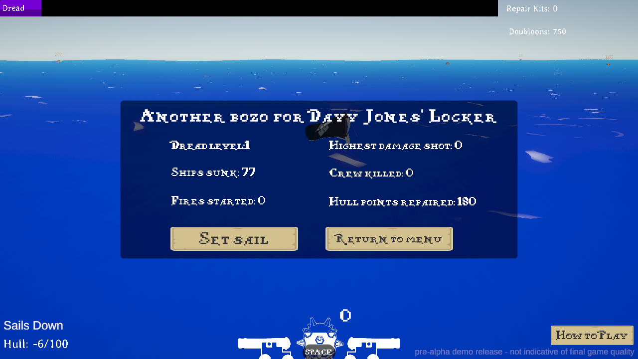
I greatly enjoyed it, I wished you could add the option to enable some sort of indicator for the shooting direction (until I got the hang of it, it was pretty hard to aim).
I guess you could also add other types of smaller ships to choose from with a forward cannon or for ramming purposes to add more variety.
The "roguelike" part of the game feels very underwhelming, so I'd suggest to focus on the mechanics and the variety of things to do instead, since it has potential for a nice long campaign.
Nevertheless it was great. Keep it up.
I was a bit confused in the beginning, but now I wonder more is in which direction do you intend to bring this game, because as of now it seems you might stumble on very linear choices or just die, where you should have lots of options even if they're not optimal to make it more interesting.
It needs lots of work on the UI to make it easier to understand, but I like the idea.
Thanks for trying the game!
I still didnt migrate most of the complicated patterns from the previous version I made (most of the ones right now are very generic) and since its a standard difficulty with little variation I can't gauge at which point the real difficulty of the game is.
The amount of bugs is pretty concerning, but that was just in the rush to have something to show. Hope you try it again some time later when it gets finally complete!
loved the game and the sheer quality of everything!
now on the demo, I think you could add more directions (I took a while to realize blue and yellow were mana for the weapons, which is kind of important when you start and waste all of it without noticing) - while writing I noticed I accidentaly skipped the tutorial and just pressed A to get the key (do with this information whatever you like)
the indicators were also a bit too far from eachother, hp bar on the left corner, counters on the right corner, and character middle bottom, makes it very difficult to pay attention to everything in a fast situation (you'll just start ignoring at least one).
also, I think the camera can be a little more centered, specially near the bottom or you almost lose sight of your character (maybe you can just fix it by extending the map terrain at the end)
The concept and graphics seems nice, but the controls are very unresponsive
if you keep either left or right pressed the balloon direction keeps going back and forward instead of a full circle, making very difficult to fly fast (the only realistic option is to hover by pressing Up repeatedly).
Also I would have expected to still be able to glide a bit when the balloon is deflating, but you just fall flat on yourself, you could achieve that later by pressing down maybe? (just a suggestion).
looks really well polished for being a first demo, the whole 1 hp its a bit frustrating at the beginning, but seems pretty catchy after figuring the controls
i'm not sure if I was missing something, but like a double click big slash could be a nice fit? and I didnt know if the items the monsters drop did anything still
overall pretty nice, gonna keep watching it
really liking the detail invested in the levels and abilities
sometimes the options did confuse me on their meaning and the overall game direction made me wander aimlessly for a bit, but I guess its part of its style as well
saw some improvements since 48, and I'll be looking forward to check it again later
the mechanics look fine, though it was a bit annoying when enemies come too fast so I would suggest making the game just a little bit slower, but I guess you intend to make mazes full of traps and more complex enemies in the future so that issue should fix itself
other than that looks great
be aware of a small bug of firing noise playing non stop after loading if you can (web player)


