Sure thing! Hope you found the guide useful. I do need to go through and give it a refresh sometime soon.
Star West
Creator of
Recent community posts
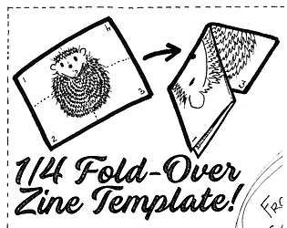
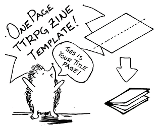
Hey there! There should be a file in the .zip that explains how to assemble it, but if it isn't clear enough, here is a site that has a video walking through the steps and may explain it better than me.😅 https://www.42ndstreet.org.uk/support/read/how-to-make-your-own-zine/
I'm glad you liked them, but I don't get any credit for those! Kona from Darling Bat Games (https://darlingbat.itch.io/) made the Affinity templates for this project.
It's been a while since I've messed with it.
The class you're looking for is .inner_column.
The profile sections each have a div with the assigned class .inner_column. These sections are profile_header, profile_content, purchased_games, and collections. Collections is further divided into a separate row (class="collection_row") for each collection you display, and there is a child div with class .inner_column within each row.
I meant to do a styling guide at one point, but it ended up on the back-burner, and I just haven't had the time to get back to it.
Here's the custom CSS I'm using on my profile page at the moment:
.game_grid_widget {
text-align: left; !IMPORTANT!
}
.game_thumb {
border: solid #000 1px;
}
.inner_column {
background: #EDD5BE;
border: #271C14 solid;
padding: 50px 50px 30px 50px;
border-radius: 25px;
}
.footer {
background: #333;
border-top: #271C14 solid;
color: #fff;
}
.game_column::before {
content: "My Games";
font-size: 1.5em;
font-family: '04b_03',Lato,LatoExtended,sans-serif;
margin: 0 0 10px 0;
font-weight: bold;
display: block;
}
There is a lot going on in this game mechanically, and it took me several read throughs to really make sure I understood how the components all work together. And, while there's nothing wrong with that, as a one-pager, I could see it giving folks pause when considering whether or not to play it, and I really think this game would shine in a slightly expanded format (like a little 4 page 1/2 letter zine) that really lets you lay things out and provide some examples.
- Using the cards to build a map is a neat idea (I've seen many other ways of generating maps on the fly, but I haven't seen it done where the cards make up the literal map before.)
- I also really like the call out regarding medications and the impact to healthcare you run into if our systems just stop working...I wish you'd leaned into that a bit more even as currently it's presented as an option rather than a required choice.
- You specify that Players should make decisions regarding stats to use collectively, but what happens when different Characters want to take opposing action? Is there any way the game can support that?
- I would suggest removing the "goes mad" bit. That has some strong implications you may not want to force on players; sometimes keeping it to the vague "loses all hope" and let the Players decide what that means.
When you get down to it, elaborate madlibs are basically the core mechanic of most trpgs (especially story games!) Your choice of prose and prompt does a good job of balancing the direction of the story forward while leaving the player with lots of options to insert their own ideas about what actually takes place in the mind's eye. And, while the distinction between prose and prompt is very clear with the switch to (parenthesis and italics text) I do think a bit of layout work could make that really clear and be used to strengthen what you're trying to accomplish here!
Firstly: Kudos on the text-only version. You may want to convert it to a single column as some screen readers struggle with multi-column formats.
The roll-under attribute mechanic here is an interesting choice, and something I'm always personally conflicted about: on one hand it's an easy way to have higher attributes = greater mastery without having to do any math, and on the other I find that folks can sometimes struggle with roll-under because it goes against the ingrained impulse that "higher is better." Regardless, it shouldn't take folks long to grok and get into the rhythm of it, and I think it's a great simple way to handle resolution.
The attributes (Swim, Song, and Solve) are great, and the GM support is solid and super appreciated. I'm still not convinced about having the Seen mechanic force folks to abandon the town as that can result in a Player having to sit out for a potentially long portion of the game; as a reference to Honey Heist it makes sense, but that's also one of the things that I personally dislike about Honey Heist.
The over-under approach to rolls based on size (where certain things get harder/easier as your size changes) is a clever approach to handling challenges, as are the split rules for mitigating damage (which can result in the creation of new potential challenges with your dopplegangers/split slimes.)
This game would definitely benefit from some additional guidance regarding facilitating challenges:
- I didn't see anywhere that specifies whether it uses a GM or not (I could see play happening either way, but then there are some questions about how the story/challenges get structured and how the amount of damage dealt is decided.)
- Some advice on creating an adventure and what sort of challenges a slime could face would be beneficial (I think you originally had some on the draft) but that would be hard to fit in with the limitations of the one-pager space.
The resolution mechanic on this is cutting edge. 😜 The theme of this game is wonderfully weird with novel mechanics to match. The physical challenge involved could definitely be frustrating for some, but I expect that would be offset by the fact that the game is clearly supposed to be goofy and absurd. I like that you went for a GM-less game, but outside of the "What are we doing" set-up there's very little direction about what to do when, which can result in folks struggling to know what to do next (this is one of the challenges I regularly see with No Dice/No Masters games;) I feel like you could use a final step after determining consequences that explicitly hands narrative control to another Player and drives the shenanigans forward.
Definitely my favorite theme of the jam! I love the use of an actual map to claim territory, using odd bits for tokens, and the suggestions for "calamitys" (e.g. farmer's market, concert.) The d6+stat resolution is tried-and-true solution pretty much anyone who's played a TRPG before will be able to pick up quick, and while I'm still unclear on what it means to have "Advantage," if I were to run this I'd be able figure something out.
I assume image should be the same size your game res is or higher
Based on what I was seeing on other game pages, that's the answer I was starting to lean to. Every example I saw had the embed BG image resolution at the same resolution or a larger resolution than their game.
Without having an html embeded game to test for myself, I couldn't say with 100% certainty that was the answer.
Glad to hear that you got it resolved!
Here's an example of how it gets applied in the code from Mingle (right click on the image and select Open in New Tab to see it clearly)


Mingle is using an image that is 1920x1080 for the embed BG, and the game_frame div is 640x360. So the image being used is bigger than the dimensions of the frame. There's a gap on either side because the game_frame is only 640px wide while the inner column is the default 960px.
Here is a handful of games using it:
- Mingle
- this game about chickens
- Lookouts
- Wayfarer
- Assessment Examination
- Vampire Survivors
- Tenjutsu
- Dynacore
In every case I've looked at, the game creator has uploaded an image that is slightly bigger than the dimensions for the frame containing their game (i.e. the game_frame div).
It also looks like you can use a GIF if you want to use an animated image; the chicken game and Assessment Examination linked above both use gifs.
Can you send me a screenshot of the specific issue you're having? I'll can see if I can figure out the problem.
Hey there! I'm going to have to look into the Embed BG option, as I've never done an embedded html game before.
I couldn't find anything in the itch documentation on Embed BG...just this comment in the forums: https://itch.io/t/213380/whats-embed-bg-in-the-theme-editor
From some initial poking around, it looks like the image is being assigned to this div with the game_frame class on it. It appears on both the iframe and click to fullscreen embeded game variations.

Two other developers and I were just talking about this on Sunday.
We would love to work on more collaborations together on itch, but the current way projects are handled make that challenging. We're not a studio and we all have our own separate individual projects we are working on, but we occasionally work together a project (usually part of a game jam), and with the current way projects are handled it's super not ideal.
We can't set up a revenue split to give us each a cut. Instead for each project we need to decide who's going to be the primary developer, and then someone has to keep track of that when a purchase does come through to make sure the correct amount gets dispensed out. It's super messy and it means we're less inclined to do full scale collaborations simply because we don't want to rip off our friends, but we also don't want to have to manage payouts to each other.


