Indie game storeFree gamesFun gamesHorror games
Game developmentAssetsComics
SalesBundles
Jobs
TagsGame Engines

jasper

22
Posts
4
Followers
A member registered May 31, 2022 · View creator page →

Creator of

Recent community posts

The game area turned completely black when I merged my two lvl2 skulls (with bones) today. I suspect it had to do with the achievement that it tried to give me.

It was the first time I played on this version and the first time in that game that I got a unit to level three. I was playing on Newgrounds and It showed a notification about an achievement that I got. However, I was not logged in to Newgrounds, so I couldn't actually get achievements. I was playing on Chrome.

(1 edit)

I'm not a big fan of the newly added Royalist enemy unit. It does add some depth to some choices, but over all, I feel that it makes any strategy that uses ranged damage less viable making it so that my games look more the same than they did before.


I do really like the tier changes affecting summoning units, as it adds more depth to that strategy.

I also still very much love the game and I'm very happy that we're finally getting updates again!

Thanks for resolving the issue so quickly!

(1 edit)

my email is <redacted>

(1 edit)

I'm also experiencing the problem described below by Askat: after buying the "Super Sale bundle", the download pages only provide the free downloads...


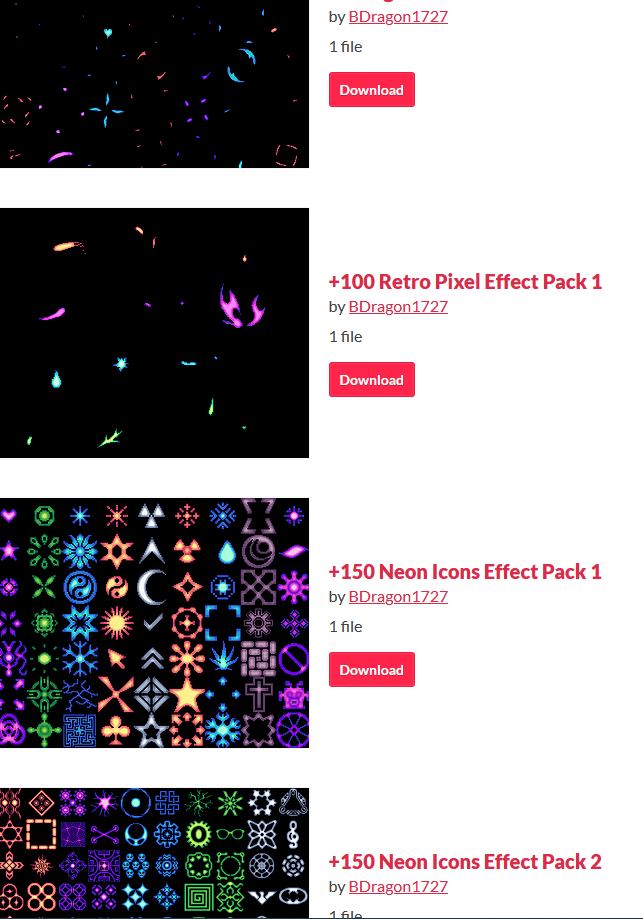
Can I recommend adding a text at the top of that image that says something like "More effects in 'Pixel Fire Effects || FX'!"?

Without such a message, it was not very clear to me what effects were and were not in this package. I figured it out looking at the other page, but it should be clear from this page. Such a message will probably make for more effective advertising and prevent people from misunderstanding what they are buying at the same time.

(I'll probably buy both sets either way, so it's just a suggestion from my side, not a complaint)

Is it me or is the last image not from this asset, but from "+60 Pixel Fire Effects || FX"?

Great tileset, and I'm using it to create a background for my game. Definitely

A few small points of feedback:

  • The shadow for the stairs seems to be missing from the pngs (the ones going from bottom middle  to top left at an angle)
  • The shadows require you to have transparency for them in your toolset, which mine (ogmo) doesn't support. Partially transparent images would be better, in my opinion
  • The bush tiles aren't spaced far enough apart to use as 32x32 tiles - you'll end up with the left part of the next bush in the tile of the right part of the one you want
(1 edit)

That makes sense!

The way I'm using the character, it's more like a conflict between lefties and righties. I guess that is the inevitable outcome anyway... ;)

Thanks, Looks great!

Will probably get these. When I get to the point where I can use them, which is quite a ways out still.

Wait... does the character suddenly become right-handed when he is facing right?

(It probably doesn't stand out unless you're as semantically satiated as I am right now...)

Does this include animations for characters facing left and right? If so, could you provide a preview of those?

Ah, I thought you could shoot if you had a zombie with a gun and you would need the mouse for that. I'd still prefer not to change my hands that much between the modes. Maybe clicking to take control of a zombie or scrolling through the different zombies could make for a good alternative control scheme

By stopping completely I mean that if you press and hold both A and S (for example), your character doesn't move.

Very nice way of working with the theme. I like the concept a lot. Unfortunately, I got stuck on the second level already. It took me a lot of fiddling to get the block into the deep part and then when that didn't actually solve the puzzle I didn't have the patience to continue. I do realize my patience is lower than usual at the moment, so that's probably a part of it too. I did get stuck in platforms a lot, but after not understanding it at first, I did always get out pretty quickly after that. Oh, and keeping the portals in separate areas  in the first level was a great choice to help the player understand the game!

I like the concept a lot, but the execution didn't quite click for me. This went from small things like not moving when pressing both W and D (I think diagonal movement makes sense for a game like this, but even if you don't do that, just pick one direction instead of stopping me completely) to more major things like not having three hands during zombie mode (WASD, arrow keys and mouse). I also didn't quite catch it when I went back to regular mode and got slaughtered by a shooting zombie before I figured out what had happened. The art  is great, though, and fits the game like a glove!

Very interesting game. I think the how to play should have been in a much more obvious location and I didn't like the toggle for the weapon instead of just holding to keep shooting, but I think the concept, art and gameplay were really good.

I just played two games where I rushed to the king (I hadn't done that since the update yet) , and I got a turn 9 and turn 10 win, but both required strategizing and were close calls, so I'd say that's a lot better now.

Maybe the king could start scaling very aggressively at around turn 12? That way, a turn 16 win should still be quite possible, but be less anticlimactic. And beating a 50/50 king at turn 20 (which should be very possible) would feel satisfying as well.

Not to a relevant degree, though. If you rush to the king, you don't really stand a chance. On the other hand, if you use strategies to actively slow your progress towards the king (rely on spells whenever you can, build as few units as you can get away with in the early game, use inefficient troop placement later on, use the protection spell to knock out your own shields) you can get to one guy that is stronger than the king (equal health, and 3x attack) that can solo the king line and survive with plenty of health left, two guys behind him that that could have taken out that line together if the first one wasn't there, and enough to easily handle everything on each of the other two lines.

(1 edit)

I really like this game, except for one bit: the fact that the boss comes out when you've done enough damage to the enemy between the levels. It creates this pressure to build a team that's good but not too good, otherwise it'll get you to the king before you're ready. And that's just not as fun to me as building the strongest team under some other type of time pressure.

To be honest, I feel that's the better way to experience the game. I added the text explanation based on feedback on early builds, as somewhat of a bandaid. I think I'll add animations and things like that in a post-jam version to help with the natural process of understanding the game as you play it. 

Fun game. Never thought I'd see a game in the "penguins can fly" genre this jam. I do wonder if this would have been better without dice. Or at least, without the rolling of the dice, the table-top theme and the types of upgrades were great.

At the end of a turn, when you and your opponent deal damage, you also get one energy per lightning symbol rolled. This is tracked below the buttons, next to the rolls and pins, and energy does not disappear (except at the end of a battle). Starting at your next turn, you can use the energy on the abilities, each ability can be executed only once per turn. At the end of the turn, when the damage is done, the ability is locked in, before that time, you can click it again to turn it off and you'll get your energy back.