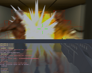
I liked the music and the graphics. Gameplay is good but enemies take too many shots to die at the beginning. Couldn’t encounter any bugs though.
lolerji
Creator of
Recent community posts
It was a really creepy game but in a good way. The enemies spawning just as you turn makes you stay on your toes all the time which I enjoyed. A bit of a hit feedback like basic effect would have made it better. Also, sometimes the enemy ants spawn just in front of the player, that breaks the illusion a bit, if that can be concealed, I think the game has a really good disturbing atmosphere :)
Controls feel good, they are responsive but I think the pacing is a bit too linear for a danmaku game, the attacks feel empty, there is not much feedback for when you are hit and when you hit or kill your enemies. Also, the enemies and the background detail is all the same color and almost the same size (I am talking about the stars) so tracking the things you need to shoot becomes annoying fast.
Thanks for checking out our entry!
Unfortunately we were not able to spend as much time on the project as we hoped as we all were extremely busy throughout november. So the character model is not ours, it is just a placeholder we used to also try out a dynamic bone asset and so on. So if you like the model be sure to check out the creator's sketchfab page, it is linked in the description.
To leave the starting area try to sprint by holding shift and jump to the platforms.
First of all, thanks for playing Bastard Sword and also leaving a comment.
The intro was fast. We probably should have made it more visual novel like and used more intervals between auto transitions the next text animation, while giving the player the ability to skip the current animation. Do you think that would be a good way of tackling this problem?
Regarding not being able to find your way in the map, we were hoping the bright lighting of the doors and the teleportation platform would make them stand out from other things in the scene, but apparently they were not enough. I am generally against the idea of introducing tutorials especially about visual things in the scene, because I think tutorials disrupt the flow of a game and generally bother players by forcing them to do certain things to teach them how those work while the player just wants to quickly dive into the game world and the actual gameplay.
Of course, certain game mechanics or elements can only be described using tutorials, in which case there should be a tutorial for those; others, I think should be described via convenient level design or lighting, convenient feedback, anything that can be incorporated into the gameworld rather than a tutorial. We tried to do it that way, and failed worse than we expected. Another aspect we need to improve upon.
Once again, thanks for the feedback and have a nice day!
Thanks for the feeback!
We honestly didn't test the game enough getting carried away by our enthusiasm, and that the deadline was 2 hours away when we finally built the project for testing. I encountered a crash and found the reason, patched it then we both tested it by playing the game twice each from start to end, didn't experience any more crashes, so we assumed it was solved. Apparently it was not.
About hitting the enemies, there is a particle effect that plays only when you hit an enemy, a red spark burst thing, but I guess it wasn't as obvious.
Now we know for sure what we need to improve :)


