Play game
Bastard Sword's itch.io pageResults
| Criteria | Rank | Score* | Raw Score |
| Graphics | #784 | 1.746 | 2.667 |
| Audio | #987 | 0.655 | 1.000 |
| Theme | #1009 | 0.655 | 1.000 |
| Fun | #1011 | 0.655 | 1.000 |
| Innovation | #1011 | 0.655 | 1.000 |
| Overall | #1012 | 0.837 | 1.278 |
| Game Design | #1016 | 0.655 | 1.000 |
Ranked from 3 ratings. Score is adjusted from raw score by the median number of ratings per game in the jam.
Leave a comment
Log in with itch.io to leave a comment.


Comments
The game looks pretty good but I didn't undestand what I was supposed to do.
First of all I found the writing at the beginning of the game too fast to read so I didn't completely get the story.
I tried to explore the map but it was hard to understand where to go because the sword got stuck in the terrain like 100 times and it was really hard to damage the enemies without getting hit so the two things combined made me quit the game very fast.
Maybe a little tutorial would help and also some hints on what to do.
First of all, thanks for playing Bastard Sword and also leaving a comment.
The intro was fast. We probably should have made it more visual novel like and used more intervals between auto transitions the next text animation, while giving the player the ability to skip the current animation. Do you think that would be a good way of tackling this problem?
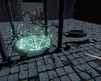
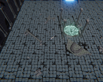
Regarding not being able to find your way in the map, we were hoping the bright lighting of the doors and the teleportation platform would make them stand out from other things in the scene, but apparently they were not enough. I am generally against the idea of introducing tutorials especially about visual things in the scene, because I think tutorials disrupt the flow of a game and generally bother players by forcing them to do certain things to teach them how those work while the player just wants to quickly dive into the game world and the actual gameplay.
Of course, certain game mechanics or elements can only be described using tutorials, in which case there should be a tutorial for those; others, I think should be described via convenient level design or lighting, convenient feedback, anything that can be incorporated into the gameworld rather than a tutorial. We tried to do it that way, and failed worse than we expected. Another aspect we need to improve upon.
Once again, thanks for the feedback and have a nice day!
Yeah I would have preferred to have a fixed text for the intro and being able to make it go forward myself.
For the map, I have tried to go through the light doors and I got the fact that there was some kind of riddle between the doors but having enemies hard as fuck to kill always behind you and colliding with too many things in the ground didn't drove me to find the solution to the puzzles. I think a little tutorial it's not bad, at least for the basic commands and mechanics, I don't think that was necessary for the light doors it was just frustrating moving through the map avoiding everything.
Hang on mate and good luck for the jam!
Btw if you have time to rate and leave a comment on our game it would be great
https://itch.io/jam/cgj/rate/477069
I like how the game looked, but it was a little hard to work out where I should be going. The enemies were very hard to hit as well. Well done on making an entry :)
Collisions are impossible to predict. I can't tell whether I am going to hit an enemy, whether the enemy is going to hit me, whether I did hit the enemy. Fortunately, when the enemy hits me, the health bar goes down, which tells me I was hit. I find it difficult to navigate the terrain because the sword gets stuck in the environment, because its collider doesn't match the model. Bad idea.
For me the game crashed twice, when I got to 60% health or so. No idea why. I'm on Win 10 64.
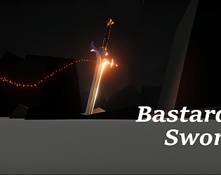
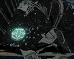
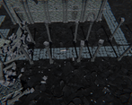
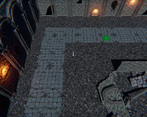
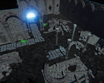
The game has pretty models and cool post processing effects, but it looks bland and uninteresting. All of the environment is grey, the enemies are all green.
Unplayable for me.
Thanks for the feeback!
We honestly didn't test the game enough getting carried away by our enthusiasm, and that the deadline was 2 hours away when we finally built the project for testing. I encountered a crash and found the reason, patched it then we both tested it by playing the game twice each from start to end, didn't experience any more crashes, so we assumed it was solved. Apparently it was not.
About hitting the enemies, there is a particle effect that plays only when you hit an enemy, a red spark burst thing, but I guess it wasn't as obvious.
Now we know for sure what we need to improve :)