Indie game storeFree gamesFun gamesHorror games
Game developmentAssetsComics
SalesBundles
Jobs
TagsGame Engines

MickM

13
Posts
1
Topics
6
Followers
A member registered Feb 03, 2016 · View creator page →

Creator of

Recent community posts

G'day, cheers for the feedback.

I didn't end up getting a mixed effect so the 'trail' is just alternating (as per the screenshot). Was keen to make it prettier but was a bridge too far in the time. If yours isn't like the screenshot it might be an issue, possibly related to support for compute shaders. 


It is definitely something that could have been done trivially with a few spirits and maybe 20 minutes of coding... It was just a personal desire to explore compute shaders. It really could have been done better as a standard shader but was a vehicle for understanding the compute shader pipeline. Just glad you managed some enjoyment out of it!

Very solid game. Played through to Nightmare +4, no health lost.

Some graphical flickering (Boss disappears with lots of bullets - flickering on damage?) and sound distortion at higher levels. Significant slow down in the nightmare levels - might need vectorisation or other optimisations to handle the quantity of objects. Ship power improvements might be an option - I ended up upgrading the cannon speed and just using the recoil to move around.

That said - probably the best game I have tried so far. Simple mechanics and idea but executed well. Despite balance being a bit too much in favour of the player, it was an enjoyable experience and kept me playing much longer than I expected. Nice work.

Cheers. A bit of fun in a super short time. Might use the idea and recreate it outside a shader to expand on it a bit of I get a chance!

Cheers.

Only had 4 hours and used it as an opportunity to try and learn compute shaders (game logic all shader based) so didn't get time to develop it much. Happy with the end state though (even if it could have been done in half the time using normal game logic!)

Cheers - would love to have had more than a few hours to flesh it out a bit more (and potentially move the gameplay logic from compute to regular shader for web version!) 

I think it's best to do both but in game is probably better; a lot of people may not read the description.

Unfortunately unplayable for me. First step would be indicating what the controls are (I believe in the end that X is select and C is something else?)

Art looked quite nice though, I would have liked to have seen where it was going.

Nice dialogue system, did you do that over the weekend?

It took a bit of trial and error to work out the controls though (this could have been mentioned).

Would have been nice if it was longer or had some randomisation into it (eg. sometimes you miss etc) but overall it was nice.

Solid entry. Quite a good example of a simple mechanic (clicking changing your shape fill) in a simple game (move your dot to other dots) which leads to quite enjoyable gameplay.

Sounds always help, as would a title screen (instead of the game immediately starting on load) but didnt detract from it too much. I did get some slowdown/jittering from the second wave onwards - unsure if this is on the game end or not (solid gaming computer so surprising)

Nice one eh.

Congratulations on your first game jam! 

This is very simple but you did manage to get a gameplay loop down. It is a good thing that you kept the scope small enough to be able to finish. Keep working on the programming and understanding the Unity engine (how the input, physics/collision etc systems work) and you can slowly increase your scope!

It is worth allocating a bit of time for polish - add in a few sounds, game over screen etc will help a lot too. Also make sure you play test: the UI for the game over text in the web version doesnt all fit on the screen!

Keep it up eh

WebGL version not playable for me - Screen too small (scroll bars in the HTML5 window - small within the page). Intro text is cut off in standalone and in HTML5. Some UI slightly cut off in standalone too. (1920x1080)

Interesting idea and a bit of fun.  I like the 'magnifying glass' idea!


It did quickly get to a point where I could not find any more bugs though and I ended up just moving the mouse around aimlessly waiting for some form of feedback. Could do with some form of on screen feedback when you are moving (eg. at least on the edge of the 'play area'?)

(1 edit)

Nicely evokes the feeling of old asteroid games. 

Could do with notes on the controls. 

Is there a way to remove the shields? (I assume that is what the larger circles are?) I was not able to get past level 1 as there werent enough un shielded suns in the few games I played.

Sounds are quite nice and fit well (Where did you get them from?)

(5 edits)

Gday all,

Big Circles is just designed as a free little time killer; 60 second rounds where the goal is to get as high a score as possible (score = ending HP).


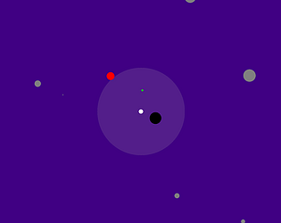
You have to avoid bigger circles and eat smaller circles. As you gain health you get bigger so get more targets!
There are 4 modes available (unlock based on progress):

Normal - Circles outside vision are grey, inside 'radar' range they are green if edible, red if dangerous (steal your health) and black if deadly (instant kill)


Hard - Night - As for normal but you cannot see anything outside 'radar' range


Hard - Blind - No radar


Insane - Harder.......


Simple controls (arrow keys) and enter will restart the level when you die so you can churn through a few rounds quickly then be on your way!


Hopefully it brings a bit of enjoyment to at least a few people!


Available for download or to play in browser!

http://mickm.itch.io/big-circles