Hello again. Yes, that would be absolutely fine by me. Thank you!
Mighty CheBo
Creator of
Recent community posts
Thank you very much!
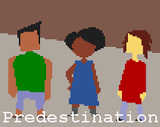
I suppose one of the design ideas was to abstract out the specifics of dialogue in a similar way to how the specifics of combat are often abstracted out in strategic systems. A final version would probably include more snippets of conversation to get the feel across, and would deliver important bits of information when they're accessed, but otherwise it's just representing small talk and unimportant manoeuvring.
I LOVE the idea. Sort of a modern Harvest Moon. I think there's a huge amount of potential here and I really hope you go on to finish this game.
As mentioned, the plants wither way too quickly. I think the aesthetic is lovely and wouldn't suggest any changes. Holding Z to read text was a bit odd at first but I actually think it's a great idea - it allows people to choose their own reading speed in a simple and elegant way.
Exciting, bombastic action. You nailed the real retro arcade feel.
I feel the controls could have been more responsive, but then that is part of the challenge. It just seemed to take slightly too long for the jetpack's lift to kick in. I also struggled with the camera when moving left to mop up remaining enemies (which was a bit frustrating, but true to its origins).
It was just too hard for me, too. I'm not much of a fan of challenging action games. I enjoyed the experience, though.
Great, simple puzzle design. A fantastic example of extrapolating a satisfying game experience from a simple concept.
I agree that the music grates after a while. Another, minor gripe is that the game sometimes felt too slow. The forced wait between player actions could maybe be skipped in later versions? Especially when retrying a level, I found the speed a little frustrating.
The charm of the game shines through, even in spite of technical issues.
Similar comments to those below - navigating the town is frustrating due to fences and such. At first, I enjoyed looking around at the lovely character design and the other nice details. But after two fights, it just got boring slogging from one to another. Walking between criminals just felt like it was wasting my time because exploration serves no real purpose. If you could find some way to include some player progression and maybe link this to the exploration (collectibles?), I think this would improve the game. Every fight really felt exactly the same except for the last one, so it would also be interesting to see some variation there.
I should say that I did finish the game and I enjoyed it overall. I just wanted to give you some good feedback.
It's the beginning of something lovely. The aesthetics and feel are top-notch.
A little more player guidance would be helpful. I got through the first door then wandered aimlessly for a few minutes (it didn't make sense to me that the way I got through one door didn't work on the others). Then a creature dropped a new recipe on death for a blue potion seemingly at random. I had to spend five minutes grinding to get enough grey squares to craft it then I used it in a location that I thought it might help at, only to find out that it didn't and I had a time limit to do something that I wasn't sure of. I turned it off in frustration after that because I couldn't face grinding for grey squares again.
HOWEVER - I did love it when I felt like I was really playing the game and making progress. One of my favourites so far. The reason I moan a little above is to give you some useful feedback because I'd love to play a finished version.


