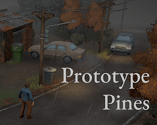
Thanks for playing and appreciate the stream - it was helpful to see someone try out the controls. Good to know the PS5 controller wasn't working for you, I've been testing on an xbox controller so maybe some issue there.
msara
Creator of
Recent community posts
Thanks for the feedback - I got some other criticism around the player character model and I agree. That character was one of the first animations sets I worked on for the project and as a result its pretty rough. I hope to do a complete overhaul for the player character soon. Also good to know the camera isn't bothering anyone yet.
Well done, I think the presentation is really great and reminds me a lot of a first-person Signalis, if you've ever played that. The weapon reloading feels great. I was playing on Windows and it did crash once when transitioning from one room to a hallway. I think some areas were too dark for me and throughout playing I wish I had a center reticle. Initially I didn't realize "F" was the primary interact button, so I was confused at the first dialog section but managed to figure it out.
Thanks for playing and the detailed feedback! Really pleased you picked up on one of my goals, which was to have a minimalist take on the souls combat.
- Totally agree on the animation variety, although the combat is minimal I think added some animation variety will make it feel much better (especially if the leftward attack will bias the player to favoring one side)
- Yes, the current camera system was built with a top-down perspective in mind and you can tell it really falls apart when trying more cinematic angles. I'm iterating on this now.
- Handling occlusion is definitely a high-priority feature to tackle, its a must for the next version
- Other smaller bugs you mentioned are also on the list to work on
Thanks for the feedback. Overall most of the combat systems are in place, but your feedback is helpful to understand where things need to be refined.
1) Thanks for the heads up, I'll need to pay more attention to my packaging set-up, there are many plugins that are included by default that I don't need.
2) Yes, this is some bug where the last input persists even going into "interaction" state and the animation react accordingly.
3) I need to do some clean-up around this buff - current the buff will be reapplied even after death.
The intro is really great and I think sets up a neat, dream-logic vibe. Overall, the game has a very confident start. The music is well done but personally I found it a little overwhelming over time, I would have like it to fade down a bit after the intro to appreciate some more ambience/mystery. I eventually solved the second puzzle (not sure I completely understood why) and died on the school of fish. Interesting combat set up, curious to see how it gets fleshed out.
Great presentation, the animations are well done. The stamina doesn't behave like I expected, the basic attack is a three-hit combo and each hit drains some stamina. However, if you only have enough stamina for 1 attack, you can still pull off the entire combo.
I found the forward momentum of the warrior pretty punishing because often I my attacks would carry me into a pack of more enemies that are ready to attack.
Pretty fun game. I agree with the comments that its a bit easy and needs more enemy variety. I tried going an electric + crit build, I was looking for a little more feedback on crit procs (other than the red damage numbers). Maybe this is beyond the scope of your design, but it would be cool if crits could interact with other mechanics.
Overall a well made experience. There's a lot going on, so I appreciate the gradual introduction to the mechanics.
The TAB select was not behaving like I would expect. I think there were times where the selection moved to enemies in rooms I wasn't in yet. Also, I would have expected the TAB (or maybe TAB + modifier) to eventually cycling through my allies.
I really like the art and sound. I think some of the in-world sound effects could use a little reverb or some other processing to make them sound more embedded in the world. Right now they sometimes sound like isolated WAVs firing off.
I think the spell selection is a bit overwhelming, some spells feel like incremental changes so the play style or my decision making doesn't change too much. I think the spell selection screen could benefit from some "icon language" to make it readily apparent active vs. passive, AoE, heal magnitude, channeling, etc. Right now I really have to sit and read closely to understand the difference in spells.
Environments could use some more props/furniture.


