Indie game storeFree gamesFun gamesHorror games
Game developmentAssetsComics
SalesBundles
Jobs
TagsGame Engines

Nic3Ntertainment

16
Posts
1
Topics
14
Followers
1
Following
A member registered Jun 17, 2015 · View creator page →

Creator of

Recent community posts

Recently picked this game up. If you don't push hard for the Dental Plan it can be a fairly quick game, I beat it in about 3 days. Enjoyed basically every minute of it.

A few negatives to get out of the way first:

-Needs better menu integration, there's a lot of stuff you can only see when you're in the right screen or place which having a status screen of sorts would make more user-friendly.

-A slightly better tutorial in the opening phases would have been nice. Made a lot of mistakes in the first few missions because of not totally understanding how things worked.

-Some of the messages in battle pass a little too quickly. I'm a quick reader, but I know not everyone out there is. I also wish there had been more small talk and rapport between the characters in battle.

Now onto the positives:

-Everything else.

This game is fun, it's cute, and it's actually got a lot of nuance to the story you may not at first realize. The characters are all fantastic, I actually wish you could spend more time with them and do more with them when everything's said and done because they're so well written and designed. The character art adds plenty of style and personality to everyone as well, so that certainly helps.

Fantastic game. Looking forward to a sequel (and the ending certainly sets one up) and an animated series (Netlfix - I'm looking at you, call this guy ASAP I want a series based on this IP immediately!).

You can buy worse things for 4 bucks, but you can't buy many better things for that amount. Can't afford it right now? Unionize and demand a copy of it in your contract. ;)

Very interesting premise. Simple system. My only issue was that sometimes it didn't seem to have a rhyme or reason to which file it grabbed when multiple were stacked on top of each other. Sometimes it would grab the top one, sometimes the bottom, sometimes one in between those two.

Other than that my only suggestions to improvement would be to add a timer so that you know how much longer you have to go for that section.

Great work - even in this simplistic form it would make a fantastic minigame for any modern setting. And with a more fleshed out level progression format you could make a little game out of it For instance you rise through the ranks of an office building with the first level being just 1 green and 1 pink. Then you move on to 2 of each type, then you get your first order of shredding unwanted things, then it progresses to there.

Nonetheless, great effort and a fun premise.

Reminds me of Manuel Samuel a bit, with fewer graphics. I think the only thing that would make it better, without going way beyond scope, would be button-controls.

Very neat; great adherence to the theme, also surprisingly good music. Appreciate the tutorial as well.

I gave it three go-throughs. The first time I got stuck, thought I froze, because I didn't realize the buttons were z, x, and c and the arrow keys. So with that knowledge in hand I gave it another shot.

I petted the cut kitties, but nothing seemed to happen - then it started following me. Then I started taking damage when it caught up to me. I figured the cat was evil and probably wrote the message to pet it - tricksy little kitty. But I made it to a room where the main character decided to wait for help to arrive.

Third playthrough I walked through a wall and kind of 'fell off the map' and got myself confused. But I didn't pet the cat, again, so I'm learning.

All in all it definitely has something here. With a little more effort I can see where a horror influence could be gleaned - some UI and a little more direction, maybe make it a bit easier to tell what you're supposed to be doing and/or what you can interact with.

Agreed on the music, though JDB's stuff is always great, it wasn't the greatest fit - just came down to the wire that I was listening to music while my cohort was running bug tests. When she was done I tossed the music in, ran one last test, and uploaded it.

If we were ever to flesh this out more, I'd definitely go with slightly different music choices. But I think they got the point across for the most point, for all the more time we had.

Thanks for the critique. :)

Yeah, the funny thing was we intended for a splash screen to give the controls visually before the opening cut scene.

And then we 'went gold', uploaded, and about ten hours after the jam ended we realized..."Forgot to make the splash screens."

Glad you enjoyed it, though. Thanks for the feedback. :)

Some really great stories coming out here. Glad to hear all these interesting takes on the different challenges and themes, and your reasoning behind it. Really shows the diversity in game makers out there.

Keep 'em coming, folks!

I was surprised I haven't seen anyone discussing how they actually factored in the overall theme and any of the various challenges. So...go on now, give us a link to your submission and tell us how you coordinated the various thematic aspects into your project.

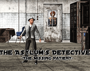
The Asylum's Detective: https://itch.io/jam/extra-credits-game-jam-6/rate/739235

So for our project we utilized the theme of Take Care in two literal fashions:

1. You're in an asylum, a mental hospital where they failed to take proper care of one of their patients and she went missing.

2. The whole story happens because one of the characters doesn't properly take care of themselves (self care is very important, remember that - especially during jams) and this is what causes them to wind up at the asylum in the first place.

Likewise we had a few obligue/figurative references to 'Take Care' as well:

1. The Highlander's uncle wasn't prosecuted by police, so they didn't 'take care' of the situation.

2. The Soldier wasn't at his post with his comrades because he cut his foot and had to go to the rear of have it 'taken care' of.

3. The Teacher was pushed past her breaking point and murdered her students - 'taking care' of them in the most mobster-ish sense.


Likewise we also met 3 of the 5 challenges (we didn't use Core and used waaay to many colors for the DOS challenge).

Extra Historian: The game is set during the 1918 Flu Epidemic.

Extra Distance: Due to the 1918 Epidemic half the people the detective can interview are behind closed doors due to quarantine.

Extra Translation: The cell of the 'Missing Patient' is filled with crazed scribbles of a fake language.

Now for some #gamedev talk...why and how did we meet the challenges?

Historian: Well, this one was easy - I literally finished playing Don'tNod's game, "Vampyr" like the day the jam began. So my mind was wrapped totally around the 'Spanish Flu' (there are two references to Vampyr in our project, BTW, let me know if you spot them). Given the correlation between 1918 and 2020, I felt it was a fitting theme.

Distance: This was a two-birds-one-stone kind of situation - on the one hand it fit the 'Social Distance' guideline, and on the other it meant we didn't need to make sprites or rooms for three of the characters.

Translation: The person who belongs in that cell (no spoilers) had recently been in France, but is also going through some serious mental trauma and isn't in their right mind. So...the scribbles all over the wall are in French - except it's written backwards, and also at a fairly grade school level because I, myself, and not fluent in French. So it's almost gibberish to begin with, then we flipped the sentences backwards.


So there's our process on things. The whole point of this jam is to flex your gamedev minds and muscles - tell us your thought process on your own submissions. =D

I'll never turn down some constructive criticism.

https://itch.io/jam/extra-credits-game-jam-6/rate/739235

I'll bookmark yours and give it a shot in a few hours, as well.

I'll never turn down plays.

https://itch.io/jam/extra-credits-game-jam-6/rate/739235

I'll bookmark yours to get to in a few hours and leave a critique. :)

.79% for me. I guess that's not too bad since I didn't have time to make screenshots and only have the main title pic.

Thanks for the critique! :)

Yeah, originally there was going to be 2 more scenes: 

1. An opening scene of The Detective pulling up in the car, but time constraints made it unnecessary effort to make all the graphics required.

2. Another chance at investigating the place between The Detective's first round of questions to the doctor (the questions similar to the driver's) and the ending questions. The final set was supposed to more like a denouement once you went to the doc and were like "I've solved it/I've failed to solve it!"

But, when push came to shove the time didn't permit the extra scripting to make all that work. :(

The driver was fun to write because he really wants no part in the game, literally or figuratively. Once again, though, thanks for the review. :)

I wish I had checked the art assets I was going to use before the jam started. After the theme popped out I spent the whole night writing a script. Finished it. Then after a short break, I went to start mapping - and learned none of my assets were the right size/style for the engine I was using.

It took me until Sunday night to figure everything out and get them resized and re-formatted (and they look clunky in the end). But I sat on my hands for almost a week waiting to see what the theme was - when I could have been formatting those assets if I'd done a little pre-check. =/

Thanks for the feedback.

Yeah, an actual Rakugo performance is often 30 minutes long; a 'short' rakugo is like ten minutes.  So trying to make a short one, that actually acted like a Rakugo, is one of the biggest challenges to any Rakugo Detective stuff.

And you are 100% right about the text coloring.  We tried a bunch of combinations of colored text, colored backgrounds for text, and that was what we finally threw our hands in the air and said 'we're going gold' with.  Definitely something I would have liked to do better and will concentrate on more the next time.

Neat. It took a couple of tries to see exactly what I was supposed to do, but once I understand the plot of the system it was simple enough.

I topped out at Year 8, myself; I just couldn't get my snake any longer than that.

Main suggestions for improvement would be:

1. Maybe a line or two to stipulate what the goal is. Someone less wiling to try stuff might not realize: Oh, I have to eat the red and yellow snake butt.

2. Maybe make whichever part you are flash a bit, at least the start of a cycle, especially for those who are colorblind so they can know what snake they're controlling.  I'm not colorblind, myself, and I kept getting confused at the start of a round as to which snake I was controlling; so I can just imagine the horror a CB person would suffer.

But overall, a neat little game.

Sorry, I don't entirely understand what you mean?  Are you referring to the copyright information I included in the credits? That's just the year those resources were produced.  When I purchased the rights to use them it is technically part of the EULA to use that exact verbatim of copyright wording.

I did wait to start making the game until the allotted day (actually almost the next day, because it took me the whole first day to write the plot out).  But the engine I used was created in 2012, the music in 2015, some of the graphics in 2011.  I mean, Unity was released in 2005 - but I don't think using it disqualifies you for the jam. ;)

I'm glad you liked the story, though. =D