While I liked the sound, concept, and design of the main character (while standing up), I have some suggestions. If I had been you, I would have put slightly less effort into making content, and would have used that time to improve the content that was already made. Platforming often felt awkward and the levels were really confusing, even with a map to help out. I really dislike how zoomed in the game is. Even though there are warning on the screen, almost half the time I would encounter an enemy I was injured by it before I knew what was happening. The animation of the player turning into the goo needed to better show the transformation so that it makes more sense to the player. (It looks like she crouches and instantly is a ball). The colors you used could have been more even. The colors you used sometimes were vastly different from each other and sometimes were extremely similar.
Otyugra
Creator of
Recent community posts
This is the version of game I intended to upload originally: https://otyugragames.itch.io/snake-pit-v110
(Since I did not modify this version of the game since the jam, you are welcome to rate this game based on the other version. This version of the game is a demo that was only meant for a friend to play test. Sorry for the confusion.)
The jump is intentionally floaty because you have two ways to fall. If you hold the button, you fall fast. If you let go of the jump, Sikk struggles to stay in the air longer so that you can maneuver in a pinch. You can also wall jump. These are both meant to be things that would have been explained to you later in the game if it had more content.
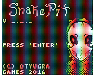
Making the game as nice looking as I can with the colors black, orange, and orange-white. Secondly, I choose to have the sprites be 7x7px rather than 8x8 and having an odd number of pixels made designing tile sets a very different experience because of the way it disrupts patterns. It certainly gave Snake Pit a personality.
I had the idea of making a game that is 64x64 pixels but is stretched horizontally. It would give the game an authentic look since some monitors back-in-the-day had wide pixels. Likewise, simply by stretching the screen (without interpolation), the game would automatically have a mild blur effect which would also add to the authentic look.
Do you think that would be allowed? I personally don't think it breaks any rules.


