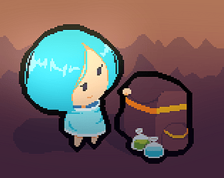
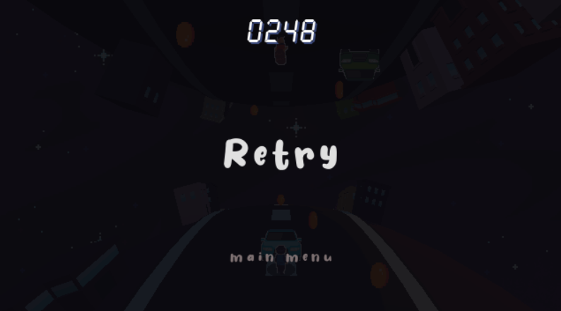
Yes, my main inspiration for the cover is Patema Inverted! Thanks for playing!
- if you get motion sickness from the camera swaying, you can turn it off in the upper right corner in the main menu.
Raeg Studio
Creator of
Recent community posts
I was trying that trick not to play any music and let the player tense up a bit until you meet the boss but yeah, I guess the boss music is a bit sudden.
In development, I was thinking of adding hints for the poison like green bubbles and a sfx to compensate for the small sprites but I forgot. Hahah
Glad you liked the game. Thanks!
I've read the description for controls but the game could use a one time tutorial at the very start of the game, similar to Temple Run and other runners. The hero have a skill, the player could use some skill too. And yeah also runs into the issue of starting in an obstacle, giving me a handicap.
The design is well fitted for the theme. Really like the atmosphere and the 3d effect. Overall, it's a cool game and I enjoyed it!
Some notes, color selection of some fonts makes it hard to look at (yellow font color with red blinking outlines), the other ghosts is good at doing their job (good AI implementation) actually, not me. Haha. The scoring system could be changed and show the players score and not the hero. Low score 510 is not changing for me (HTML vers.) Overall, interesting approach to a Pac-Man game and it's fun to play. Good job!
Yea, known those bugs. Not really game breaking so I just left it. Don't really have much time and this is a one man studio, btw. There are many plans for the game like tutorials, power up plots (circles), shops. Just like in the Dokapon Kingdom but prob can't do it on my own haha. About the items, there are descriptions on it on the game's itch.io page. The damage system is very simple, enemy attack - player defense, that's it. Lol. Anyways, thanks for playing and glad you like it?
The design for the theme is interesting and good, I like it! It teaches me the mechanics at the tutorial level but the first battle (both paths) just increases in difficulty so much. It spawns alot of enemies especially the fast one where it's introduced but its not moving, that's not good for a beginner like me. I won't leave a rating since I didn't finished the game (If you still want to, please tell me) Anyways good job on the atmosphere and graphics. More games to come!
Cool game and i like the upgrades, makes me feel like I'm actually stronger, although I can do it just for a second. I cheated the game though, I found a loop hole where I can just go to the back of the energy pods spawner and shoot from there. It basically gives me infinite ammo. Pog! Game could use some background music to make it lively. Anyways, good job and keep making games!
First of all, I love the story. I like the backtracking and the emotion-eating beings (they gave off a danger vibe) The atmosphere is good although the tilesets could actually use some work. You know your game design well, especially the part where you muted the music because something bad is gonna happen. The game is good and the story is amazing along with the mix of future and magic, good job!
I also use godot on my game so I noticed some things, you forgot to turn off the "export with debug" on. The robot double jump can be fixed (maybe it's intended?) if you parent the sprite to a node2d, this way you can just set the node2d parent scale.x to -1 or 1.
There's a lot, A LOT of systems for this game and I just found out about it this week. Lol. I took some effort naming the characters. Glad you like them. For the mechanics though, yeah it'll take some time, moreover that there's no tutorial. Thanks for playing the game and I'm happy you like it! I'm not quite sure about your take on "bugs and should be easily fixed" though :)
Cool platformer and a nice touch of puzzles. This is actually good for your first time. I like the story and beating the Evil Lactose Intolerant King is satisfying, him lying on the ground. I actually tried jumping over him 10 times where all you need to do is stomp on him, facepalm.
What bothers me is the scaling of the pixel characters, it destroys the pixel. The camera can be improved with smoothing. If you want to build up more on this platformer, you can watch Jonas Tyroller's platformer tips. Goodluck on your gamedev journey and more games to come!
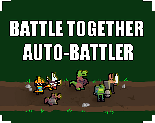
Cool game and nice concept! I like the joining of the crowd and the smashing of the guards to a corner. Lol. There's two thing that you can improve if you don't mind getting unsolicited criticism.. One, there's no visual feedback for my mouse clicks. Two, I don't think you need that much lights for the torches, they tend to look ugly. You can place just one in the middle of the crowd or set them to be not blocked by the other crowds. Now go make more games!
Known bugs:
- Moving warriors that's already placed in the field and has synergies will let them receive the buff again.
- You can't take the field unit back to the docking area (floating objects on the left)
- On buying cards and you go low than 4 gold, you can still press the level up button.
- If all enemies are dead, it sometimes continue to next round instead of the next wave. You can still press ready then battle to continue to next wave.
Dont @ me. I made this in 7 days. There's probably more bugs I haven't seen.


