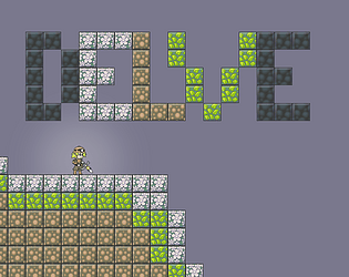
Yeah, I admittedly just skimmed a bunch of font pages, looking for a good one, and settled on yours. I'm still using it, and if it ships with it, I'll credit you (I'd feel bad if I didn't). I worked around the missing glyphs by using 'x', '/', and '\' to get this really neat looking result. 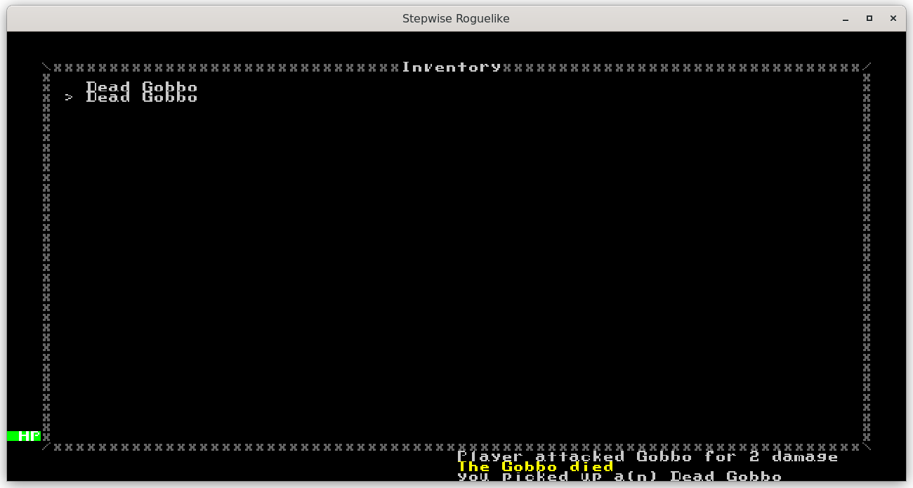
I also like that the tiles are 16x16, because it makes it much easier to see. If I had *any* cash I'd chuck a couple bucks your way as thanks - maybe when my game is selling ;)


