can't describe how sad i am that this kind of master piece ain't even in the top 10
Rebourtino
Creator of
Recent community posts
thx for the feedback :)
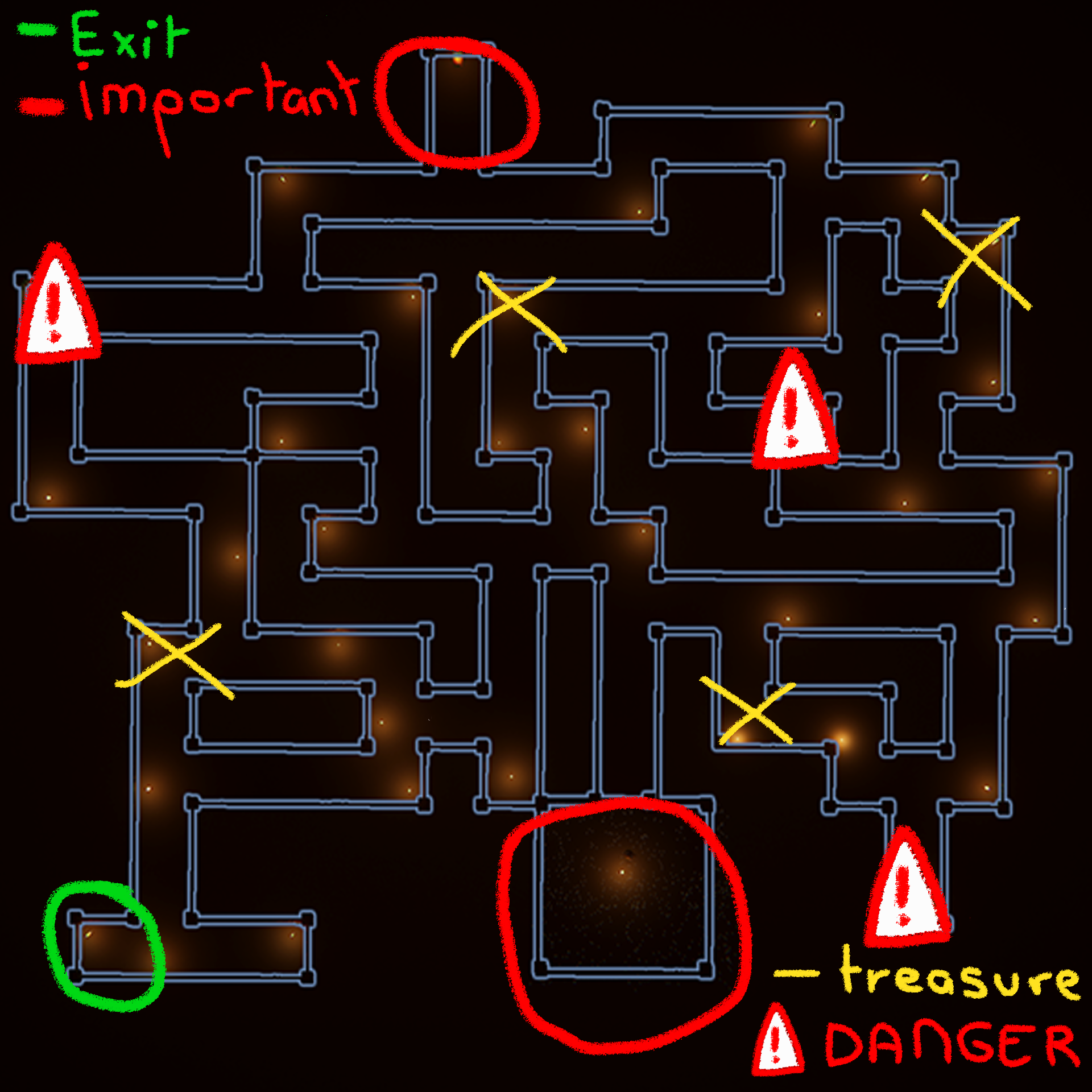
- the starting point is the bottom circle (i could't add the current player position on the map because this feature would have taken too much time for only a week)
- the volume is off by default because i forgot to detele the playerprefs (but at least it doesn't hurt you hears like most games and you are able to edit the volume at anytime while in game)
- the flashlight is automatic (it create a glowing effect on the player to see better)
yea I agree, a check point after the code would have been nice but their is already 3d sounds of the monsters. Oh yea for little nightmares, it is on steam. I recommend playing the the second game first (because in the game chronology the second one come first) or do as you wish.
you can download it for free on REMOVED :
- little nightmares I : LINK REMOVED
- little nightmares II : LINK REMOVED
Personally after finishing the games twice I decided to support the devs by buying the premium version on steam (also to get achievements :)
bro I really appreciate the time and effort put in this well written review thx :)
my though:
Menu:
- I messed up when uploading the game on Itch.io so the volume Playerprefs were set at 0 by default *my fault*
- for the resolution I tried my best to accommodate all players so in the settings there is options like (Fullscreen, show fps,1920x1080 etc...) because I play in 4k and for the UI scaling to not be miss placed I set canvas to fit with screen size and if blurry, upscale resolution.
- for the screen title I wanted to add a shake effect (walking effect) with particles but I only had a week and I had so many bugs to fix that I didn't have enough time to finish :(
Game:
- I didn't wanted too much UI in game for the player immersion and I like the fact that you have figuring out what to do and how to do it like in Little Nightmares (my favourite games) or Inside. however I totally agree with your point with the flashlight !!! I didn't realise it but I should have polished this part a lot more.
- for the spelling mistakes I cant defend myself lol :) I'm French...
- for the map I agree its a bit confusing but the way u pick up the map (facing forward) is the way it supposed to got. The red circle on the bottom is the starting point.

- u can miss corridors true its on me...
- I could have updated the UI to show the danger only after but I though that players would not open the map again so I decided to put it in the first place
- I had a feature were all the lights of the maze are turned off (apart from the ones near the map and flash light) until you pick them up but I was scared that some players would still got in the dark and get lost for ever lol :D
For the dialogues I was praying no ones knew Japanese ;) (Im too broke to pay someone for the voices LOL)
All over thanks for the review You're in the 1% of players that got trough the maze :)
For those who struggle on the maze part the first two digits of the code is 31


