Indie game storeFree gamesFun gamesHorror games
Game developmentAssetsComics
SalesBundles
Jobs
TagsGame Engines

sinetwo

57
Posts
1
Topics
31
Followers
30
Following
A member registered Jun 26, 2020 · View creator page →

Creator of

Recent community posts

Yeah I agree with the two first tracks being similar in rhythm and difficulty. Some people actually found the game hard regardless so it was hard to balance the game properly. 


The arrows can definitely improve with more definition so that's also good feedback. 


Bear in mind that this was done over a 2 week game jam outside of our normal responsibilities (work, family etc.) so it left us very little time to make the nice to have changes, and we had a lot we didn't get time to do. But if we do a reincarnation of this we'll definitely add this to the list!

(1 edit)

This is pretty cool! I love the lighting and music. The difficulty could be managed a bit better for me if the holes started off larger and got smaller as you progressed.

Weee, this is great! We've had it in two youtube videos so far so we're super thrilled to see you do this!

Not actively at the moment as it's likely the game will have a revamp. I'm currently back to the drawing board to see how we can improve on the next iteration ☺ 

Looks great! Thanks so much for doing the play through! 😍

Please let us know your video link when you've done it, we'd love to see!

(4 edits)

Sure thing, on Dusk's page there are downloadable versions 😊 


https://dustydusk.itch.io/rhythmpg

Many thanks Sinigangshake

Much appreciated trainarmadillo88

Cheers Byteme187, we're hoping this may go somewhere in the future...

Thank you so much ArcticCage! 

Hey Kayonji, 

You're indeed right, this is feedback we've been given from others and it's something we noticed ourselves. Unfortunately it was too late in the game jam to make those changes 😔 

I've been thinking about a few options and one may be to have it go vertically in the center, semi transparent, making it more opaque as it gets closer to the hit area. Hopefully that way your eyes move around the top, middle and bottom of the screen (but not necessarily the sides). 

The other option may be to just shift it further up, but then the user is focused going right to left and won't see much at the left, top or bottom. 

I'll do some looking around on UI best practices and see what works well. 

Thanks so much! 

There are a few others, like Klang and Metronomicon. I'm hoping this will include proper combos (like a fighter) and a bunch of other features at some point! 

Hah that's much appreciated. I think it helped that we did some design and planning ahead of time so we had a good way forward when the jam started

Many thanks Bredulu, we appreciate it! 


I'll post the tracks sometime this week

Cheers tottori, it means a lot to us

Thanks it was a solid team effort. I'm hoping to make something more of this when the rest of the features have been defined and there is a way is easily incorporating more levels ☺

Thanks for the kind words Mom0

(1 edit)

Thanks so much Captain! I'll try yours out too when I'm at a computer ☺ 

(1 edit)

Great to see the devlog had an impact! Thanks 

(1 edit)

Thanks for the feedback, much appreciated! 

I'll post the tracks on this page next week when I'm back on the computer 👍 

And koreographer is definitely worth the dosh. If I didn't have that we'd never be able to make this

Thank you! We didn't really have synthwave as a theme in mind to begin with but it just naturally went that way for the team ☺

Thank you so much. Whilst we treated the game jam as a trial for the game, and whilst we found a lot of interesting issues and polish we can apply, I would be quite keen on getting this on to mobile. 

It definitely needs more polish and substance but I think if we add more RPG elements to it, it could work (spells, potions etc) 

Thanks! I reckon carry on trying and you'll easily get to the end. The majority depends on the combos really!

It's something we discussed in quite some detail. It felt as though some players found it too easy unless there was a complete defeat. 

In all honesty it was really hard to find the right balance, as some people said it was too easy and others too hard! 

We also considered having difficulty levels per stage, but it was extra work we didn't have time to do unfortunately. Now that we've got the game working more or less, this would be pretty easy to incorporate. 

Thanks theioti, can't wait to try yours out too

Thanks so much Mike, I'll try out your submission as well next week ☺ 

(1 edit)

Thanks TscheiBie, unfortunately this is something we didn't have time to implement. Ideally we would detract something (combo, multiplier, score etc.) from the Player should they press the incorrect buttons outside the "buffer zone". It's on the improvement list if we get to it though :)

This is really good. I love the art, the style, the polish! Everything works really well. Is there a possibility for a WebGL/HTML5 build?

That's great to hear Woitsley. There are definitely things we could improve on for a bigger game, and I kind of feel like this form factor would lend itself quite nicely to mobile!

Thanks so much for the great feedback SquishyCat! We put a lot of effort in small details in the last few days. Plus it was fun to play around with some of the new Unity features :D Hopefully with more user feedback it's something we'll be able to take a bit further and improve on for a bigger game.

(2 edits)

Right, we have published!

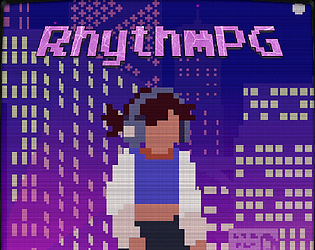
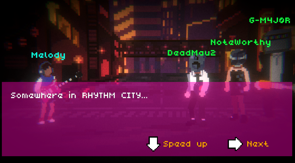
RhythmPG: The turn based, rhythm based, pixelart synthwave inspired RPG (it's a mouthful, we know!)

Massive team effort with DustyDusk and Irene . DustyDusk will be posting the Mac and Windows builds prior to the gamejam finishing, but the WebGL build (tested with Chrome) is now live!


https://sinetwo.itch.io/rhythmpg

We'd love any feedback you have - thanks for showing interest!

Finishing touches in the game. Look at these 'street light spark effects' which no one is ever going to notice :D 


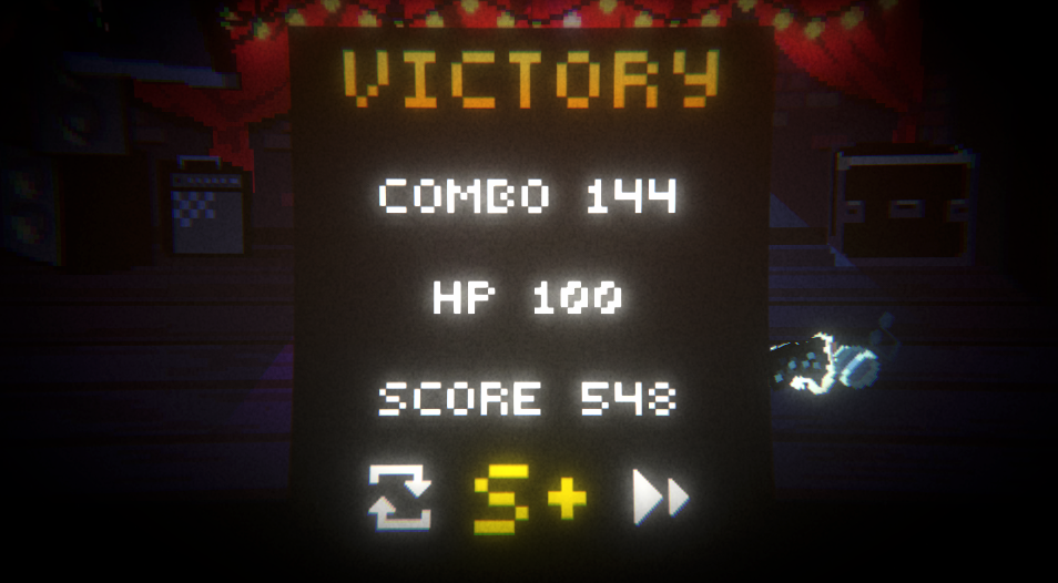
Aaaand a few more screenshots as we're getting close to finalising!


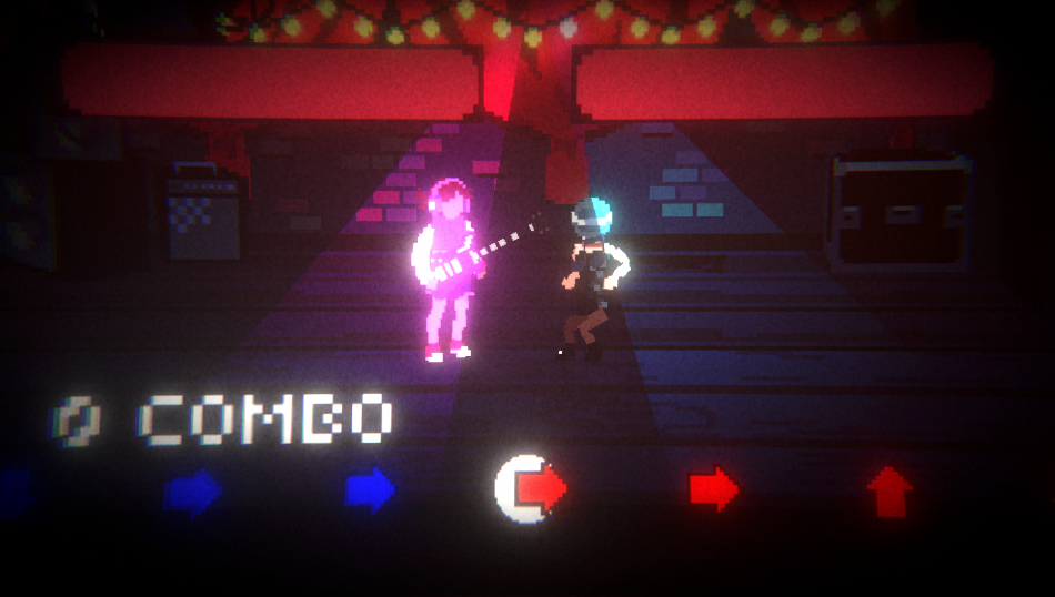
The combo and health bar system in effect:

And here are some near completion screenshots :)


In terms of the devlog, have a look at our Trello board. It's really been a huge team effort over the past week and a half given that we've got work/school commitments and families to cater for in the evenings. 1.5 more days of fixing bugs and we release the 3 stage demo!


(1 edit)

Here's Dusk's combo system in effect with health bars. I still need to work on the animations a bit as they're not as snappy as I'd expect, but overall the project is starting to take shape!

Here are the idle animations for the 2nd boss