Indie game storeFree gamesFun gamesHorror games
Game developmentAssetsComics
SalesBundles
Jobs
TagsGame Engines

thegreatcatposter

12
Posts
4
Followers
A member registered May 10, 2021 · View creator page →

Creator of

Recent community posts

I really loved the opening, it was very sensual. I also enjoyed the flashback to the main character holding her baby, very soulful. Currently your game has a lot of bugs which could likely be fixed in 27 minutes. Depth sorting was a huge one, just in the starting house's living room, I ended up standing on all the furniture and tvs. Also, there was a tree near the entrance to the forest(right after the first crab) that wasn't depth sorting.

And sir, I don't know if you're aware, but jumping using Space allowed me to traverse past collisions and travel outside of the map boundaries. It was quite hilarious and fun. Also, during battle, if I pressed up or down, the screen would scroll up to the field screen.

And one last bug, after the flashback cutscene with the hot loincloth woman, there were 2 speech bubbles sitting out of bounds in that room. I used Space to jump over to them, and it got me stuck in an endless dialog loop with the loincloth woman. I only escaped using the escape key and jumping back.

It would be good to take precisely what you have right now and refine it into a diamond before proceeding any further. The game has good feels and atmosphere, which I value above all else, but it needs a prudent examination before these bugs get out of hand.

Many apologies for the long delay in this fren, I napped for far too long. This was a wonderful little blurb from NWP. My immediate first impression was immense nostalgia for the psx era which I barely partook in as a kid. However, you managed to pull off that feeling without seeming derivative of other games out there. It's not a throwback or homage, it's distinctly your style.  Everything looked and felt sharp and crisp as well, love it.

I think your choice of the puzzle relying more on performing an action(with comedic consequences) as opposed to exercising our brains is a great choice. It's something that will never slow the game down too much for first time players, and second timers will still have that challenge of navigating the pits.  It fits well with the game.

I have no complaints at this point. This was a well-executed, brief demo, and I look forward to seeing how NWP expands from here!

Thank you for your feedback maprower! Glad you enjoy the atmosphere, things should be a lot more fleshed out and less rough by next DemoDay since most of the frameworks are in place for pumping out content and adding polish.

You're right though, I can see how the controls aren't for everyone. Keyboard bindings are definitely needed, especially since your character will be able to use their own special attacks next DD, which will mean 3 more buttons to use.

Good to see you this DemoDay! I'm happy to hear you like the atmosphere of the game. It's still very rough around the edges, so my goal for next DD is to give more of a real vertical slice with more npcs and actual dialog. I'm shooting for the art I have now to be the bare minimum standard. The music is just CC stuff for now, hoping to have some friends make an OST soon.

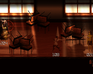
For the controls, I'm thinking Input prompts are in order for the Pre-Round sections, as  there's some features people are missing. For example, you're actually able to heal yourself between waves by selecting the main character and pressing N, then up or down. You can do this to repair the cover objects too. An actual tutorial is a must.

I'll be giving your latest build of Northwest Passage a go soon and will give feedback; very pumped to see you're still working on it. But first, I must take a nap.

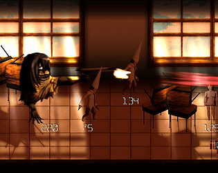
Wolgi, you won! Thank you so much for your feedback once again. The game is indeed hard, but I'm glad to see you beat it regardless. Next demo day you'll also have some special moves like the enemies have, so we'll see how that impacts difficulty.  On the backend,I just implemented hue shifts for aberrant enemies so you can pick them apart easier in battle(Dunce's who shoot projectiles have a reddish hue, and the one witch with an upwards attack has a purple hue now), good catch. 

There was healing inbetween rounds before, but now if you heal yourself/cover in the pre-round and then die, the points you spent on healing no longer reset themselves, for convenience sake. But if you decide you want to reset the points you spent, you can press and hold P to reset them as they were when the Pre-Round began. Will try to make this clearer in the future.

That dang reticule, can't believe it's still doing that, will try to brute force a fix for that.

And thank you for your comments on the art. I'm really trying hard to have a unique style but also keep improving on a technical level. The goal is for the current drawn characters to be the bare minimum standard going forward. I'm going to focus a lot on polishing up the graphics and adding new assets for next DD., so hopefully it will feel a little closer to an actual game than just a tech demo. Also, the music is just placeholder CC stuff, going to have some friends work on an ost very soon.

Where did you go? Come back to agdg

Hey Blue9Fairy. I just like this minute uploaded an updated version that's a bit easier, with an expanded ammo count. Might be worth a try. Also, examine enemies in the prewave phase and look at the second white box next to their move names. The black lines show which row their attack targets. This will make it easier to see which angle is safest to attack them from.

Also, for ammo, you can manually reload by pressing R, so you're not stuck automatically reloading while being attacked. Hope it helps.

Hi Fishking, congrats on making it to round 4. In testing, cover would always protect 100% from front view attacks, and around 85% from off angle attacks, but it felt almost to OP so while balancing the game for DD, a clutch decision was made to take reduced damage even from head on attacks. Based on feedback, I'm thinking of having cover give 100% protection at first, and then gradually giving less protection as the cover object is worn down. This might give more incentive to repair the cover object over time.

For the between round sections, you're meant to use the pool points(shown in the upper right corner) to recover health and repair cover objects. Right now I think it's set at 80 per round, it's an arbitrary number and needs more testing to see how it should be set. So battles are meant to become a war of attrition, to see if you can complete them using limited healing resources. For the next demo, I'll give an option to restart battles from round 1 to avoid soft locking.

With reloading I forgot to include instructions that you can reload manually from moving or aiming by pressing R, sorry about that.  Will definitely give increased ammo capacity for the average gun. Also, I'll make sure that you can reload behind cover, with the cover bonus, because.. that just makes sense.

Thanks for the feedback, it was very helpful!

Hey wolgi, thank you for the feedback! I'm glad you like the aesthetic. I'm hoping that as I add more content each DD, you'll get more of a feel for the atmosphere I'm going for.  Yeah, the game is quite difficult no doubt, it's partly because I'll be adding in special moves for the main character so you'll be able to choose a moveset to counter enemies; should make it easier. But it's really good to know how people are faring. As far as knowing where to stand, it's all about examining enemy moves by looking at the second box next to the move name. The black lines show which row the attack targets, so you can get a feel for the safest angles to attack from. However, you're right, it would do well to have more telegraphing of attacks. I think I'll do that through animations instead of ui to mitigate the risk of homogenizing the feel of attacks across enemy types.

You're right, I didn't give enough protection with cover. During testing, I always had it where taking shots from head on under cover made you receive zero damage, while you'd only receive a little from off angle attacks. From the feedback I'm getting, I think I'll make the cover system work so that initially it gives 100% protection, but gradually gives less as its "health" is worn down. Definitely will have to revisit reloading, will at least give a ui cue in the meantime until its sorted out.

I'm glad you were able to get a feel to get to 3, I know it's pretty fast and vicious right now.

And for the isometric movement it's good to hear that. Wasn't sure how people prefer movement in isometric.

Thanks again for the feedback, hope you can make next demo day, I'm definitely planning to have more actual content next time around.

As others have said, this has very nice production values. I'm not sure why the call for a tutorial, I found the battle system to be intuitive and easy to figure out. I just think maybe it would be nice to have a numerical indicator for movement points, unless I missed that. Also, I'm not sure if I can fix this in the settings, but you should allow players to right click out of certain windows instead of having to select the X in the corner. Other than that keep it up! I've seen your progress many times in the threads but had no idea this game was so comprehensive and full of content already.

Hey, I think it seemed unresponsive because of the reload animation. When she flashes blue, she's reloading. The ammo counter is in the bottom right corner. Probably should give her more than 8  bullets per clip, forgot to change that last night.  I also forgot to write instructions for manual reloading which can be done by pressing R. Also, she's yellow in shooting mode, and flashes red while shooting. Hopefully giving more ammo will fix the feeling of being unresponsive.  As far as general switching between shooting and moving, I'll see what I can do to make it more readable before adding in the real character and animations. Thanks for playing man!

Hey, first off the guy who posted my game in the current agdg thread wasn't me lol, but still thanks for the comment, I'll check your game out tonight. If you're willing to give it another shot, check out the game page for a description of game mechanics/controls, and you can check keyboard controls by pressing tab at any point during battle. Sounds like you were in the prebattle phase, and when you clicked on the enemy(use j to select and k to deselect) you were looking at info on their moves. To start the battle, you need to deselect any selections, then press and hold N until the bar fills. The battles are real time and very fast. The only info I still need to add to the game page is the line of scrimmage: You'll see how the enemies' side has different colored tiles. If an enemy is on the border of their tiles and yours, they can transform your column of tiles into moveable tiles for themselves(it happens automatically after a set time), decreasing the amount of space you have to move. You can do the same to push back enemy tiles. It only works though if the adjacent oppositions tiles are unoccupied. Hope this helps, let me know if there's anything that's not making sense.