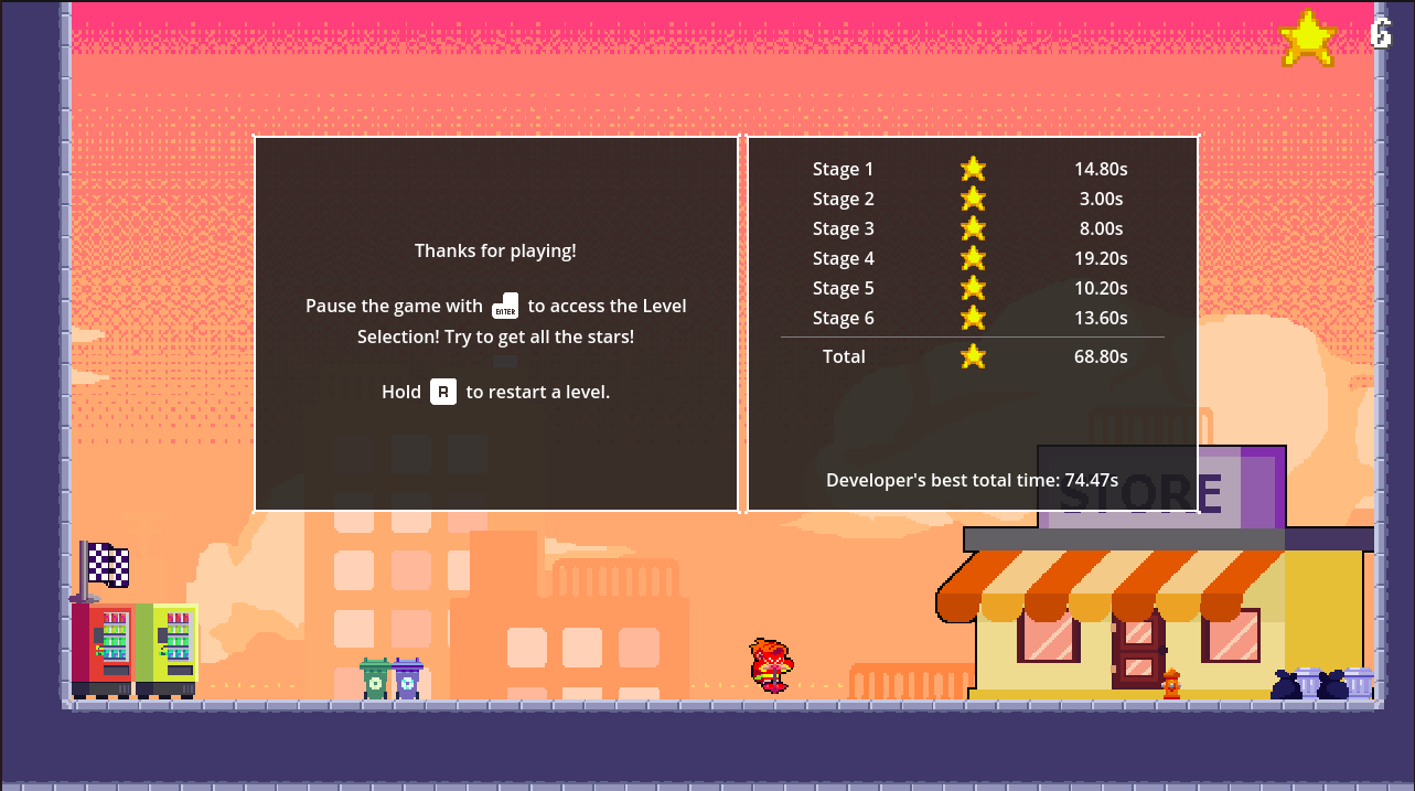
Here is my speedrun for this game! Let's see if anyone else joins the competition :)
theguywithawhy
Creator of
Recent community posts
I'm glad you had fun the game!
During the transformation you are basically invulnerable, so I wanted to prevent spamming and letting the game become too easy. You can still do very short and quick bursts, but now I think it's more of a skill than mindlessly mashing space. Thanks for the very thoughtful feedback!
I loved playing your game! It has such a great atmosphere with the beautiful art and visual effects, the fitting ambient music and sound effects which make the player feel every action (even walking!).
The gameplay is really fun. It makes you anticipate the clown box sound with every inch you move. The monkey box is a great mechanic and allows for clever level design. Also, the fact that the clowns stop chasing you after a while is a nice touch IMO.
Overall, this is a great game. Well done!
Hey! Your game has a quite unique idea and is fun to play. Showing your time in the end is a nice addition to give the player a reason to replay the levels and get better times. Although I'm a little worried about the pieces getting stuck in the corner, so far I was able to get them out by just throwing the body into them.
What the game lacks most is in terms of style. Changing the background and walls, adding a background music and a sound effect for snapping the pieces would go a long way to improve the game. Also, the end screen and the hint popup could use some polish.
Overall, this game has a nice and original gameplay, but needs some polish in visuals and audio.
I had a lot of fun playing your game! The visuals are clean, the music is relaxing, and the sound effects add to the experience. Also, I like the background effect. It's simple, but adds a lot!
The puzzle mechanic is well-utilized in the level design. It gives you a lot of freedom and I never felt like the solution was obvious from the start, which is a plus. I also had fun challenging myself to use as few items as possible. The last level is my favorite, because it forced me to think about every obstacle and how to manage my items the most.
The only nitpick I have is that there isn't separate reset option for the platforming portion. Sometimes I'd fall from a parkour and I'd have to reset the layout because of that. The layouts don't take too long to reconstruct, but I'd imagine it could easily get frustrating, especially if it happened multiple times in a row.
Overall, this game is pretty nice in terms of aesthetics, gameplay and level design. Well done!
I really enjoyed playing your game! The music fits well, the graphics are minimal and informative, and the sound effects add to the experience.
The puzzle design is very clever! Binding each direction to a specific move has a lot of potential, and the switching tiles make this mechanic even more interesting. IMO the levels have leveraged this idea quite well. I especially liked the 7th level!
Overall, this is a very fun game. Well done!
I loved playing your game! The artstyle, music and sound effect are all great. The gameplay is fun and addictive and it was difficult to put down the game. The difficulty is well-managed by giving the player a safe environment in the first few levels and introducing the enemies and hazards later on. My only nitpick is that some of the single spikes would camouflage with the background and I would keep hitting them because I wouldn't see them.
Overall, this game is visually great and very fun to play. Nice job!
Hey! I really liked playing your game. The visuals are nostalgic, the music is relaxing, and the slider and collision sound effects make the game more satisfying. Also, the popup when you forget to set the velocity is a nice touch.
The idea of changing the physics variables begs for someone to break the game, and I mean it in a good way :) It really feels like a relaxing sandbox with a few levels to test your understanding of the environment.
Overall, this game has great vibes and a cool mechanic. Nice job!
Hey! I really liked playing your game. The visual effects and music add a lot to the style of the game, the sound effects made playing the game feel satisfying, and the puzzles are simple to understand but clever. I especially loved the 8th level (no spoilers!)
All of these, combined with the polished interface (settings, pause menu, etc.) made this game a feel like a complete package to me. Huge props to you and great job!
Hey! Your game is quite interesting and fresh.
I really liked the ambient music which made the game much more atmospheric. The puzzle mechanic is also unique and the combination of 2D/3D modes adds to the style of the game. The main character is also a nice touch :)
While I did understand the puzzle mechanic, I didn't have get a good intuition for how to go about solving the puzzles, and got stuck at the second level. I think having a couple first levels with short pillars on each corners for the 2d character to move on plus having checkpoints on the pillars would make it easier for the player to understand the puzzle mechanic better, and then apply it to more challenging levels.
In terms of nitpicks, I'd like a faster 2d character movement (although I understand this could break the current puzzles) and sound effects for 2d character jumping and picking/dropping the boxes.
But overall, it was a fun experience, and I think this idea has a lot of potential. Well done!
Hey! I really had fun playing your game. Overall, the levels are detailed and look polished, the game mechanic is creative and the difficulty progression feels nice.
The charging system works quite well. It lets the player experiment in the first few levels with the recharging potions, and makes you think about what block sizes you choose later on.
IMO the one thing that the game lacks a little is sound effects. Adding sound effects for placing blocks and selecting block sizes would have a big effect on the game. Also, I experienced a few collision bugs when moving around, but they didn't affect the puzzles.
Beside my few nitpicks the game is fun, clever and aesthetically pleasing. Well done!
I never thought I'd see a white blood cell with a gun, but here we are!
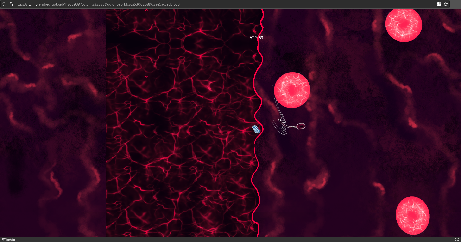
I liked the aesthetics and the especially art a lot. The gameplay is quite fresh and overall, and the music fits well. I do have a couple of nitpicks though; I'd sometimes confuse the direction that I was going because of the front and back of the mitochondria looking very similar, especially in high speeds (this can be fixed with a pointing arrow), a high-score display would be nice addition because the ATP quickly goes down when moving fast, and adding a sound effect for getting energy would go a long way to make the game feel more juicy.
Overall, it was a really nice experience to play your game. This is the highest score I managed to screenshot:
Hey! I really enjoyed playing your game. Wanted to get some high scores but the leaderboard stared crashing :(
I like the music choice for the gameplay, but I wish the bullet hit effects were a little bit more juicy.
The orbit system is a creative idea and adds more to the visuals and the gameplay. Shooting the orbits especially feels satisfying (though I'm not sure if it's as powerful as it looks XD).
The enemy spawning area and smaller vision makes it really difficult to dodge them when the wave starts, but after that you just clamp all the enemies together and easily dodge everything.
Overall, I think it's a pretty good and enjoyable experience!
Hi! I really enjoyed player your game. Here are some of my notes:
+ I really liked the music for both the main menu and the gameplay.
+ The sound effects feel great! The fire, the potion splash, etc. all sound juicy.
+ The throwing mechanic feels satisfying, especially when you snipe the enemies or throw the potion as a trap.
- I usually don't hate a wall of text at the beginning of the game, but the font made it a little difficult to read. I think it may have been less overwhelming if it were split into multiple shorter texts.
- While the game is mechanically fun, there isn't a solid gameplay objective (except collecting new items). Adding a procedural wave / timer system could fix that.
- The gameplay slowly becomes repetitive and there isn't much of a difficulty curve. Again, a wave system would help here.
- The popup for getting a new item isn't immediately responsive to input.
Extra Notes:
* Adding more maps and enemies can really improve the gameplay in terms of visuals and difficulty curve for the future. Of course, I think the three enemies and the single map are more than enough for the game jam.
Overall, I had quite a lot of fun with the game! Also, the poor guy forgor :(
Hi! I really enjoyed playing your game. Here are some of my notes:
+ The overworld is aesthetically pleasing and nostalgic
+ The music doesn't feel repetitive and the transition between the overworld and battle version is cool
+ I LOVE the design of the shadows! Also, the background effects in the battles and the pause menu looks nice.
+ The simple-looking combat system is intuitive and at the same time allows for different strategies and combos.
+ The reagent system incentivizes the player to use a variety of different skills as opposed to just spamming one single skill if they want to capture the shadows.
- The Obelisk (pretty much everyone else has said it, I think it should be repurposed for a special mechanic or a less frequent action)
- Movement speed could be higher, both walking and sprinting.
- The automatic movement during the tutorials felt clunky. It may feel better if the enemy quickly jumped onto the player instead.
- The battle trigger hitbox sometimes felt clunky, especially with the dogs and the cat.
- The close button for skills book in battle blends with the background. I don't know if it was just me, but I had to look for it every time. Maybe adding an outline to the button could fix it.
Extra Notes:
* In my first run I assumed that the damage amount only matters for defeating the shadow not capturing it. This made me stuck on the dog battle and unable to progress. Although, I don't know if I missed the explanation of that in the tutorial.
Overall, it was a great experience! Also, dog jumpscare :D


