Indie game storeFree gamesFun gamesHorror games
Game developmentAssetsComics
SalesBundles
Jobs
TagsGame Engines

TimeSpaceWarrior

18
Posts
9
Followers
2
Following
A member registered Dec 13, 2022 · View creator page →

Creator of

Recent community posts

can you show me where there are 5 colors. and I did use GB studio. if you want to check I even put the GB rom as an extra download, and here is the Github repository SpaceTimeWarrior/TL-Hyperion-War (github.com)

the export is to monochrome. with SGB active (for changing the color palette of the whole screen). this was to prevent accidentally doing 5+ colors. the version I used is 4.1.3 (this version split the singular project file into multiple smaller files and create prefab objects)

where you playing on mobile as only the top part is a part of the game screen if that is the case as the lower section is for an emulated controller

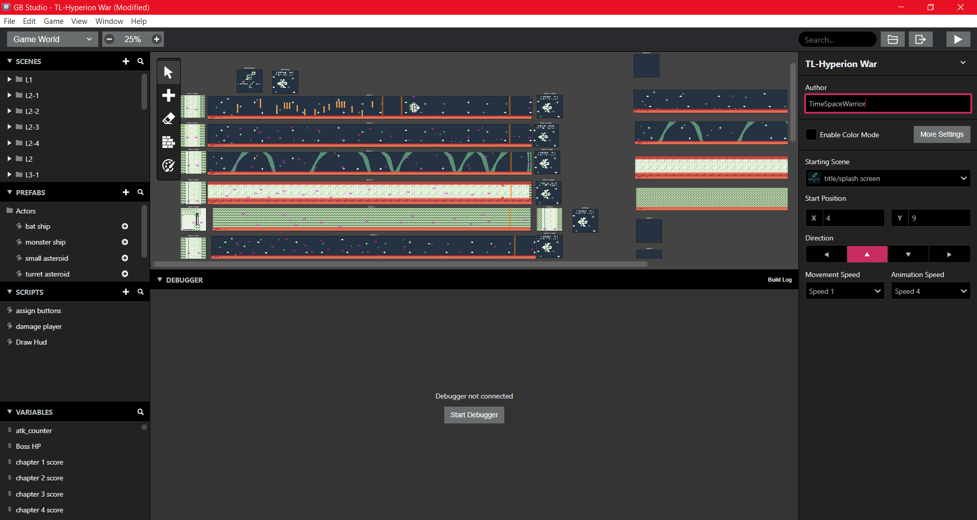
here is a picture of the editor with a preview of chapter 2 as well as the first part of the endless mode as well as the first chapter which is in the jam. the red is collision, the orange is triggers and the purple are actors. this is zoomed out so, most of the actors are not visible except for a purple rectangle. the only one of these that has anything visible is the actors

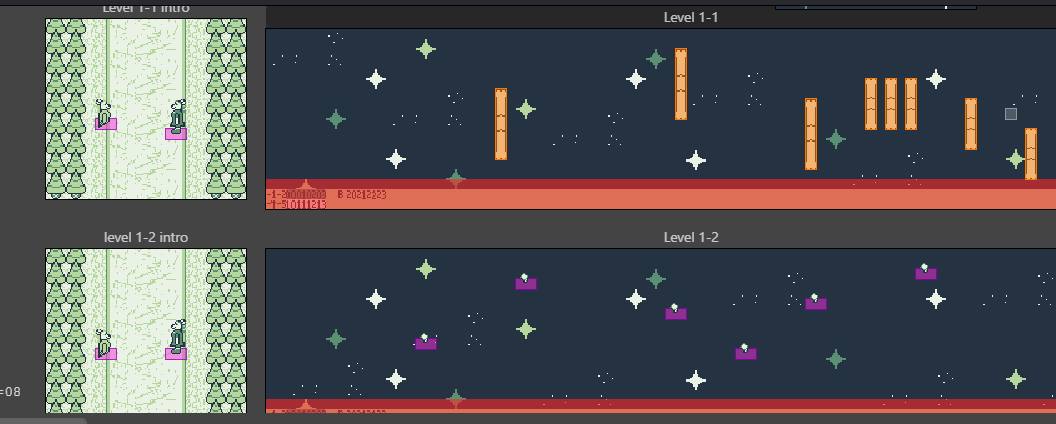
this is a closer look at the first two levels as well as the Hud before it is retiled to what is visible in game as well as the intended ghost version of Blair. I didn't fix that because it kind of looks better.


could you rate my game here is the link

Temporal Light: Hyperion War by TimeSpaceWarrior (itch.io)

thank you for playing. I might look into making the bosses better maybe I will add boss hp numbers to the Hud (otherwise it will increase the tile count by a lot) another thing I will look at is reducing the number of sprite tiles on screen

thank you for playing. you weren't doing anything nasty just pointing out where I can improve.
These responses match up with your comment. 

  • the first level of chapter 1 has the ring section that if you miss too many bone rings the level restarts with a very small dialog instead of a normal dialog, I think the cutoff is 1500 points. which is why the grading is generally better if you are lower than the perfect but still close
  • levels 1-4 of chapter 1 the intro takes place in the far future and Blair is telling the events of the main game as a ghost to one of her decedents Jem. (one of the main protagonists from another game in the series that takes place roughly 4500 years later). that also isn't a bear, but I can tell what you are talking about (that is Blair while I did think of changing it, it still kind of looks good with that in mind).
  • Can you DM me on discord the sections with incorrect spelling. my discord name is the same as my itch.io username
  •  I may take a look at that.
  • Are you talking about the music or the sound effects. like the spelling can you tell me where that is.
  • I may reduce the damage required in the final game. Or add how much of the boss's health is left. 
  • Just added that to the game it will be updated after the voting period ends (key bind is enter or shift)
  • Rebalanced and fixed the level 2 grade I accidentally put the perfect score instead of the 96 score, so it defaulted when it was checking the values. I may change the score system to be more balanced around how you are doing per level instead of overall which is how I currently have it
  • I am thinking if you do a perfect level healed by some amount (don't know yet by how much) but for the start of each chapter (or 4-5 levels the player will be healed to full)
  • I am using GB studio which puts the games limits to that of the Gameboy (or Gameboy color when the color version is released). I might look at reducing tiles on screen.

and I hope your Alchemy Jam #2 goes well

thank you for playing. I am going to look for some other way of doing the text boxes. I have already found a way to change the font and frame but not an easy way to get the setting permanent. I did think of making the player sprite smaller however I wanted the ship to not look too out of place with other ships in the game especially in later levels. Sadly, with GB studio I can't shrink the sprites without removing detail.

Thank you for playing
Sadly, since I use GB studio that is going to be hard as it only has horizontal movements for shoot em' up scene types. I do appreciate the tip maybe If I remake the game with a better engine, I will consider that. I might reduce the number of tiles the bullet uses.

Like others I replied to this game is a prequel to a series (Temporal Light).

I originally planned to have a platformer but that was used in a jam earlier this year. I didn't want this to be considered a continuation of the other game. Another thing I did consider before the jam was to create a star fox like game sadly there isn't an easy way to do a large amount 3d rendering with GB studio (at least with a decent framerate). So, this was Plan C.

Thank you if you want it is a prequel to my main series. I actually designed the ships to have a similar but different feel to the other games in the series. (Probably the only ship that is close to another ship is blair's but it was designed to look similar to jem's ship because they use the same framework. there are differences with the piping and secondary engines, the gun arms are at a visibly different angle [jem's are straight while blair's is 45 degrees] and although not visible but when the color version is uploaded the color is also different)

Thank you if you want it is a prequel to my main series. most of this game is not necessary to understand other games in the series. (literally the only part is that it happened and both Blair and Sune are involved and there is a huge cataclysm that happens at the end of the game...it has something to do with the title of this game).

I recently updated the game to have volume control. as well as remixing the noise channel down an octave. (some had more than one)

I also added a pause screen which allows you to change the settings above as well as view Peryil's status and view a map of the level

in the volume control I also added the ability to switch between the jam version of the music and the new remixed version.

I also facepalmed on one of the level music I had accidentally left one instrument channel completely muted in the jam version. (Level 3's theme. wave channel)

it is a really good game. managed to complete all levels available. the bosses are a little bit of a difficulty spike. especially the water undine.  This is a minor issue but using a colorblindness simulator you may have a problem with the colors used. the free simulator I used does the two most common forms of color blindness. (my mouse is normally a similar shade of red as the character it is the same color for both) you might need to darken the air slightly. here is a suggested range for Air if you decide to add a color blindness option. R range:0-176 B range:215-220 G range:220-231. this is out of 255.  (the lower the number on the range the more of a perceivable difference). for fire and earth just adjust the brightness of the colors and it will work. both of these are minor issues and can be worked around. below are the alchemical hints with both color blindness shown as they are in game.

 overall, it is really good. the use of deflection does keep the player on their toes and the use of black and white is definitely a good take on the theme. the game is very responsive, very little to no noticeable input lag.

the infinite jump is a feature not a bug as normally gb studio does not allow this. I had to manually override it. internally I called it the flight system. as the character is a phoenix after all.  as for the music I will look into this to try to lower the db. is there any song in particular for me to look at. there is a download for the whole soundtrack the ,uge file is the filetype the engine uses and what built the mp3 and wav files.

the art is really good. I noticed there is no game over state on the health bar being depleted. On timeout it brings to the victory screen regardless of how many you made happy. The music is good. The concept is also good.

I recomend going back after unlocking a transformation. If you didn't notice the blue area drains peryil's health rapidly as she is a fire bird elemental (Phoenix) in deep water.(the rate is roughly 1hp/sec)

this is a really polished game. as well as a very good soundtrack. the only issue is some jumps are pixel perfect near the start of the game

this is a really good game. and is really polished.

this is a very polished game. it might take me a bit to memorize the recipes.

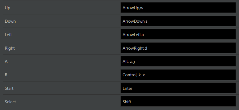
which common keyboard controls are not used. the only reason why I can't do rebindable keys is because that is a limitation of the engine.

currently

Dpad- wasd/ arrow keys (either is used)

A: alt, z, j

B: control, k, x

Select: shift, tab

start(not used yet) - enter, escape


in the next update

dpad up: up arrow, w, numpad 8

dpad down: down arrow, s, numpad 2

dpad left: left arrow, a , numpad 4

dpad right: right arrow, d, numpad 6

A: alt, z , j, q, numpad 1

B: control, k , x , e ,numpad 3

start(not used yet): enter, escape, r, numpad 7

select: shift, tab, f , numpad 9

(2 edits)

@jakeoff what software did you use to create the image. the game you made looked good, and I do agree with the comments. this image looks good, but I prefer to use my own. the reason why I ask is there were a few oddities such as extra words, incorrect color of the diamond dust. and wrong color of the berries. (the last one is forgivable since the image is small and it is hard to tell what they looked like), if you want here is the reference story for the berries, I used (foxberries). this takes place well over 10 years before the events of this game. these are the exact same type in that story you can also read the other stories on that same github but most are encrypted).  here is a preview for level 2 the face rooms are ones I have not yet started.