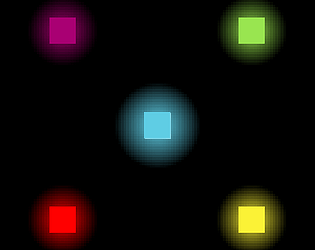
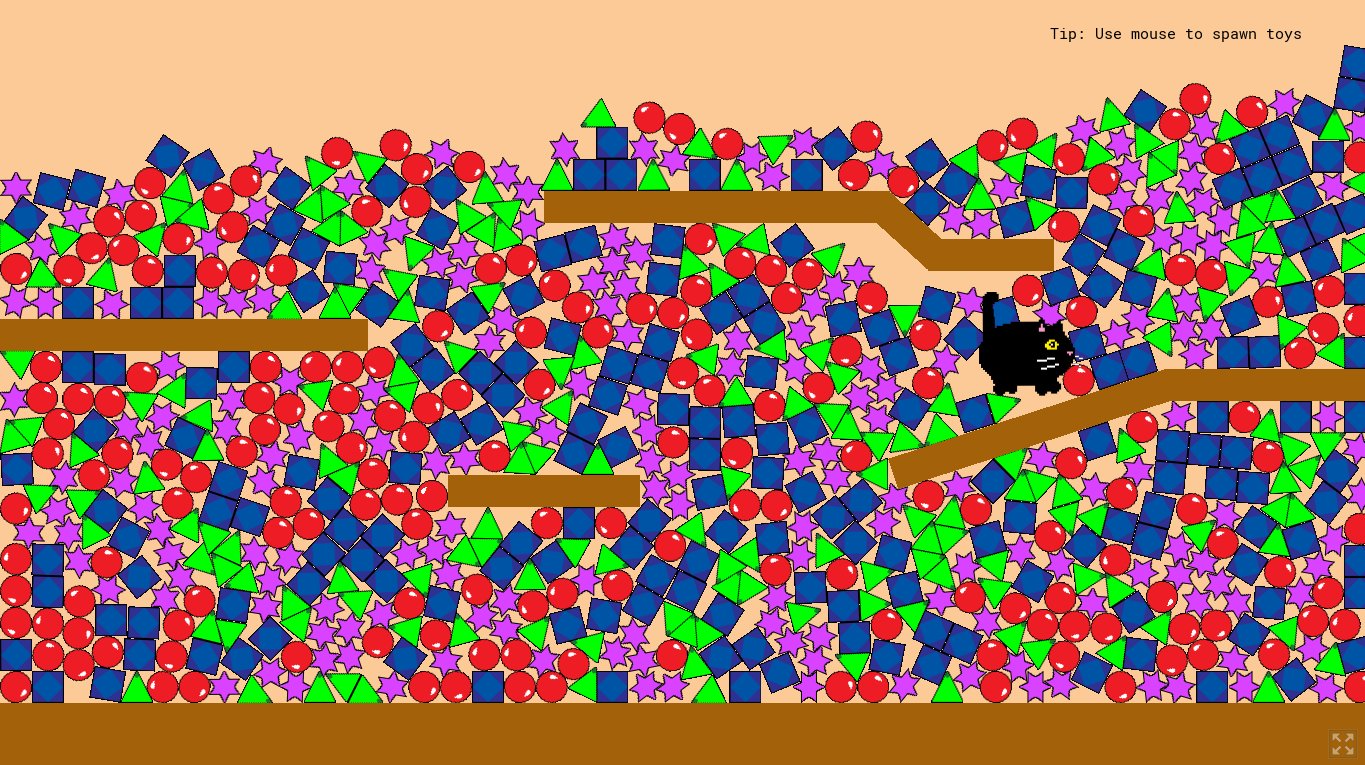
Thanks for the review! Yes, changing color to the opposite of whatever you're shooting at gives you 2x damage boost
User made username
Creator of
Recent community posts
Not sure why Firefox is a problem. But downloaded game did work. I liked it. Tho, it could have been better if I could choose where to attack. Positioning yourself when you have a lot of speed is pretty hard thing to do. The text goes pretty fast for me would be better if there was some way on re-reading it. But generally pretty good and simple game!
I actually liked the game. Unfortunately it gets repetitive after some time (probably because there's no sounds and/or music). As I read through the comments, it seems like not everyone keen on reading game description before playing so I think it would be better if the text appeared in-game (for example: on the start and after death). Generally game is nice.
For me it's actually kind of nostalgic because of simple but fun concept, like the games that I used to play when I was a child.
Good job!
Game looks absolutely gorgeous! But perhaps more limitations on mob spawn could take a place. While waiting for the cool down on your attack to go away, there's like, a hundred more mobs spawn, gather into one giant moving blob of a mobs that is very hard to attack without taking damage. But generally the game is fantastic!
This game is pretty confusing. Needed some time to understand that CPU is like Mario's CPU and not some weird guy or some kind of a abbreviation from the game mechanic, but maybe it's just me.
Don't really understand how the mutation works - is it multiplication? Is it addition? is RNG involved?
I like the disappearing effect text tho. And sprites look cool!
The one that is on the game's icon is my favorite. Generally game concept seems interesting, keep up the good job.
Maybe it's just a windows version thing but game is extremely buggy: suddenly game went from English to Spanish, and upon death on level ~ 8 or 9 teleported me back on the level 2.
I really enjoy how I can just spam knifes, gives a certain sense of power. Despite the level jump, I enjoyed every aspect of this game, nice work!
I got the boys waiting for that intruder to come out lol.
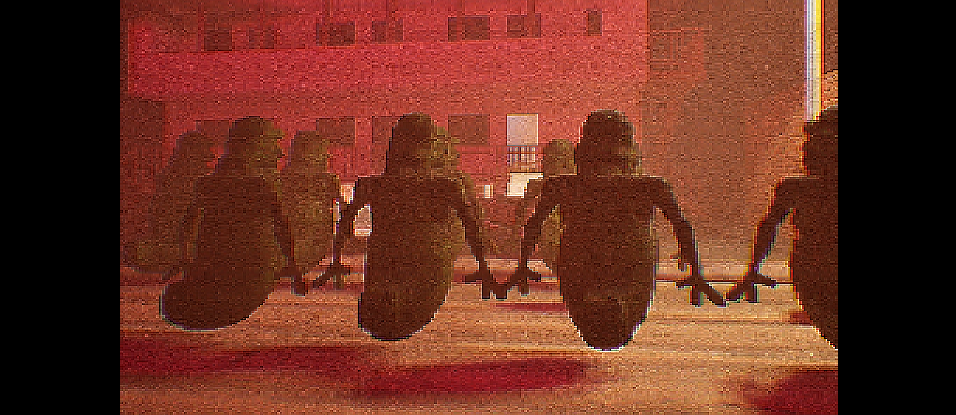
Anyways, I liked the game, but not sure if I completed it. It doesn't says "the end" or "ending 1". It only says "you died". Would be good to mark the rooms, after getting the key I went up by nearest stairs to only realize there was no room that I've been given key from. Also would like to point out that the stairs on the other side of the house are barelly climbable. The game was pretty creepy until 'the boys' came :D. Not sure what exactly about them made me laugh but oh boy I had fun.
Despite all the minor flukes game is good, could have been better if it was a little longer to just get into that 'spooky' vibe but generally game is good. Good job!
Edit: forgot to mention a small detail: you've got a ZIP file inside of a folder inside of another ZIP file when downloading the game.
Thanks for the feedback! I was thinking about some armor/durability cells as an option, but it would require me to make a whole new damage system which would require a lot of time which I had none on the time of creation of the tab.
PS. Now that I think about it, it would also require reconstruction of cell's system which was already hard to create. The same applies to life-cycle-time cell.
Thanks again for your feedback!
Thanks for the feedback! For UI zoom I wrote it both in the description and in "the beginnings" section of the info tab. It's ctrl + mouse wheel scroll (ps. it was made that way so you could scroll text without scrolling the whole camera).
Now that I think about it, I think I should have added more information about how the upgrade UI works and not how it generally works.
I also can agree that the upgrade UI could have had some better visuals (it was planned to be a whole cells and not just last/first parts of it) yet the system was very hard for me to understand and make a plan to create such. It was more of an 'idea' and 'throwing stuff in and out until it works'. My main point there was to learn on how to at least make working prototype of that.
Because the UI was made as last thing I had not so much time to work on it (I have poor time management skill and underestimated the difficulty of such a thing).
But despite all that, I'd say the game is final, released. I did about 90% of what was planned for this game and I actually like the final product. I'll take notes based on how this one goes to make next game a little better. Thanks again for your kind review!
(PS. game concept was partially taken, simplified and modified from Spore, the start of it to be exact)
Thanks! There was actually planned more to it. More mechanics like additional score machine, moving sound, hunger bar or any other way to give the game reasons to eat fish (which would enhance the strategical aspect of the game). Unfortunately making the freezing mechanic itself was more tedious than I thought it would be. Glad you liked it!


