Indie game storeFree gamesFun gamesHorror games
Game developmentAssetsComics
SalesBundles
Jobs
TagsGame Engines

Fred Bednarski

97
Posts
8
Topics
855
Followers
246
Following
A member registered Jan 14, 2017 · View creator page →

Creator of

Recent community posts

(2 edits)

Thanks Thom. Shame to hear it, but that's ok :)

Although, I feel I might have not explained it well. When I say physical, I mean uploading a game in pdf format for people to print and play.

Itch does support "physical" games (it even has a dedicated category for them) and actually has a decent tabletop indie design community.

The title pretty much says it all - are physical/tabletop games allowed in this jam?

I'm honored and humbled that you want to publish an adventure for this little game. Of course you're free to do it - the game itself in under CC-BY license, so you just need to mention that it was made for Endure by Fred Bednarski somewhere in the pdf. A link to this itch page would be nice too, but not necessary.

...and not sure if you seen my response to your previous comment (it was a bit late :/) but feel free to make any changes to the rules to make your adventure play as you want it.

I originally planned to write some adventure modules on my own (but life got in the way and I haven't published anything in years) and have them pretty much self contained - adding all the mechanics needed into the adventure module itself. If that's something you'd like, so people don't need two pdfs - go for it.

Glad you like the game.

The way I run it is that you don't get any endurance back on a failure - you loose it all: both what you spend AND the difference. This makes for pretty brutal games where players are forced to find ways to recover Endurance pretty often (this often leads to players changing goals to find a safe space and rest instead of proceeding).

I don't play with any "obstacle turns" - just swap focus between characters as it makes sense in the narrative. The enemies/obstacle doesn't get their own turn, they are a constant threat. So if two players approach a zombie, the zombie grabs one of them (ask the player to roll to avoid), then switch focus to the other player saying something around the lines "the zombie will bite into the first player's character neck, what do you do?) and so on.


Saying all that, this is how I play it, you are free to play the way you want. If introducing turns is more your style - go for it! If you or your players don't enjoy finding ways to recover Endurance in the middle of the action, feel free to give the spent Endurance back to the players :)


Hope that helps.

(2 edits)

Sorry, I don't currently have the time to work on this project.

However, Bitsy HD is open source - so anyone can grab the code and make their own version. Another user did rebase it to the 6.0 version, but that version is untested. You can grab it straight from github and give it a spin https://github.com/Level0gamedev/bitsy_X2

If I hear that it works well enough from few users, I will be happy to put that version on here. Otherwise, I treat it as an experimental build.

Thanks for the answers - looking forward to the updates and will post on github if I stumble upon some bugs (or come up with some small feature requests) :)

In the meantime - is there a way to music from external source (like an mp3 or ogg file)?

Hi,

First of all - wow - Bitmelo looks really awesome - I am surprised the forum here is not more busy! Also, I am really happy that it is still worked on (recent update less than two weeks ago!). I am constantly on a lookout for my "perfect" game engine for small games, and Bitmelo ticks pretty much all the boxes! Before I jump in full, I have some questions:

Does bitmelo support more than 1 palette? I would love to be able to do palette swapping. Right now it only seems there is 1 palette with unlimited(?) colors, so I can do palette swaps by color cycling, but it can get a little unwieldy if I want to have for example 4x16color palettes.

Is there a way to import/export tiles from/to graphics format (maybe indexed .png?) - that would make it much easier to draw for me, as I prefer using a dedicated drawing programs (also saves me bunch of time on redrawing if I wanted to use of my old tilesets).

Any plans on adding a music tracker and a sound generator? As someone who knows little about sound, the three tabs and playing a sound in different keys seems a little scary. Having some kind of Bfxr style generator to make some sounds to start with sounds like a good idea :) Also, I am pretty sure you *can* make whole music with the tools as they are now, but again - seems kinda scary. A tutorial would help, or a tracker where I can just organize my sounds into music would be nice. Or an import from some other tools?

Anyway, sorry for the bunch of questions :P This is an awesome tool, and I am looking forward to making something with it.

Oh, and if I find any bugs or have a feature request, would you rather have it posted here or on github?

Once again - thanks for an awesome engine!

WhatI didn't know that! That is awesome news!

...also - they fit so well with your game - they make my mind spinning with ideas :)

Will come back with more comments once I read through the book, but...

YOU GOT BEEPLE's ART?! Why are you not advertising on here that you've got freaking BEEPLE's ART?

https://vonbednar.itch.io/endure

Thanks for this! This will be a great resource. 

I am reading through it right now, currently on step 2. I think it would be good idea to explain in that step OOP/objects and why are you using it for organization. I can see a new coder being really confused by the OOP syntax that just got introduced here all out of sudden.

I really like the idea of charting a map of a childhood world on top of  actual place. If I were to play in in person, I think I would even prefer using a vellum or other transparent paper to overlay the two at the end.

Also, looking at the character cards, I see a theme of adulthood making you jaded and less imaginative. I think as a part of the second day, before the epilogue it would be interesting for each player to check out one place from the kingdom in the city - say what is there now. Will the characters stay jaded and be defacto about the real world, or will their encounter previous day allow them to see some beauty and magic in the mundane?

I like the graphic design of the game, but I think it could be pushed a bit further. One thing that I noticed is the lack of variance between child/adult cards. Maybe create a different card back, use different fonts (a serious one for adults, a playful for kids) or a different layout? I think the color difference alone is not enough. I think the guidebook could be made bigger in size. The card sized pages work ok, but bigger would allow you to make the rules even clearer.

I really love this game - the idea of stranded StarTrek-ish crew trying to find each other on an alien planet is awesome.

I think the crew roles could be expanded. I know there is a right of veto, but the game doesn't mention much about describing the POIs, so it doesn't seem like it is a big part of the game. Maybe you can also give each role some mechanical "skill" like in board games? Not sure what they would be yet, but it is something to think about.

Also, I know that English is not your first language, but I would love to see more thematic vocabulary. I would use Scanner / Tricoder instead of Oracle, for example ("Check your tricoder readings" is much more thematic than "consult the Oracle"). Also, maybe adding more alien entries to the Oracle table?

I really like the idea behind this game, I think, if you expanded it a bit it would be an awesome game!

Thanks Saddy!

I am glad that the layout/aesthetics manage to convey the ideas of explorers of the past. That was one of my main goals :)

Thanks for your feedback Daniele... and your English is good - I had no problems understanding your comment :)

I agree with me missing the theme - see other comments for explanation. Just wanted to share my game with more people, and as an unexpected bonus - I got great feedback from you all!

I agree with you - it is more of a game in a style of RPG/Story Game than a proper game with winners and losers. I don't want to make it about points, but your idea of making the write-ups mandatory is a good one. I will think about it and see what I can do to make it more game like.

Thanks for your feedback! I wanted to make it aesthetically pleasing so it is fun to receive and opening this "strange letter" might put you in the mindset of a cartographer from the past.

I have envisioned the game to be played in a chain, but from feedback I see there is a good amount of people who would prefer to send it back and forth. I want to avoid always having to deal with the same number, so I am currently looking into changing the procedure of generating the number, so each time it will be random, even if it comes from the same person.

...and I agree with the "one map" critique. As mentioned in other comments, I didn't know of Mapemounde until the deadline, and decided to join last minute and ask if it was ok with the organizer. I am glad I did - because the feedback has been priceless! Thanks once again.

Oh, and yes - I will work on the game more after the judging is done.

Thanks for your feedback!

2- Yep, as explained in other comments here and on the community - the game was made for the other jam and a fellow designer pointed me to this jam less than an hour before deadline, and the jam organizer was fine with me submitting. Once the judging is done, I will update the files with mentions of Mapemounde.

3 - I have couple people mention this. I imagined the game as a chain between 5-6 people, but it seems there is more interest in sending it back between few people instead. I am now looking at different was of generating the string of numbers, so it is compatible with those players.

4 - I was torn between giving players creative/narrative freedom and having strict rules. My current idea to remedy this is to include it in the key. My plan is to create multiple keys (as well as provide an empty/form fillable key) to create the premise for each map. The key that exists now has a low fantasy setting implied. What would you like to see in the initial context?

Thanks for your thoughtful review, Sam!

I agree with you on the theme. I have joined the jam last minute, after a fellow designer mentioned that my game could fit into this jam as well. I have made it with one map in mind, but I thought that having the same map done by different peoples could be seen as multiple maps (if you squint your brain really hard). I asked the organizer and was allowed to stay submitted. So, I am not hoping for any high marks, but the feedback I have received from fellow contestants, has been amazing.

I am planning on finishing/expanding the game. I had gotten some good feedback that I want to implement - but I want to wait until the jam judging is done until I make any changes. I will have an instruction page that is for the first player (that will have proper rules for creating first five hexes) and I will turn the key into a double sided sheet - with advice on one side and tables on the other. 

Thank you for sharing your workshop code and pdf.

I just quickly looked through it, but it looks quite comprehensive and a great asset for starting writing your own RL.

Yeah, that makes sense - will put a reminder for myself :)

(2 edits)

That's good to hear - thanks! Yep, I worked on it only this weekend and published it yesterday (even forgot to add a part) and it fits the other criteria .

Of course I will add the jam to the description. I wasn't sure if I would be able to stay submitted, so I haven't changed it before. I will get it done later today when I upload some better "screenshots" as I just realized how low rez some of them are. I will add a proper CC license as well (also forgot that, it was a hectic evening trying to finish in time;)

I am looking forward to reading through all the other games in this jam!

Hi, 

I submitted my game (of Maps and Men) just before the deadline when a fellow designer told me about the jam and that my game could fit. However, I am not 100% sure it does fit, as players are cooperating in making a single map. If I would really stretch it, the second map could be the descriptions that players give to each hex. 

I would love to hear from others (and especially from the jam organizers) if my game is OK to stay submitted. If not, I am perfectly fine for my submission to be removed.

Thanks in advance.

Please do a quick check on the forum before posting - this is a known issue, with a simple solution: https://itch.io/t/743160/i-cant-create-a-new-project

Awesome, thanks Cedric - that would make my sound making so much more streamlined and pleasant :)

Just looking at the snippets, I can't see you creating e.frame anywhere. Enemy has a key variable, which looks like it might be a sprite index. Hopefully it is just this typo :)

If that's not the case, I would check if your enemies array is > 0 during the game, maybe your spawner code does not fire up correctly?

That works but is is a bit of hassle to use - I should have put it in as a feature request instead of bug, as it works as expected.

I would love an option for the yellow/pitch bar to have a minimum value of 0 that produces no sound, instead of the current minimum value that produces a sound. Basically, coming from pico8 sound editor and trying to recreate some sounds from my old projects takes forever - instead of few clicks, I need to set the pitch bar by bar (because bleeper autofills the bars in between) then adjust the volume to make the quiet pauses.

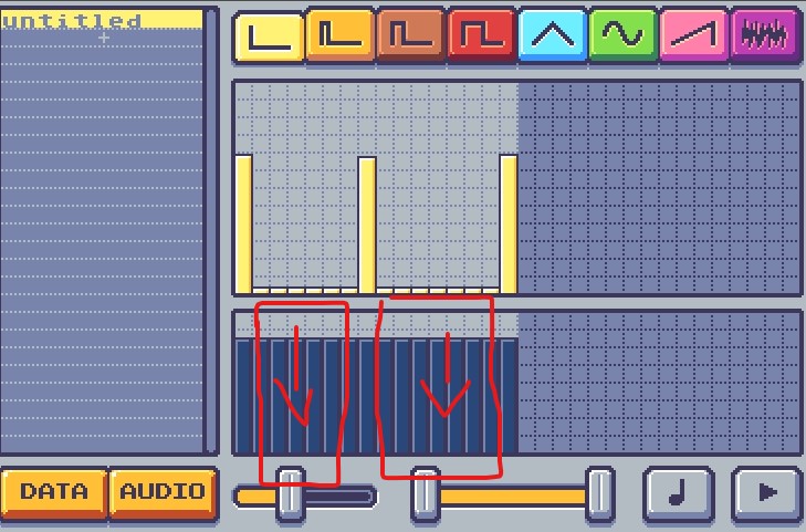
In a perfect world, I would love a mode for Beeper to behave like pico sound editor - only create a bar where you click (the in between bars stay quiet), default volume is 0 and changes only on the bars you click (currently the below example in Beeper would be filled with bars of sound in between):

...but this is not a high priority thing, worse comes to worst I can make and export from pico8.

(2 edits)

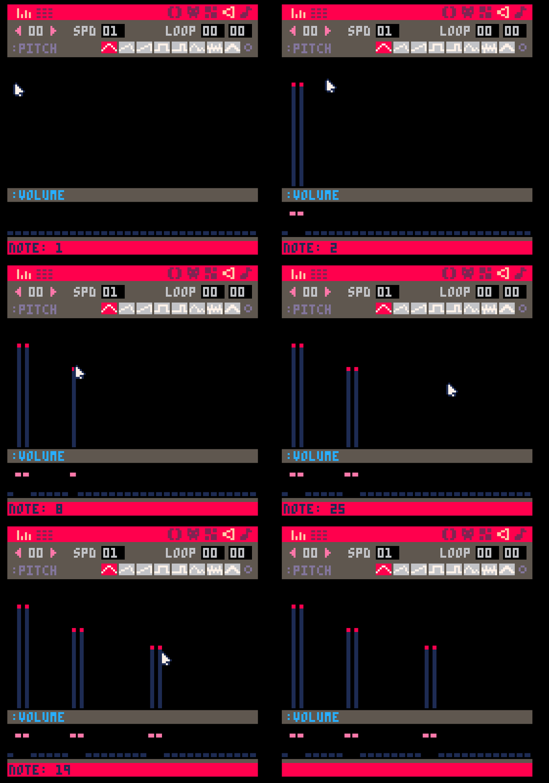
Not sure if it's a bug or expected behavior (and not sure if I should post it here or . When I want to make a sound-effect of 3 different bars (for a "bloop, pause, bloop, pause, bloop" sound) I am getting a constant sound.

Also, when sound is zeroed out on the yellow bar, it still produces a sound (similar to noise instrument) because the volume is not zerod out. I think the behavior should be if you zero out yellow bar, the volume/blue bar should be zeroed out OR there should be no sound produced on those yellow bars (see below):


This might be out of scope of how the engine is currently designed (with src folder not visible in assets panel), but it would be handy to have a small PICO8 like text editor inside the engine to either write code or do quick changes without switching to a full blown code editor like Atom.

Currently you can scroll to zoom the tilesheet and map panels. It would be great if you could zoom each independently (so you can have a bird's eye view of the map but it is still easy to choose tiles).

Also, if possible, zooming other panels would be nice - My main laptop has smaller screen, but high resolution, which makes the assets and tile brush panels a bit small.

Good to know that you can read the texture. It would be awesome if there was a function that would let you grab a rect from that texture. 

If it doesn't fit on your roadmap, I am pretty sure you can do it with js as is (or with a use of library). Which makes me think - can you add your own libraries? 

One of the awesome aspects of Pico8 was being able to use memcpy to copy and paste parts of the screen to make cool effects.

I know that pixelbox does not map memory like fantasy consoles, but it would be cool if there was an function to copy and paste parts of the canvas in a similar manner.

(1 edit)

I second that request - couple basic example projects would be awesome to get a hang of the engine.

In the meantime @RocketStarGames, you can look up github for the project, the basic API is there.
Edit: Seems that the author beat me to a reply by 39s :P

You sure do! 

Exalted should have sent you a link for it. If you didn't get it, send me an email or Twitter dm (both found in my bio on here) and we'll sort it out :)

As someone who laid out a game in typewriter font, here's my 2c.

First of all, let's look at your non-typewriter options.

Serif fonts (unless inspired by the programming fonts with its geometric forms, monoline weights and slab like serifs) will create a wrong feel to the text. It will either push the text more towards fantasy (not sci-fi) literature or everyday mundanity. I don't think it is something you would want.    

 Helvetica is the vanilla of the font world. It is perfectly fine, and will seldom clash with other flavors, but it will not add that much on its own.  If you are going for no-nonsense, direct approach (or you are at a deadline and need something to just fit in) - go for it, but you can't really "season" the text with Helvetica and give it a theme.

You can season with Avenir. The futurist roots of the font, mixed with a bit of playfulness fit the theme of Agents of the O.D.D well. Not to mention, manuals for big organizations would often use sans serif fonts, as they were the non-nonsense new hotness when manuals became more of a thing (1960s). Sure - this is the time that Helvetica rose to power, but it became so ubiquitous that it lost its flavor. If you decide to go with non-typewriter typeface, Avenir is a good call. 

...and now for typewriters.

The font you currently have is very distressed. It looks like it was made on a beaten up typewriter, with over-saturated ink ribbon or pulpy paper. It gives it a LOT of personality and creates a time and space around it. I love it... but yeah, it is not great for body text.

The big issue here is the texture. The jagged lines look cool, but they also "vibrate" on white page (especially on the screen) and make our eyes tired. You can experiment with minimizing it by mimicking how it would look made with actual typewriter or actual paper. After all, people are perfectly capable of reading (even beaten up) typewritten text without much issue. The problem here is contrast.

Unlike fonts, typewritten text like this would have a range of values. The ink bleed (what gives those letters this jagginess) would be lighter than the core of the letter and it would flow better with the page (which would not be pure white, nor would it shine light into our eyes like screen white does). The font has a very noisy change between the white and black - this jagged change makes our eyes tired. You can try to minimize this eye strain it by not using a pure black for your text (maybe something around #1a1a1a instead) and not making the page pure white. Give it a bit of yellow or just grey it our a bit. Even if you have the #1a1a1a text and an ecru page it will still read as pure black & white - but it will be much easier on the eyes.

Another idea is to create more whitespace on the page. Leave out some spots for the reader's eye to rest safely away from the noise of the font.

Of course - you can try using a different typewriter font. One that is not a crisp and perfect recreation, but also not as distressed. This is what I ended up doing for Endure. I used F25 Executive - it still has a bit of ink bleed (giving it almost a humanist like aesthetic), but it is not distressed to the point of being noisy. For me it was a good balance between machined and man-made look.

...and for keeping it looking like an artifact from the time & place - you can still keep the headers in a sans serif font and make it look like it was made few decades ago using office supplies. After all Letraset was a thing, and many offices used it :D

[it ended up being much more than 2c, but hopefully it was worth to spend the time reading this]

Love it! I spent too much time playing it last 2 days :D

Would love a random deck each time you play - maybe keep the current mode as daily challenge (make a score screen with a date so we can compare top scores?). This is because the "same deck for a whole day" makes me optimize my runs (more of a strategy), while a completely new deck makes make decisions on the spot (more tactical play). I think having both in game would be awesome.

Also - I would gladly pay for an android version!

You can find how to contact me on my itch.io page here: https://vonbednar.itch.io/ (I am doing it this way to have my email visible everywhere for spam bots to find it ;)

Awesome! Let me know once you are done - I would be happy to add your French translation on here with my layout :)

A really good and rules light take on Warehouse 13 and The Lost Room TV Series. If you want to play in a strange world and solve problems using strange items - this is your game!

Also, the included tables make it super easy to pick up and play! 

Thanks Jason!

Don't really have an idea, I am ok sitting it out :)

Nevetheless - looking forward to the bundle!