You know, I would totally be down for cleaning communal Tetris garbage for an afternoon, except I hate the fact that every two minutes I have to wait two minutes for the board to scroll up. The scroll is funny the first time you open the game, but I wish it was skippable from then on.
winterbeak
Creator of
Recent community posts
I made the main playing field the small size of 500 x 500 pixels in order to reduce the distance you have to move the mouse. Also, it meant I didn't have to manually implement graphics scaling, which PyGame didn't have support for until very recently. Hopefully nobody decides to play this on a 4K monitor, because it will be laughably tiny there.
It's funny being a developer, because you're shocked every time someone spends more than a minute on a level you can first try every time. I might nerf a few levels if I can get around to it.
Beat the game on hard! I like this a lot, despite how small it is. The art and music are really great! The penned-in art style is completely different from anything else I’ve seen before. Gameplay was fun, challenging but not frustrating, though it was pretty standard for a bullet hell shmup. I do wish there was a boss healthbar, but that's a very small nitpick.
There are a lot of features in this game, but I feel like more focus should have been placed on the main gameplay! I like the different worlds, the ship travelling, all the different enemy types, but the main parts of the game are a little boring. Right now, combat is just occasionally pressing a button, and resource gathering is just walking around. There needs to be a bit of extra complexity! Some simple things you could add are making it so that you can defend enemy attacks by timing a button, or maybe some special movements techniques like dashing or rolling.
It's clear that you put a lot of effort and polish into this game - it looks and feels really nice to play! I wish there were a few more levels, since a bunch of the mechanics felt unexplored, though I get that as a student probably you didn't have enough time for it. This will make a fine addition to my personal collection of window-mechanic games!
Reached the credits! A few of the early-middle levels were a little overwhelming with how much was on the screen, especially when you don't really have a grasp of the colors yet. However, once the color interactions start clicking, the game becomes a lot of fun! I especially enjoyed the last level, with all of its sectioned-off mini-puzzles. Well done!
I found this game hard to learn, but easy to master - once you get into the swing of things, you really get into the swing of things. Interestingly, the more moths there were the easier it was, since reflecting bullets is a lot simpler to do than encircling things. Nevertheless, I had a lot of fun playing this game, and got pretty far in. Here's my high score!
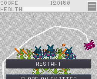
Small nitpick with the controls - left click to grapple and right click to ungrapple is kind of awkward, and I would have preferred the much more common hold to grapple, release to ungrapple. But I otherwise found the game to be quite satisfying to play! The swing physics were very good, and I always felt like I was in full control of the ball.
Weaving side to side like that feels incredibly satisfying once you get the rhythm down! This game is very fun for just an hour of work, I played until I got a high score of 38. Perhaps if you do something like this again sometime, maybe you could add in a sound effect for two? Would make the game just that much better, without sacrificing too much time.
This game felt amazing to play! The physics feel just right, and defeating enemies is incredibly satisfying, whether you're shooting them or simply running into them. However, one major issue I had was that there was practically no anticipation for certain events - without warning, enemies would spawn immediately in front of you, and also it was hard to judge when the cube would change colors. It's not the randomness that's the problem, it's just that you have no indication when and where said randomness was going to happen! Adding a spawning animation for enemies would help tremendously (it wouldn't have to be fancy, just having them flicker for a moment before becoming active would suffice). As for the cube, giving it a visible timer (or maybe even having it sync up to the beat of the music) would have made it feel a lot fairer!
A lot of puzzle platformers mash the genres together without reason, but not this one. Love how the platforming is actually part of the puzzle; some parts seem impossible until you remember that you can move and jump! As well, the execution feels spot on - playing through the level again after dying isn't a drag and is actually fun. I don't think I have anything bad to say about this! It's that good!
I've gotta say, I loved the bossfight and I loved endless mode! But something felt lacking in the normal levels, and I think I've pinpointed the reason why: they don't encourage the use of the platform as a weapon. It's very, very difficult to hit something while you are still moving to the right, so you have to stop to kill - but the goal is towards the right, so it's much more efficient just to dodge enemies rather than defeat them. This problem was amplified in the level before the boss, where new enemies would almost instantly replace the ones that you offed. Landing a hit and managing to catch your fall is the best part of the game! That's why I found the other parts of the game much more enjoyable - progress isn't distance-based, so you can stop to prepare shots when necessary.


