Play game
Colorbound's itch.io pageResults
| Criteria | Rank | Score* | Raw Score |
| Gameplay | #5 | 4.160 | 4.160 |
| Innovation | #6 | 4.080 | 4.080 |
| Overall | #8 | 3.960 | 3.960 |
| Theme interpretation | #18 | 3.800 | 3.800 |
| Graphics | #67 | 3.160 | 3.160 |
| Audio | #78 | 2.760 | 2.760 |
Ranked from 25 ratings. Score is adjusted from raw score by the median number of ratings per game in the jam.
GitHub repository URL
https://github.com/Zeroji/colorbound
Leave a comment
Log in with itch.io to leave a comment.


Comments
A very good and interesting game. I got stuck at 1-8, so I guess it's getting more and more challenging. While the use of colours to define interactions isn't something entirely new, the way you implemented it is pretty solid and well done and still feels fresh enough. I really enjoy this game.
Great puzzle game, reale like the minimalistic style . Congrats!!
This seems really interesting. Not sure if my computer isn't working correctly though. I tried this in Edge and Chrome and got some different bugs with it. In Chrome I see a pink screen. In edge I am getting this error. Is there a way to fix it?
That's bizarre and slightly worrying. Could you press F12 to open the developer console and see if there's any obvious errors? I don't use getParameter directly in my code so it's probably an Engine bug.
The pink screen on Chrome is something that's happened to a friend before, please try to reload a bunch of times / restart your browser.
If all else fails, you can always try it on phone/tablet (same URL) but the controls are harder to use.
Really nice game, good idea, and neat puzzles, I liked the simplistic visual style to it
I gave 5 stars on the innovation (though I think the graphics could have been better but it's cool that you are doing this all with geometric shapes - if I'm not wrong)
Thank you for your rating!
The graphics could be better, but I went with a simplistic style because I'm better at simple shapes in terms of art. However, these are all assets made in Aseprite, not pure geometric rendering. You can view all the files at https://github.com/Zeroji/colorbound/tree/master/assets
Hi, I played the game. I like the idea behind it, it's a pretty creative theme interpretation. I also like how the difficulty curve is just enough to keep the player on the edge. I really loved the color mix mechanic, that added a lot more strategy to the game. Weirdly this games feels a lot more like a strategy game than a puzzle game, but puzzle games do have some strategy in them, i suppose. The UI is really clean and crisp, this game is very well polished and has a good feel to it. The sound is good, even without music. Now, I haven't played every level, so I assume there is variety. The controls feel nice and fluid. All and all this is a really cool game, I couldn't find anything wrong with it, so I can't give any recommendations. Well done.
Edit: I just notice the name is "ColorBOUND" lol.
Thanks for your feedback!
If you want to have an idea of the variety, play the first level of each "world" through the Levels menu, every first level unlocks the next one :)
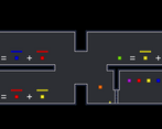
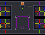
Reached the credits! A few of the early-middle levels were a little overwhelming with how much was on the screen, especially when you don't really have a grasp of the colors yet. However, once the color interactions start clicking, the game becomes a lot of fun! I especially enjoyed the last level, with all of its sectioned-off mini-puzzles. Well done!
Thanks for playing, congratulations on finishing all the levels!
Last one was made right before the deadline, so I decided to section it to cut the amount of work on my side. Glad you enjoyed it :)
Hey pretty good! Really cool theme interpretation!
What an amazing game! Great theme interpretation, excellent game mechanic and level design. 5 stars!
I completed to level 1-7.
Level 1-8 is meant to be difficult, maybe too difficult. However you can go back and start from level 2-1 using the Levels menu! :)
This is, a really good game!
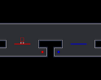
The gameplay is a combination of a platform, and puzzle game. Besides avoiding spikes and making precise moves and jumps that need to be timed, you also need to think about the layout of the map, and what route you should go. I like that concept, it works amazing in this game!
The graphics are also good, they're retro, simple, and have a distinct contrast between monochrome backgrounds and colorful obstacles. The combination of these characteristics, make the visuals of this game pleasant to look at.
The only thing that I found lacking, is music. A game like this, would definitely benefit from having some kind of chiptune music; in my opinion, it would make this game a lot better!
But even then, this is a solid game, which is really fun to play, and deserves a good rating!
What a nice game ;)
Gameplay:
I love the idea of color switching and door puzzles and even though I'm not good at logic games it was a lot of fun. Everything worked pretty well, the only problem I had was with portals as I really couldn't predict what they will do. Also when I quitted the game then I couldn't close my tab and I couldn't do anything with my browser, you hacker :P PS: Checkpoint system is amazing.
Graphics:
Graphic style is really wise and makes game enjoyable. I would just add a little of juice, like particles when we hit different objects and when we leave portal. The fact that you respected color blindness is also stunning.
Audio:
Sounds are well fitting, but I've lacked a music a lot. Even a really peaceful track just composed of few notes. It would give a lot of mood to that game. On level 5.1 I could make my own song by going from left to right and hitting those color changers, it was fun :P
Innovation:
It's definitely a well made idea (there are many games that make use of colors), but yours is not only well designed, but also it gives a lot of room to creativity.
Theme:
I get the bounds reference, but as for leaps there I can see only portals (so it's not something that follows us through entire game).
In short. A great game that really made my brain grow a little. Thanks :P
Thanks for your feedback, I'm sorry about your browser! The "game saved" window is here because previously quitting would just lag your browser and leave you on a slowed-down title scene, so I added this because I couldn't figure out a way to detect browsers. You're definitely the first to report a crash though.
Regarding the music I couldn't find what kind of soundtrack would fit the game... and for the leaps reference, well, it's a platformer ;)
Great work. I really enjoyed this. The puzzles I played through were smart and well designed. You also did a good job in the early levels of teaching the player the rules so they know what works and what doesn't.
One recommendation I have is that even though you know which platforms you can stand on based on the color of your player, I think it would be good if the platforms themselves gave some feedback too. So, if you are red only then should the red platforms becomes solid, otherwise they should just be outlines, giving the player some visual feedback that they can pass through. It just makes it easier to follow what's happening.
Overall, great work.
Thank you for your feedback!
That's a really nice idea, either platform outlines or some kind of opacity change. It would be a bit of a pain to change this for all "objects", though - do you think it'd be okay to have these features in early levels only? (I'm envisioning co-op gameplay for later, and this would not work)
If it's possible, I think it's better to do so for all levels. That way it is more consistent.
Well it wouldn't work for co-op, for example if one player is red and the other blue, platforms can only adapt their graphics to one of the players. Maybe I will implement it as an option, only for single-player levels.
Awesome game. The level design is well done and the game controls really well. Nice job.
Reminds me of Portal-like puzzles, which have always caught my interest, good job :)
This did turn out nice! I really like the mechanics! You managed to get a bunch of different puzzles out of some relatively simple gameplay which I really enjoyed. Graphics were plenty adequate and I think overall things worked. Some music and extra sound effects would be nice, but not necessary to enjoy the puzzles. Nice work!
Thanks for your feedback!
I initially wanted to add a soundtrack, but I ran out of time and couldn't decide what kind would fit the game. What sort of extra sound effects do you think are missing?
Whoever think out these puzzles must be super intelligent! I stuck at level 4! Fun and solid machanics!
Graphics are quite good, despite not being that much detailed, it feels good. Gameplay mechanics are so good! This game turned out pretty well! Awesome work!
This is a highly polished platformer, with cohesive graphics. I had a lot of fun playing this one! I'm not colorblind, but colorblind mode helped a lot near the end. There is some cheese in some of the levels that I noticed, but that's a minor gripe.
Thank you for your feedback!
Colorblind mode is not supposed to help non-colorblind users to play, but I'll allow it :p
Some levels (like 2-4 which you mentioned) have some shortcuts, but during game design I thought "if someone can make that jump first time they deserve it" so congratulations!
I dig it, really makes you think. Especially with the ability to interact with similar colors and not just same colors. Definitely a challenge